
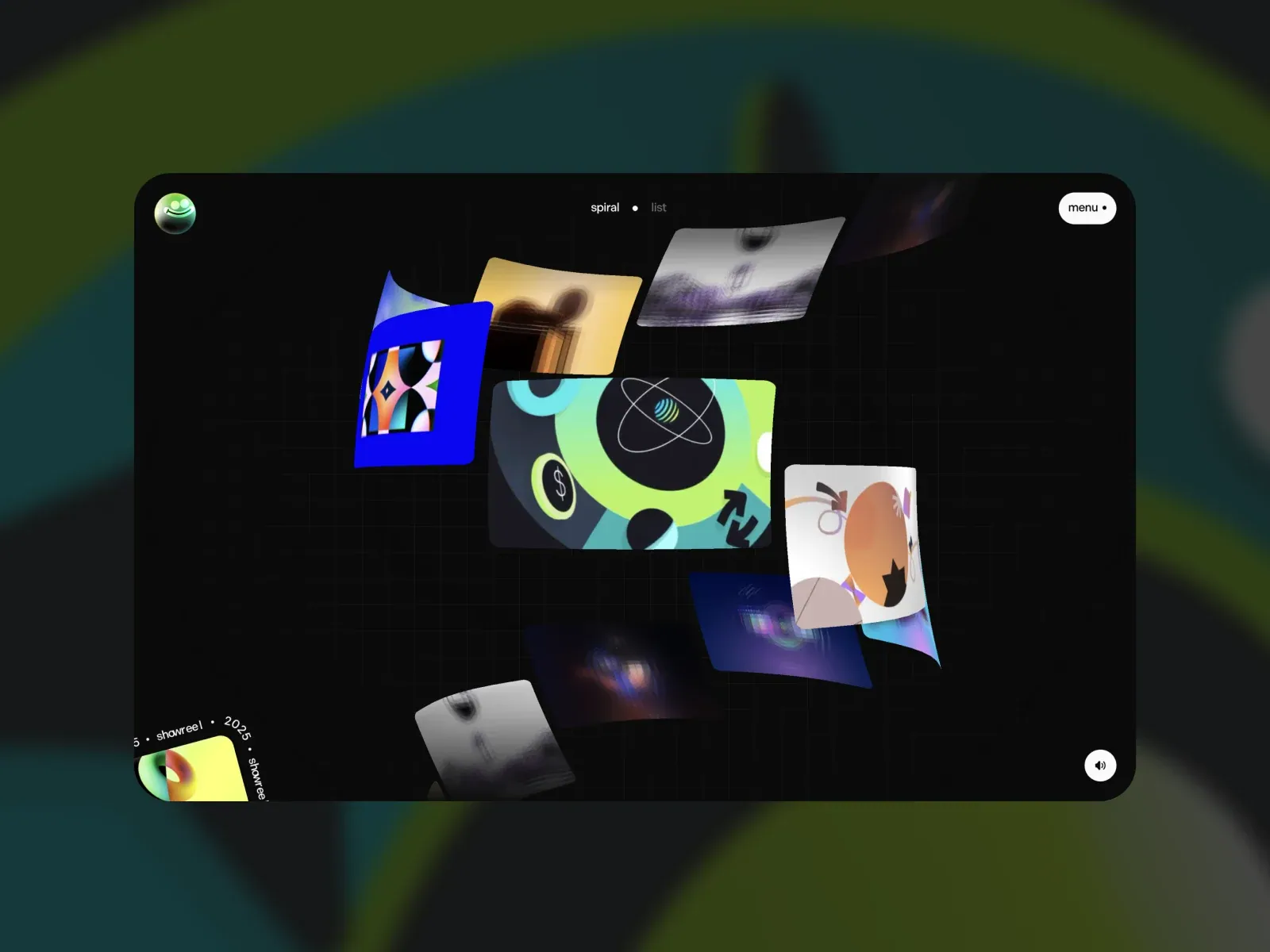
Gallery screenshot, saved 2026-10-24
How it’s built
- Layout
- Wide black rounded window floats over blurred dark teal-green surroundings. Varied rectangular work images overlap in a loose diagonal spiral across a faint grid. Tiny view labels at top center, small round mark upper-left, menu pill upper-right, sound glyph bottom-right, and clipped circular element lower-left.
- Type
- Tiny white/gray sans-serif labels and controls; images carry most color and hierarchy. No large headline. Exact family and metrics unknown.
- Color and surface
- Near-black canvas, subtle grid, dark green-blue atmosphere, bright blue/lime/yellow/peach/violet thumbnails, white pill controls. Rounded boundary; no distinct card shadows.
- Components
- Small circular mark, spiral/list selector labels, menu pill, sound icon, floating portfolio thumbnails. Images overlap and partially occlude; thumbnail artwork provides color.
What makes it work
- layered image arc
- size variation
- dark ground
On a new subjectUse an unrelated image set on a dark canvas, arranged as variable-size overlapping tiles along an arc, with terse edge controls and no large headline.
Prompts
Create a finished desktop homepage for {{website_name}} in {{industry}}, for {{audience}}, using {{content}} and making the intended {{functionality}} understandable. Transfer the composition rules below to unrelated subject matter and new artwork. Use one large, centered, near-black rounded stage inset within a softly blurred dark teal/green surround. Inside it, compose a sequence of separate rectangular image planes into a decisive curved or diagonal deck around an open focal pocket. Make each image a distinct panel, vary panel size and aspect ratio, tilt a few panels, and overlap neighboring edges enough that front-to-back order is unmistakable. Let one vivid central panel anchor the deck while smaller cream, muted photographic, violet, or warm accent panels continue its arc. Keep the trajectory visibly curved or diagonal rather than a closed, evenly spaced orbit. The overlap and changing scale are essential; loose separated thumbnails, a uniform tile grid, and a single hero image do not satisfy the composition. Preserve generous dark negative space around the deck. Set small, quiet navigation at the top of the stage: concise primary links for {{functionality}}, plus a compact menu affordance if needed. Add only a small mode or category label and a restrained sound/media control when relevant. Keep labels legible and subordinate, and place any secondary caption near an edge rather than across the imagery. Use image content appropriate to {{industry}} and {{audience}}, with varied crops and clear silhouettes. Adapt the exact colors, text, artwork, number of panels, and navigation labels to {{website_name}}, {{content}}, and {{functionality}}. Do not place the page inside a photographed device. Do not imply a particular animation, hover effect, sound interaction, 3D rendering method, or software library from this still. Mobile proposal: scale the stage to the viewport with safe margins, keep the deck’s curved overlap legible using fewer/larger panels, and move secondary controls into a compact reachable row without flattening the stack into a grid.
Implement a responsive, accessible homepage for {{website_name}} in {{industry}} for {{audience}}, using {{content}} and real controls for {{functionality}}. Treat the selected gallery screenshot as a static visual reference only. Build a spacious dark composition with a centered inset stage, rounded outer corners, and a softly blurred green/teal surround if suitable for the new brand. The defining structure is a deck of multiple rectangular image planes following a curved or diagonal path around an open focal area. Use CSS layout and transforms or another maintainable technique you choose; no reference implementation technology is known or required. Vary card dimensions and angles, establish deliberate z-order, and let adjacent image planes partially cover one another. Make overlap, scale change, and the deck trajectory visible without relying on motion. Anchor the focal zone with one relatively large image and continue the arc with smaller panels. Keep the deck within the stage and preserve dark negative space around it. Use new images for {{industry}} and {{audience}}; keep subject content, crop, palette, and count variable while preserving the overlapping-deck relationship. Add semantic links for the primary navigation, a real menu button only if the information architecture needs it, and working controls for the specified {{functionality}}. A small media/sound control is optional and should only appear if it has an actual accessible action. Provide visible focus, keyboard operation, descriptive image alternatives where images convey content, and decorative treatment for non-informative imagery. Do not make text part of a background image. Mobile proposal: at narrow widths, reduce outer margins, retain the dark stage, use fewer and larger overlapping panels along a compressed but still curved/diagonal path, and keep the focal panel visible. Place navigation in a compact top row or reachable menu; maintain contrast and readable labels. Do not rearrange cards into a regular grid or remove overlap. Respect reduced-motion preferences for any newly designed motion; the reference still does not establish that motion exists. Prohibitions: do not copy source identity, artwork, wording, exact colors, or panel positions; do not recreate gallery/browser/device framing; do not claim fidelity to unobserved motion, hover, transitions, sound, 3D, or a specific technical stack. This is an unvalidated recipe: render desktop and mobile views and assess composition before claiming a match.


