
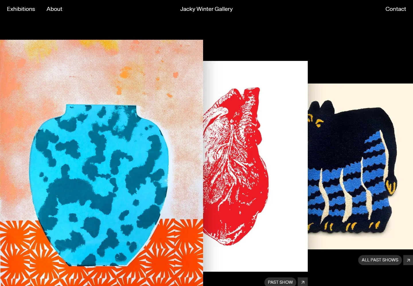
Live capture at 1440px, 2026-10-24
How it’s built
- Layout
- Sparse black header and field hold colorful rectangular image panels with unequal widths and vertically staggered tops; their adjacent edges appear flush.
- Type
- Tiny white navigation and identity; image-led hierarchy.
- Color and surface
- Black ground and vivid varied image surfaces.
- Components
- Sparse white header labels and unequal-width colorful image panels staggered vertically against black.
What makes it work
- Black field and sparse white header labels
- Vivid unequal-width rectangular image panels with vertically staggered tops
On a new subjectFor a marine research collection, arrange vivid unequal-width ocean-image panels with vertically staggered tops on black beneath tiny white header labels.
Prompts
Create an original visual direction for {{website_name}} in {{industry}} for {{audience}}, presenting {{content}} and enabling {{functionality}}. Composition invariant: Stage several large rectangular visual cards over an open dark canvas, with visible front-to-back overlap and varied tonal/image grounds. Keep navigation in a shallow top band and any actions small and attached to the related card. Typography character and hierarchy: Use simple light sans navigation and compact action labels; artwork or media may carry its own display typography. Color/surface contrast: Use a near-black open field with clear contrast for labels; vary card imagery and ground colors to suit the target. Image and component roles: Replace the source artworks with new subject-appropriate projects, products or editorial images; the stacked-card relationship, not artwork subject, is the invariant. Visual estimate from the selected image, not a measured CSS value: Visual estimate: header around 14% height; image cards span almost width and dominate half viewport; center card partly occluded. Scale this balance to the actual content. Variables: replace all source identity, wording, products, people, artwork, palette details and actions with new material for {{website_name}}, {{industry}}, {{audience}}, {{content}} and {{functionality}}. Preserve only layout relationships and type hierarchy. No source asset or exact phrase is mandatory. Do not infer named fonts, framework, CSS, animations or tested interactions. Continue with sections that support the new content, using the same relative whitespace and clear grouping. Change the overlapping deck into a readable stacked sequence; retain which card leads and keep actions beside their respective items.
Implement a responsive page for {{website_name}} in {{industry}} for {{audience}}, presenting {{content}} and implementing {{functionality}}. Wide composition: Stage several large rectangular visual cards over an open dark canvas, with visible front-to-back overlap and varied tonal/image grounds. Keep navigation in a shallow top band and any actions small and attached to the related card. Type system: Use simple light sans navigation and compact action labels; artwork or media may carry its own display typography. Surface treatment: Use a near-black open field with clear contrast for labels; vary card imagery and ground colors to suit the target. Media/components: Replace the source artworks with new subject-appropriate projects, products or editorial images; the stacked-card relationship, not artwork subject, is the invariant. Visual estimate from the selected image, not a measured CSS value: Visual estimate: header around 14% height; image cards span almost width and dominate half viewport; center card partly occluded. Scale this balance to the actual content. Variables: replace all source identity, wording, products, people, artwork, palette details and actions with new material for {{website_name}}, {{industry}}, {{audience}}, {{content}} and {{functionality}}. Preserve only layout relationships and type hierarchy. No source asset or exact phrase is mandatory. Do not infer named fonts, framework, CSS, animations or tested interactions. Continue with sections that support the new content, using the same relative whitespace and clear grouping. Change the overlapping deck into a readable stacked sequence; retain which card leads and keep actions beside their respective items. Use semantic, selectable text and meaningful image descriptions. Keep controls clearly named, keyboard usable and visibly focused. Any requested action should work as new behavior; do not assert source behavior from this static image.
Measured
Fonts loadedMessinaModern, MessinaModern Fallback, MessinaSans, MessinaSans Fallback
H1100px / 400 / -4px
Body text20px
Page background#000000
Text color#ffffff
Page height11,796px
Computed CSS at 1440px, 2026-10-24.


