
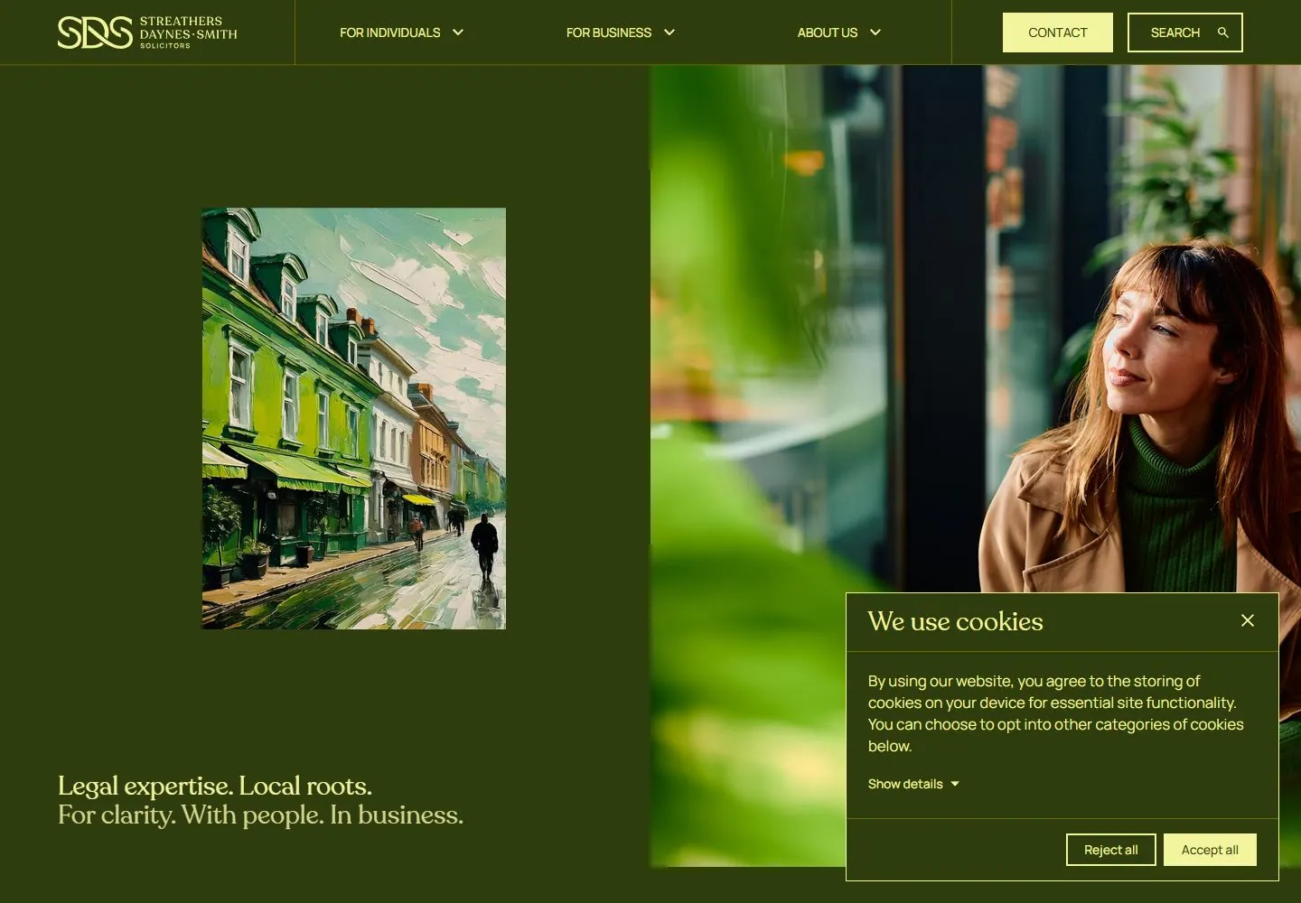
Live capture at 1440px, 2026-10-24
How it’s built
- Layout
- A mobile page is shown on a tilted phone in a green upholstered setting. Inside the device, a dark brown top bar with light serif monogram and hamburger leads to a large portrait, followed by a dark brown block of cream and gold serif copy and a second image with yellow playback controls. Phone and upholstery are gallery staging.
- Type
- Cream and gold medium-sized high-contrast serif copy with short line breaks; small identity and sparse utility icons. Exact fonts and metrics unknown.
- Color and surface
- Deep brown, cream and mustard gold, full-width natural portrait photography.
- Components
- Stack a dark brown header, full-width portrait, cream/gold serif text block and another image with small yellow control-like elements.
What makes it work
- Dark brown stacked mobile panels
- Full-width documentary portrait
- Cream and gold serif message
- Second image with small yellow controls
On a new subjectFor a public horticultural training service, stack original gardener portraits with a deep brown header and cream/gold serif invitation, retaining a second image and small yellow control-like details.
Measured
Fonts loadedRecoleta, GentlemensScript, Manrope
H128.6192px / 400
Body text16px
Page background#2f3d0e
Text color#f2f49e
Page height7,697px
Computed CSS at 1440px, 2026-10-24.
Live behavior
- Today
- Streathers Daynes Smith current desktop uses dark olive green, pale yellow serif copy and a ruled fixed header. Hero is evenly split: a small inset painterly street image on the olive left panel, a tall photographic-looking seated-person image filling the right half, and a short two-line serif statement low left. A pale-bordered olive consent panel obscures the lower right. Current evidence is separately versioned from gallery reference.
- Responsive
- At768px the painted inset street image is absent and the person image occupies full width below compact monogram/hamburger header; the serif statement follows beneath. At390px the image similarly spans full width and379.15625px height below64px header; consent covers the following statement and much of lower content, so nominal H1 metrics do not establish visible mobile copy. Consent actions stack vertically on mobile but remain horizontal in tablet/desktop. No exact breakpoint inferred.
- Scroll
- Actual desktop scroll750px in7697px document brings a two-column section into view: large media rectangle left, right serif heading with script-emphasis conversations, body copy and outlined action between fine rules. Fixed olive header remains visible at this sampled offset. Consent still masks lower right; header persistence beyond these positions and playback controls untested.


