
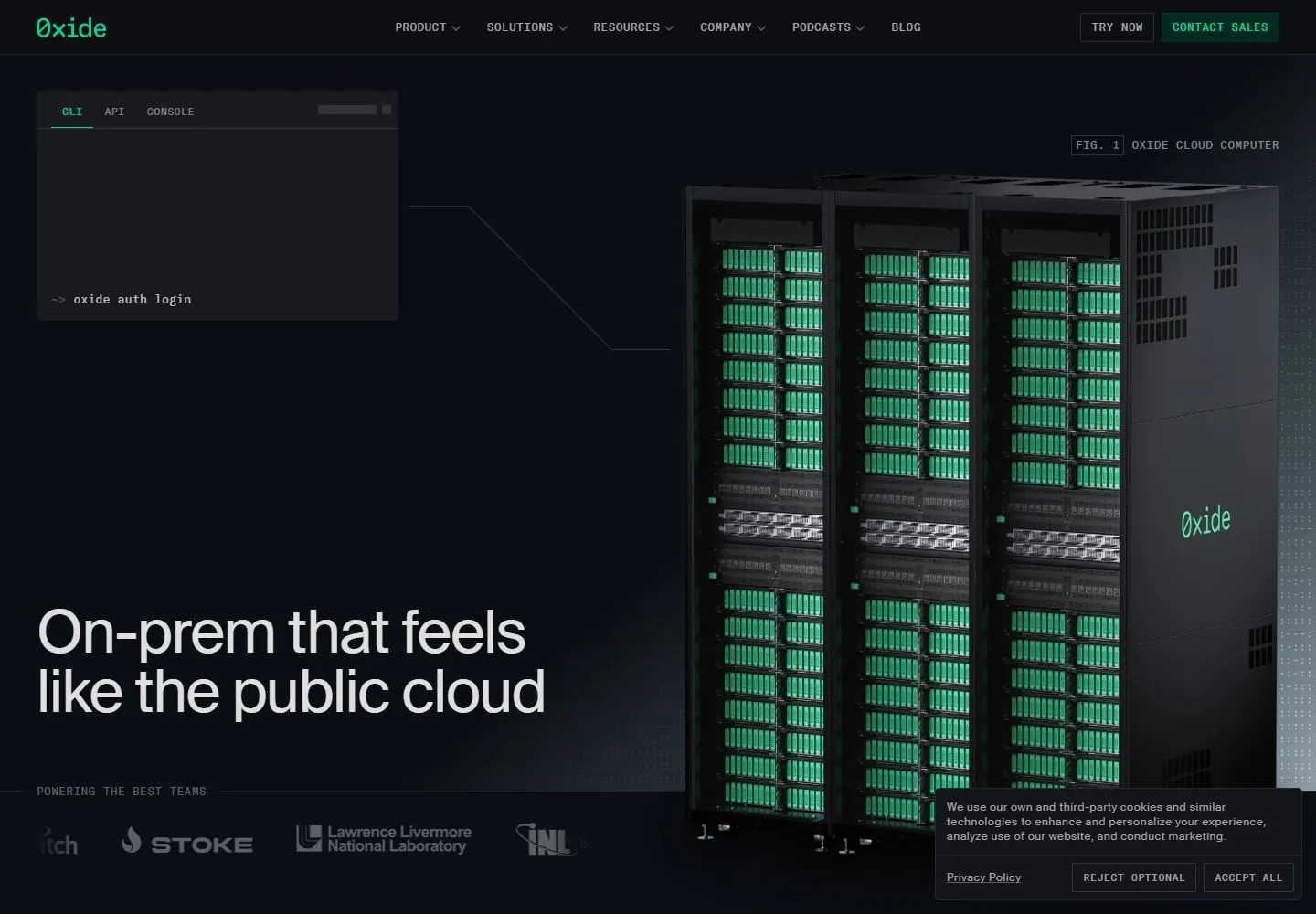
Live capture at 1440px, 2026-10-24
How it’s built
- Layout
- Dark blue-green page splits a yellow headline and gray text at left from tall dark equipment image with green accents at right; tiny mono header and outlined form.
- Type
- Regular pale yellow sans headline; small gray sans body and tracked monospace-like uppercase navigation.
- Color and surface
- Very dark blue-green, pale yellow, gray and glowing green accents.
- Components
- Split text and tall equipment image, compact header and outlined form.
What makes it work
- Dark blue-green field
- pale yellow headline
- tall dark image with green accents
- compact mono-like header
On a new subjectFor a public weather observatory, pair a pale yellow headline with a tall dark instrument image and green accents on very dark blue-green.
Prompts
Create a visual direction for {{website_name}} in {{industry}} for {{audience}}, shaping {{content}} and supporting {{functionality}}.
COMPOSITION INVARIANTS: Use a dark technical canvas with compact utility navigation, a readable copy region, and a substantial subject-relevant technical object or diagram. Let thin lines connect parts of the visual without turning the whole page into a schematic. Preserve the observed visual hierarchy and spacing relationships, not the source-specific object inventory.
TYPE: Give the lead a large, clean sans hierarchy; keep nav, figure notes, and panel labels small and utilitarian. Use a compact monospaced character only for short technical labels, not as a claimed source font. Set a readable scale step between display text, supporting copy, captions, and utilities. Do not name a font family.
SURFACE AND COMPONENTS: Near-black and charcoal surfaces with high-contrast light copy and one restrained signal accent. Fine technical texture should stay low contrast so the main content remains readable. Component roles: Top navigation, small technical panel, connector detail, large object/diagram, caption and a lower proof/support row. Cookie notice is incidental and should not define the design. Keep controls visually distinct and subordinate to the main content.
IMAGE DIRECTION: Use a new technical illustration or product view tied to {{industry}} and {{content}}; server racks and source marks are not required. Proportion estimate from the selected still: Visual estimate: header about 6% height; cabinet around 45% width and 70% height; headline occupies lower-left quarter. Treat it as an estimate, not fixed CSS geometry.
VARIABLES: Adapt names, details, image subjects, palette accents, and working actions to {{website_name}}, {{industry}}, {{audience}}, {{content}}, and {{functionality}}.
PROHIBITIONS: Use original copy and assets. Do not reproduce the source brand, exact wording, photographs, illustrations, products, people, or signature artwork; source-specific objects and motifs are optional only when they genuinely fit the new subject.
CONTINUATION: Continue with modular evidence or product sections that reuse fine rules and restrained signal accents rather than a repeated hero panel.
RESPONSIVE PROPOSAL: Stack headline before the technical visual, then expose detail labels as a readable list or simplified diagram. Keep controls above the fold and avoid tiny annotations. These are design proposals, not observed mobile behavior. The selected still does not establish source fonts, CSS, implementation technology, motion, or control behavior. Do not present any of those as observed. Implement requested {{functionality}} as working new behavior without implying source validation.
Implement a responsive page for {{website_name}} in {{industry}} for {{audience}}, presenting {{content}} and working {{functionality}}.
INVARIANTS: Use a dark technical canvas with compact utility navigation, a readable copy region, and a substantial subject-relevant technical object or diagram. Let thin lines connect parts of the visual without turning the whole page into a schematic. Keep the same relative prominence and spacing without requiring the same source objects.
TYPE AND SURFACES: Give the lead a large, clean sans hierarchy; keep nav, figure notes, and panel labels small and utilitarian. Use a compact monospaced character only for short technical labels, not as a claimed source font. Near-black and charcoal surfaces with high-contrast light copy and one restrained signal accent. Fine technical texture should stay low contrast so the main content remains readable. Maintain clear display/body/utility scale, readable line lengths, and sufficient contrast. Components: Top navigation, small technical panel, connector detail, large object/diagram, caption and a lower proof/support row. Cookie notice is incidental and should not define the design.
IMAGERY AND SCALE: Use a new technical illustration or product view tied to {{industry}} and {{content}}; server racks and source marks are not required. Visual estimate only: Visual estimate: header about 6% height; cabinet around 45% width and 70% height; headline occupies lower-left quarter. Use flexible widths and content-led dimensions; do not copy this screenshot's coordinates as fixed values.
VARIABLES: Adapt names, details, image subjects, palette accents, and working actions to {{website_name}}, {{industry}}, {{audience}}, {{content}}, and {{functionality}}.
PROHIBITIONS: Use original copy and assets. Do not reproduce the source brand, exact wording, photographs, illustrations, products, people, or signature artwork; source-specific objects and motifs are optional only when they genuinely fit the new subject.
CONTINUATION: Continue with modular evidence or product sections that reuse fine rules and restrained signal accents rather than a repeated hero panel.
RESPONSIVE PROPOSAL: Stack headline before the technical visual, then expose detail labels as a readable list or simplified diagram. Keep controls above the fold and avoid tiny annotations. Use semantic content, keyboard-operable controls, visible focus, meaningful alt text, and no clipped content. The selected still does not establish source fonts, CSS, implementation technology, motion, or control behavior. Do not present any of those as observed. Implement requested {{functionality}} as working new behavior without implying source validation.
Measured
Fonts loadedGT America Mono, SuisseIntl
H165px / 400 / -1.625px
Body text16px
Page backgroundoklch(0.162 0.01 260)
Text coloroklch(0.79 0.0011 260)
Page height9,916px
Computed CSS at 1440px, 2026-10-24.


