
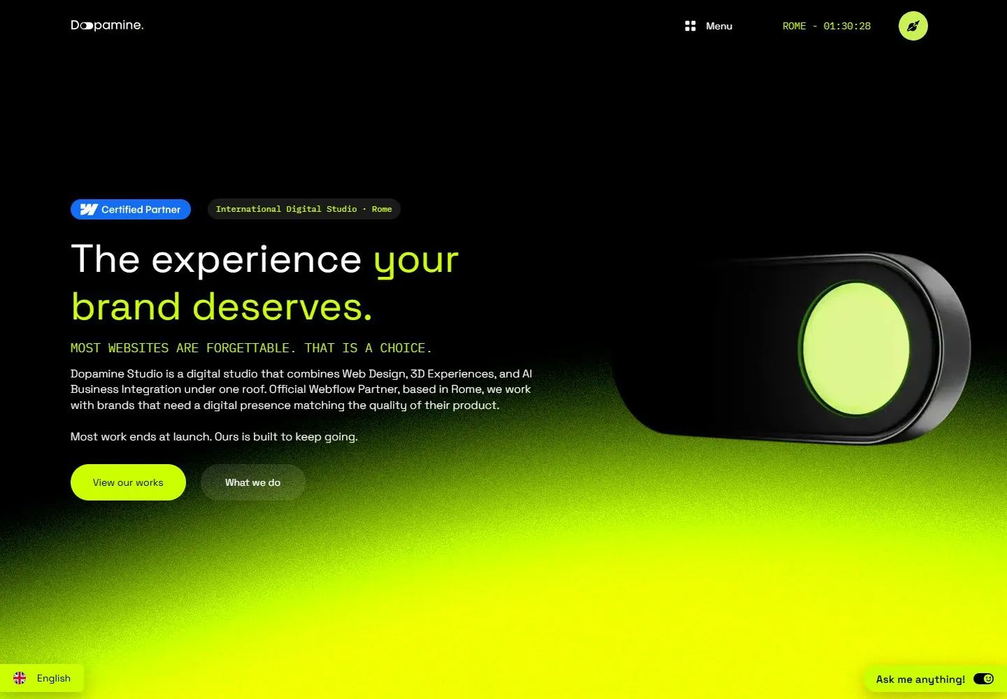
Live capture at 1440px, 2026-10-24
How it’s built
- Layout
- Gallery image presents a laptop on bright patterned upholstery against black. In-screen dark page has a small brand/nav row, a left-aligned two-line proposition with lime italic emphasis, a short highlighted tagline and compact support copy. Two rounded calls to action sit beneath. At right, a glossy black capsule-like object with a lime circular center balances the copy; the lower screen fades into vivid lime. Laptop, fabric and black outer ground are presentation framing.
- Type
- In-screen proposition uses medium-large italic sans with lime emphasis; utility text is tiny, support compact and the tagline uses small tracked uppercase. Exact face/metrics unavailable.
- Color and surface
- Near-black in-screen upper field transitions into vivid lime lower glow; white text and luminous green highlight, blue certification chip, glossy black/lime object. Laptop and fabric are outside the page.
- Components
- In-screen brand/navigation, certification/location tags, value proposition, tagline, explanatory copy, paired actions and abstract product-like form.
What makes it work
- Dark-to-lime page field
- Left-side proposition and support
- One large balancing visual on right
- Clear pair of actions
On a new subjectPair an unrelated concise proposition with one relevant abstract or product visual on the opposite side, then offer two clear next steps. Replace claims and do not copy the laptop or textile setting.
Prompts
Create a visual direction for {{website_name}} in {{industry}} for {{audience}}, shaping {{content}} and supporting {{functionality}}.
COMPOSITION INVARIANTS: Set a dark hero with copy and actions on the left and one large subject-relevant object or interface on the right. Let a vivid soft glow rise from the lower region to connect the two sides; keep top utilities sparse. Preserve the observed visual hierarchy and spacing relationships, not the source-specific object inventory.
TYPE: Use a large clean sans heading with selective accent emphasis, a small uppercase eyebrow, readable paragraphs, and pill-shaped actions. Avoid tiny body text over bright areas. Set a readable scale step between display text, supporting copy, captions, and utilities. Do not name a font family.
SURFACE AND COMPONENTS: Start with black or deep charcoal, then use a controlled gradient accent chosen for the new brand. Maintain contrast where the glow passes behind text and keep the object edge legible. Component roles: Compact header/utilities, optional proof label, headline and paragraphs, two actions, large object/interface view, and small utility controls only where functional. Keep controls visually distinct and subordinate to the main content.
IMAGE DIRECTION: Use new product artwork relevant to the intended content. The source device, partner badge, location/time and exact lime hue are not required. Proportion estimate from the selected still: Visual estimate: copy uses about half width, device around 35%; lime glow fills lower 30–35% of frame. Treat it as an estimate, not fixed CSS geometry.
VARIABLES: Adapt names, details, image subjects, palette accents, and working actions to {{website_name}}, {{industry}}, {{audience}}, {{content}}, and {{functionality}}.
PROHIBITIONS: Use original copy and assets. Do not reproduce the source brand, exact wording, photographs, illustrations, products, people, or signature artwork; source-specific objects and motifs are optional only when they genuinely fit the new subject.
CONTINUATION: Continue with capabilities or work examples that reuse the light-to-dark transition sparingly and keep text on calm surfaces.
RESPONSIVE PROPOSAL: Stack copy before the object; reduce the glow behind text and place language/support controls below the main CTA so they do not float over it. These are design proposals, not observed mobile behavior. The selected still does not establish source fonts, CSS, implementation technology, motion, or control behavior. Do not present any of those as observed. Implement requested {{functionality}} as working new behavior without implying source validation.
Implement a responsive page for {{website_name}} in {{industry}} for {{audience}}, presenting {{content}} and working {{functionality}}.
INVARIANTS: Set a dark hero with copy and actions on the left and one large subject-relevant object or interface on the right. Let a vivid soft glow rise from the lower region to connect the two sides; keep top utilities sparse. Keep the same relative prominence and spacing without requiring the same source objects.
TYPE AND SURFACES: Use a large clean sans heading with selective accent emphasis, a small uppercase eyebrow, readable paragraphs, and pill-shaped actions. Avoid tiny body text over bright areas. Start with black or deep charcoal, then use a controlled gradient accent chosen for the new brand. Maintain contrast where the glow passes behind text and keep the object edge legible. Maintain clear display/body/utility scale, readable line lengths, and sufficient contrast. Components: Compact header/utilities, optional proof label, headline and paragraphs, two actions, large object/interface view, and small utility controls only where functional.
IMAGERY AND SCALE: Use new product artwork relevant to the intended content. The source device, partner badge, location/time and exact lime hue are not required. Visual estimate only: Visual estimate: copy uses about half width, device around 35%; lime glow fills lower 30–35% of frame. Use flexible widths and content-led dimensions; do not copy this screenshot's coordinates as fixed values.
VARIABLES: Adapt names, details, image subjects, palette accents, and working actions to {{website_name}}, {{industry}}, {{audience}}, {{content}}, and {{functionality}}.
PROHIBITIONS: Use original copy and assets. Do not reproduce the source brand, exact wording, photographs, illustrations, products, people, or signature artwork; source-specific objects and motifs are optional only when they genuinely fit the new subject.
CONTINUATION: Continue with capabilities or work examples that reuse the light-to-dark transition sparingly and keep text on calm surfaces.
RESPONSIVE PROPOSAL: Stack copy before the object; reduce the glow behind text and place language/support controls below the main CTA so they do not float over it. Use semantic content, keyboard-operable controls, visible focus, meaningful alt text, and no clipped content. The selected still does not establish source fonts, CSS, implementation technology, motion, or control behavior. Do not present any of those as observed. Implement requested {{functionality}} as working new behavior without implying source validation.
Measured
Fonts loadedIBM Plex Mono, Space Grotesk, ITC Avant Garde STD
H156px / 400
Body text14px
Page background#000000
Text color#333333
Page height17,725px
Computed CSS at 1440px, 2026-10-24.
Live behavior
- Today
- At 1440px, a wide text/object hero uses white headline, lime monospace supporting line, round controls, and a dark product render over a noisy green lower field. The heading, supporting line and body remain visible in t0, t2 and hover frames. At scrollY 750, a centered approach section and four outlined graphic cards replace the hero. Mobile stacks copy over the object; reduced-motion fresh-load shows a rotated object compared with the normal mobile frame.
- Responsive
- Desktop is 1440x1000, tablet 768x1024, mobile 390x844. Layout changes from wide two-zone to stacked copy/object; desktop has fixed top nav and bottom utility pills. Document height is 17725 CSS px.
- Scroll
- At scrollY 750 a centered approach statement and four outlined cards occupy the viewport while top nav and bottom utility controls persist.


