
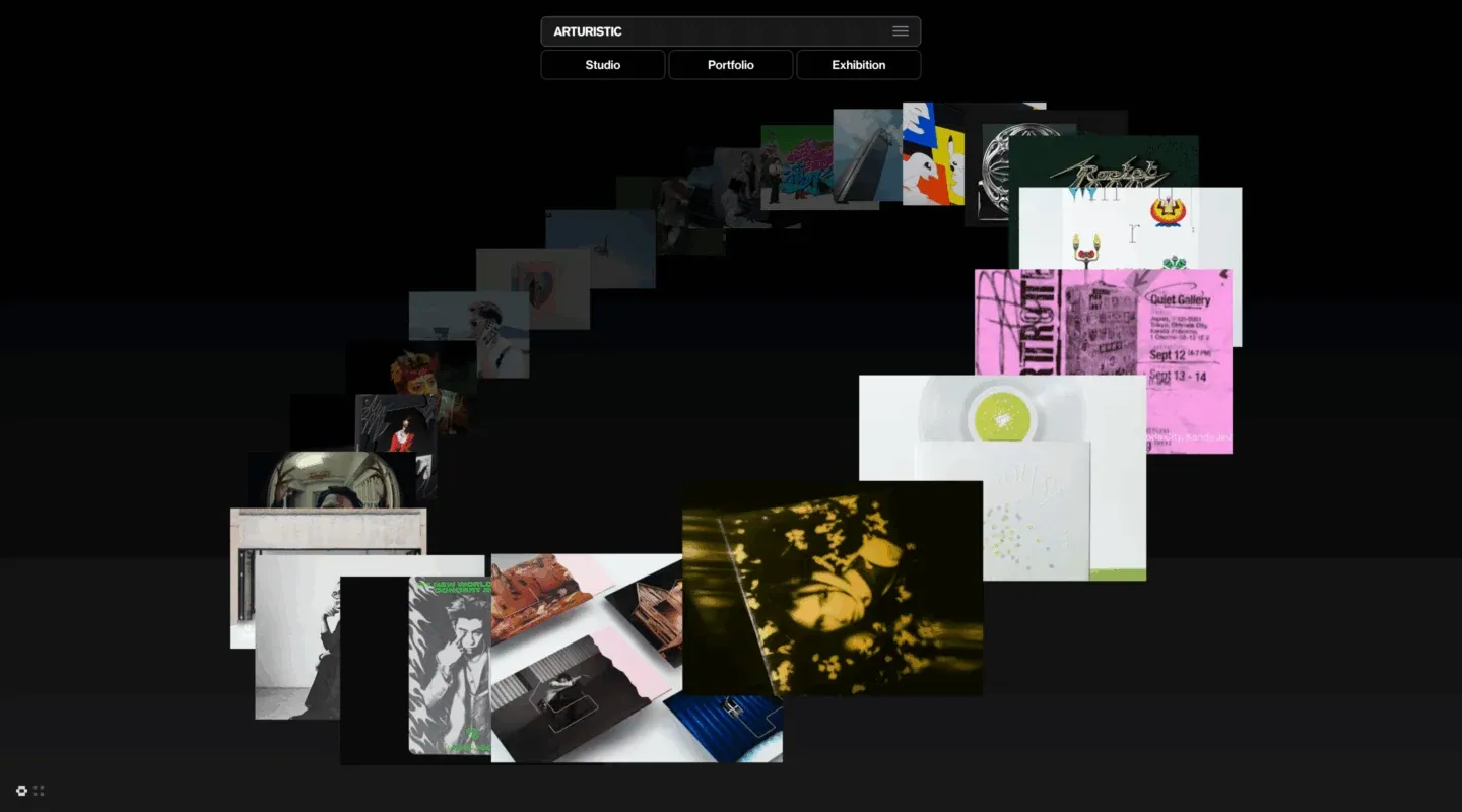
Screenshot from Minimal Gallery, saved 2026-10-24
How it’s built
- Layout
- Black canvas with a small pill-like identity/nav module centered near top. Many rectangular artworks form an overlapping loose arc descending from upper center, sweeping down the left and back up to right before a denser lower cluster. A darker band separates top artwork field from lower section; tiny controls sit bottom left.
- Type
- Very little visible copy; compact white labels in top module. Artwork images provide most text and graphic variation.
- Color and surface
- Black/charcoal ground, translucent-looking dark image edges and layered tiles of varied colors; no shadows clearly distinguish the overlapping image planes.
- Components
- Identity/menu controls, numerous overlapping artwork thumbnails, small lower-corner glyphs.
What makes it work
- Dark open ground
- Overlapping image rectangles
- A curved trajectory around a central open area
- Minimal navigation
On a new subjectArrange unrelated reference images as overlapping planes along a curved route that preserves a central open area, with a smaller cluster where useful. Keep labels minimal and replace the art collection.
Prompts
Create an original visual direction for {{website_name}} in {{industry}} for {{audience}}, presenting {{content}} and enabling {{functionality}}. Composition invariant: Keep compact two-level navigation centered near the top. Arrange a curved chain of overlapping rectangular previews that sweeps around a mostly empty central area, with image size and overlap establishing depth. Typography character and hierarchy: Use tiny clear sans labels within restrained controls; allow new image content to carry its own type styles. Color/surface contrast: Use a dark open ground, subtle separation between image layers and readable light labels; choose new image colors for the target subject. Image and component roles: Use varied original previews relevant to {{content}} rather than copying source artwork; keep their differing rectangular proportions and layered order. Visual estimate from the selected image, not a measured CSS value: Visual estimate: deck spans about 65% width and 60% height; top nav narrow and centered. Scale this balance to the actual content. Variables: replace all source identity, wording, products, people, artwork, palette details and actions with new material for {{website_name}}, {{industry}}, {{audience}}, {{content}} and {{functionality}}. Preserve only layout relationships and type hierarchy. No source asset or exact phrase is mandatory. Do not infer named fonts, framework, CSS, animations or tested interactions. Continue with sections that support the new content, using the same relative whitespace and clear grouping. Reduce the arc into a short scrollable or stacked set of previews, preserve order and avoid an inaccessible horizontal-only layout.
Implement a responsive page for {{website_name}} in {{industry}} for {{audience}}, presenting {{content}} and implementing {{functionality}}. Wide composition: Keep compact two-level navigation centered near the top. Arrange a curved chain of overlapping rectangular previews that sweeps around a mostly empty central area, with image size and overlap establishing depth. Type system: Use tiny clear sans labels within restrained controls; allow new image content to carry its own type styles. Surface treatment: Use a dark open ground, subtle separation between image layers and readable light labels; choose new image colors for the target subject. Media/components: Use varied original previews relevant to {{content}} rather than copying source artwork; keep their differing rectangular proportions and layered order. Visual estimate from the selected image, not a measured CSS value: Visual estimate: deck spans about 65% width and 60% height; top nav narrow and centered. Scale this balance to the actual content. Variables: replace all source identity, wording, products, people, artwork, palette details and actions with new material for {{website_name}}, {{industry}}, {{audience}}, {{content}} and {{functionality}}. Preserve only layout relationships and type hierarchy. No source asset or exact phrase is mandatory. Do not infer named fonts, framework, CSS, animations or tested interactions. Continue with sections that support the new content, using the same relative whitespace and clear grouping. Reduce the arc into a short scrollable or stacked set of previews, preserve order and avoid an inaccessible horizontal-only layout. Use semantic, selectable text and meaningful image descriptions. Keep controls clearly named, keyboard usable and visibly focused. Any requested action should work as new behavior; do not assert source behavior from this static image.


