
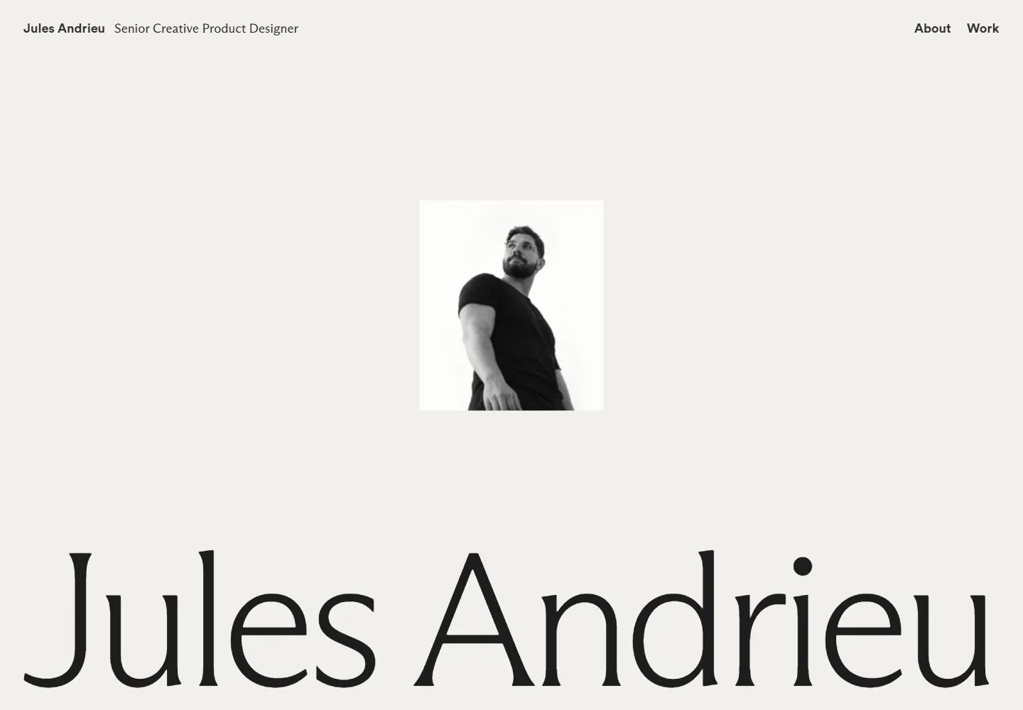
Live capture at 1440px, 2026-10-24
How it’s built
- Layout
- Warm off-white background; tiny designer name and role top left, About/Work top right. Small monochrome portrait sits centered in the upper half. A huge black high-contrast serif name spans the lower width, with lower portions cropped by the frame.
- Type
- The identity name is an oversized refined serif with strong thick/thin contrast. Name/role and nav are small bold sans. No prominent supporting paragraph visible.
- Color and surface
- Warm pale ground, nearly black text and monochrome portrait. No cards, lines, borders or shadows.
- Components
- Name/role label, two navigation links, centered portrait, monumental personal-name typography.
What makes it work
- Open pale ground
- Name as dominant graphic mass
- Small portrait
- Metadata much smaller than name
On a new subjectMake the unrelated subject's name or key identity the largest element, supported by one small portrait or representative image and minimal metadata.
Prompts
Create an original website image for {{website_name}} in {{industry}}, serving {{audience}}, presenting {{content}} and making {{functionality}} apparent.
INVARIANTS: Place a small monochrome focal image high in an otherwise open pale field; align identity/role and links on opposite ends of the top rail; let an enormous identity line span roughly 94% of the lower width.
TYPOGRAPHY: Use a fine, high-contrast serif for the giant identity and small plain sans utilities.
COLORS AND SURFACES: Ivory or near-white ground with dark ink; image values remain monochrome.
IMAGERY: A small original subject image may replace the portrait, retaining its roughly 18% width and secondary role.
VARIABLES: Supply original identity, writing, imagery, accent hues and tasks for {{website_name}}, {{industry}}, {{audience}}, {{content}} and {{functionality}}.
PROHIBITIONS: Do not copy source branding, wording, photographs or signature artwork. Do not turn privacy notices, submission frames or cut-off essential text into style rules. Avoid generic card stacks, extra decorative panels or an unrelated large hero heading when they erase the specified hierarchy.
CONTINUATION: Translate the same relative type scale, alignment and image treatment into the next real content section; give that section a clear purpose rather than duplicating the hero.
RESPONSIVE PROPOSAL: Keep the top rail compact, move the focal image above the identity, and fit the full identity to the phone width without losing the large scale contrast. Render clear, readable original text and subject-appropriate controls with consistent spacing. These proportions are visual reproduction targets, not common measured CSS. The selected still does not establish source fonts, technology, motion, hover or responsive behavior. Preserve those evidence limits; this prompt remains unvalidated.
Build a functioning responsive website for {{website_name}} in {{industry}} for {{audience}}, using {{content}} and working {{functionality}}.
INVARIANTS: Place a small monochrome focal image high in an otherwise open pale field; align identity/role and links on opposite ends of the top rail; let an enormous identity line span roughly 94% of the lower width.
TYPOGRAPHY: Use a fine, high-contrast serif for the giant identity and small plain sans utilities.
COLORS AND SURFACES: Ivory or near-white ground with dark ink; image values remain monochrome.
IMAGERY: A small original subject image may replace the portrait, retaining its roughly 18% width and secondary role.
VARIABLES: Supply original identity, writing, imagery, accent hues and tasks for {{website_name}}, {{industry}}, {{audience}}, {{content}} and {{functionality}}.
PROHIBITIONS: Do not copy source branding, wording, photographs or signature artwork. Do not turn privacy notices, submission frames or cut-off essential text into style rules. Avoid generic card stacks, extra decorative panels or an unrelated large hero heading when they erase the specified hierarchy.
CONTINUATION: Carry the relative type scale, alignment and image treatment into appropriate content sections without repeating the hero or inventing irrelevant features.
RESPONSIVE PROPOSAL: Keep the top rail compact, move the focal image above the identity, and fit the full identity to the phone width without losing the large scale contrast. Use semantic reading order, meaningful image descriptions, keyboard-operable controls and visible focus. Check display text bounds after the chosen fonts load at desktop and phone widths; keep complete essential text inside its container. Verify the actual requested actions rather than styling inert controls. Respect reduced-motion preferences if new motion is added. These proportions are visual reproduction targets, not common measured CSS. The selected still does not establish source fonts, technology, motion, hover or responsive behavior. Preserve those evidence limits; this prompt remains unvalidated.
Measured
Fonts loadedABC Arizona Flare Variable Unlicensed Trial Variable Regular, Circular Std Bold, ABC Arizona Flare Variable Unlicensed Trial Variable Regular Placeholder, Circular Std Bold Placeholder
H1278.892px / 400 / -13.9446px
Body text12px
Page background#f1f0ec
Text color#000000
Page height10,923px
Computed CSS at 1440px, 2026-10-24.
Live behavior
- Today
- The portfolio uses a warm off-white background and a compact top row: “Jules Andrieu” and role at left, “About” and “Work” at right. A small centered black-and-white portrait sits above an enormous high-contrast serif “Jules Andrieu” title that reaches almost the full desktop width along the bottom of the opening view. At scrollY 750, the name remains oversized at the top of the viewport and a centered biography appears below it. Tablet and phone keep the same restrained header, centered portrait, and large name, scaled to their narrower widths.
- Responsive
- Desktop is 1440×1000 with a 1440×10923 document; the scroll state is at actual scrollY 750. Tablet is 768×1024 with a 768×11185 document. Phone and fresh reduced-motion phone are 390×844 with 390×9220 documents. The desktop title is measured at 278.892px font size, 210.26px line height, and 1382.38px width; its captured family declaration is ABC Arizona Flare Variable. On tablet and phone the title remains prominent but occupies a smaller viewport-relative width. These viewport captures do not establish breakpoints.
- Scroll
- The desktop-scroll screenshot is measured at actual scrollY 750 in a 10923px document. It shows the oversized name across the upper area and a centered paragraph describing freelance product design work below it. This one captured position does not establish sticky behavior or the scroll mechanism.


