
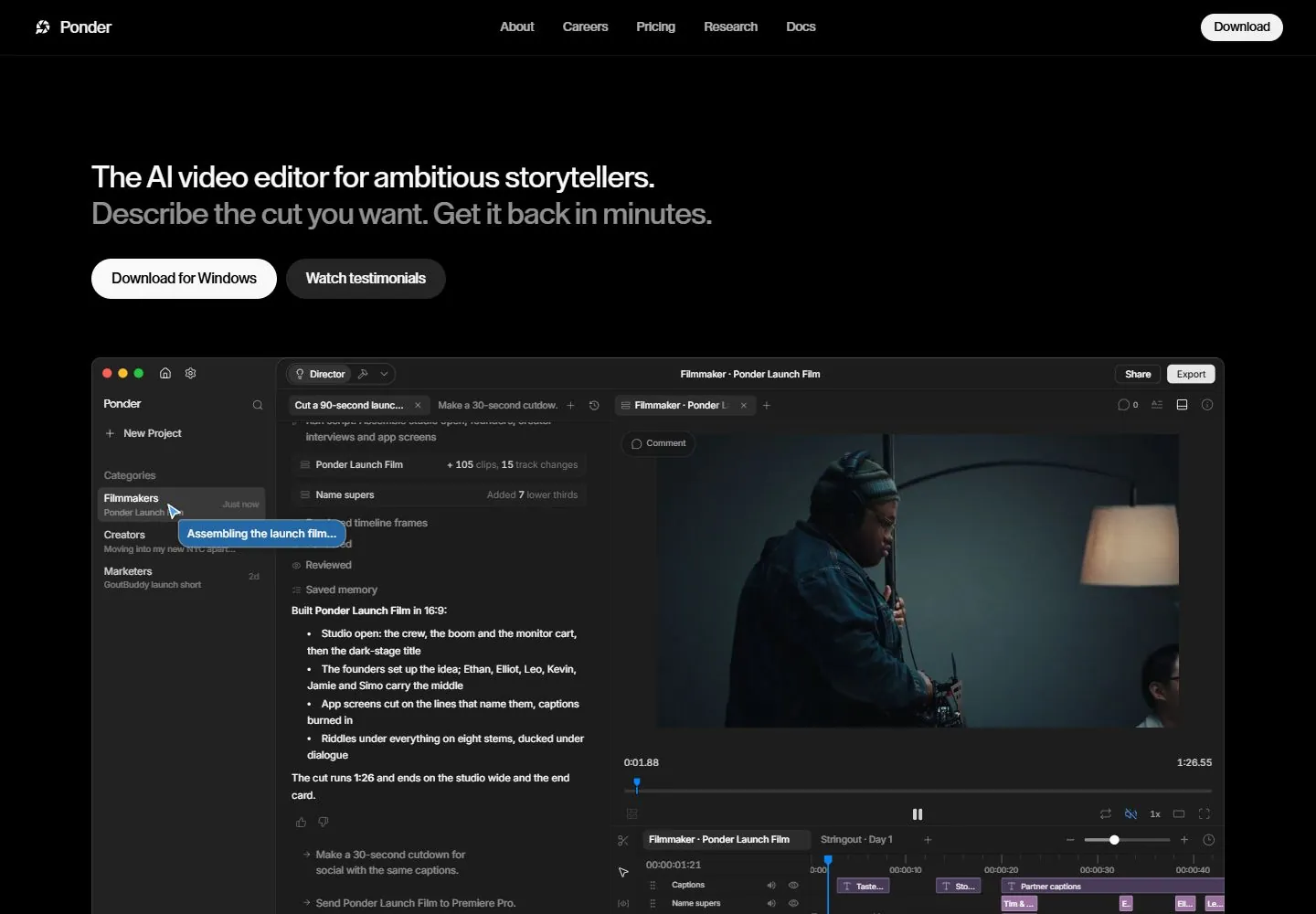
Live capture at 1440px, 2026-10-24
How it’s built
- Layout
- Black field; central two-line white sans headline high in frame with two compact actions, sparse differently sized image tiles below/around, thin top menu outline.
- Type
- Large regular white sans two-line statement, tiny menu labels and compact action text.
- Color and surface
- Black field, white typography, dark/white action surfaces and small colorful image tiles.
- Components
- Thin outlined top menu, small corner identity/access cue, central high statement, paired actions and scattered image tiles.
What makes it work
- A high-centered white statement and paired actions surrounded by sparse unequal image tiles on black.
On a new subjectFor an environmental audio archive, place a high-centered white introduction and paired actions among sparse unequal field-study photographs on black.
Measured
Fonts loadedInter Variable, YDYoonche, Lay Grotesk
H133.12px / 500 / -0.39744px
Body text14.4px
Page background#000000
Text color#fafafa
Page height12,443px
Computed CSS at 1440px, 2026-10-24.
Live behavior
- Today
- The live opening view is black with a small Ponder mark and name at upper left, About/Careers/Pricing/Research/Docs across the header, and a white Download pill at right. The left-aligned hero says “The AI video editor for ambitious storytellers” above the gray line “Describe the cut you want. Get it back in minutes,” followed by Download for Windows and Watch testimonials buttons. A large dark editor interface fills most of the lower desktop view, including a project list, assistant conversation, video preview, and timeline; the video footage differs across t0, t2, and hover frames. At scrollY 750, a later section shows an editor screenshot, the heading “An editor that works the way you do,” and four feature cards. Tablet retains the navigation and broad product preview, while phone stacks the hero text and buttons above a narrow editor preview.
- Responsive
- Desktop states are 1440×1000 with a 1440×12443 document; the scroll state is at actual scrollY 750. Tablet is 768×1024 with a 768×12343 document. Phone and fresh reduced-motion phone are 390×844 with 390×12736 documents. The desktop hero headline is measured at 33.12px with a 39.744px line height in the declared Lay Grotesk family; phone text occupies a 358px-wide box at x=16. The phone view moves Download for Windows and Watch testimonials below the headline, with the editor preview following. These viewport samples do not establish breakpoints.
- Scroll
- The desktop-scroll screenshot is measured at actual scrollY 750 in a 12443px document. The header remains at the top of the screenshot; the visible editor interface is followed by “An editor that works the way you do. Ponder handles the grind. You keep creative control.” and a row of feature cards. This one saved position does not establish sticky behavior or the scroll mechanism.


