
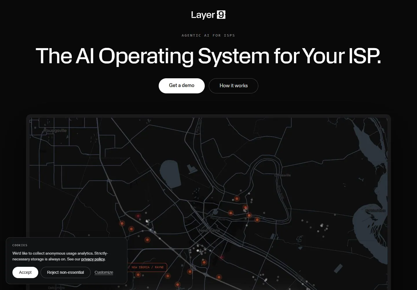
Live capture at 1440px, 2026-10-24
How it’s built
- Layout
- Centered headline and actions sit over a black field, with a layered emblem and small labels below.
- Type
- Large regular white sans headline, smaller gray supporting copy and labels.
- Color and surface
- Black surface, white and gray text, restrained orange and purple highlights.
- Components
- Centered mark, heading, two pills, list, layered emblem and logo tiles.
What makes it work
- Centered white text and paired actions above a glowing layered diagram on black.
On a new subjectFor a public transit project, place paired actions above a layered route diagram on black.
Prompts
Create a visual direction for {{website_name}} in {{industry}} for {{audience}}, shaping {{content}} and supporting {{functionality}}.
COMPOSITION INVARIANTS: Center a compact identity and eyebrow above a broad headline and paired actions; lead into one wide, framed technical visualization. Keep the page dark and let the visualization begin beneath the copy rather than compete with it. Preserve the observed visual hierarchy and spacing relationships, not the source-specific object inventory.
TYPE: Use a very large, plain sans headline and small tracked utility labels. Supporting copy should be moderate and brief; buttons are clear rounded forms with distinct primary/secondary weight. Set a readable scale step between display text, supporting copy, captions, and utilities. Do not name a font family.
SURFACE AND COMPONENTS: Use a near-black ground, soft charcoal framing, pale text, and limited muted signal colors within the visualization. Preserve readable separation between text and any dark graphic. Component roles: Centered header, small eyebrow, large title, two adjacent actions, wide framed visualization, and a secondary consent notice only where needed for the new site. Keep controls visually distinct and subordinate to the main content.
IMAGE DIRECTION: Select a subject-appropriate chart, map, model, or system view for {{content}}; no particular map or geography is required. Proportion estimate from the selected still: Visual estimate: headline spans around 85% width; map begins near 40% viewport height and takes about 60% visible area. Treat it as an estimate, not fixed CSS geometry.
VARIABLES: Adapt names, details, image subjects, palette accents, and working actions to {{website_name}}, {{industry}}, {{audience}}, {{content}}, and {{functionality}}.
PROHIBITIONS: Use original copy and assets. Do not reproduce the source brand, exact wording, photographs, illustrations, products, people, or signature artwork; source-specific objects and motifs are optional only when they genuinely fit the new subject.
CONTINUATION: Continue with explanatory sections that enlarge or annotate the same visual subject, maintaining the dark technical surface and concise labels.
RESPONSIVE PROPOSAL: Wrap the centered headline, stack actions with comfortable targets, and place a legible cropped visualization below. Move notices away from key controls. These are design proposals, not observed mobile behavior. The selected still does not establish source fonts, CSS, implementation technology, motion, or control behavior. Do not present any of those as observed. Implement requested {{functionality}} as working new behavior without implying source validation.
Implement a responsive page for {{website_name}} in {{industry}} for {{audience}}, presenting {{content}} and working {{functionality}}.
INVARIANTS: Center a compact identity and eyebrow above a broad headline and paired actions; lead into one wide, framed technical visualization. Keep the page dark and let the visualization begin beneath the copy rather than compete with it. Keep the same relative prominence and spacing without requiring the same source objects.
TYPE AND SURFACES: Use a very large, plain sans headline and small tracked utility labels. Supporting copy should be moderate and brief; buttons are clear rounded forms with distinct primary/secondary weight. Use a near-black ground, soft charcoal framing, pale text, and limited muted signal colors within the visualization. Preserve readable separation between text and any dark graphic. Maintain clear display/body/utility scale, readable line lengths, and sufficient contrast. Components: Centered header, small eyebrow, large title, two adjacent actions, wide framed visualization, and a secondary consent notice only where needed for the new site.
IMAGERY AND SCALE: Select a subject-appropriate chart, map, model, or system view for {{content}}; no particular map or geography is required. Visual estimate only: Visual estimate: headline spans around 85% width; map begins near 40% viewport height and takes about 60% visible area. Use flexible widths and content-led dimensions; do not copy this screenshot's coordinates as fixed values.
VARIABLES: Adapt names, details, image subjects, palette accents, and working actions to {{website_name}}, {{industry}}, {{audience}}, {{content}}, and {{functionality}}.
PROHIBITIONS: Use original copy and assets. Do not reproduce the source brand, exact wording, photographs, illustrations, products, people, or signature artwork; source-specific objects and motifs are optional only when they genuinely fit the new subject.
CONTINUATION: Continue with explanatory sections that enlarge or annotate the same visual subject, maintaining the dark technical surface and concise labels.
RESPONSIVE PROPOSAL: Wrap the centered headline, stack actions with comfortable targets, and place a legible cropped visualization below. Move notices away from key controls. Use semantic content, keyboard-operable controls, visible focus, meaningful alt text, and no clipped content. The selected still does not establish source fonts, CSS, implementation technology, motion, or control behavior. Do not present any of those as observed. Implement requested {{functionality}} as working new behavior without implying source validation.
Measured
Fonts loadedhead, body, body Fallback
H174.88px / 350 / -1.4976px
Body text14px
Page background#090909
Text color#ffffff
Page height7,985px
Computed CSS at 1440px, 2026-10-24.
Live behavior
- Today
- Layer9 saved desktop uses near-black with a centered compact identity, tracked monospace-looking overline, large light-weight white sans statement and paired white/outline pills. A wide dark rounded demonstration panel below pairs a map with an orange-accented risk dashboard, then a dashboard/spreadsheet view. Small mono labels, thin borders, fine charts and bright orange/red indicators make the lower panel dense against the sparse hero. Consent panel overlays bottom-left content.
- Responsive
- At768px the heading wraps into two lines, action pills remain horizontal and the two-pane demonstration scales into the available width. At390px heading wraps into three lines at the same46px size as tablet, actions stack and the wide dashboard is replaced by a phone-framed demonstration. Consent grows relative to viewport, actions wrap and much of phone content is masked. Exact switch breakpoint and unobstructed mobile demonstration unknown.
- Scroll
- Actual desktop scroll750px in7985px document moves the demo top out of view, leaves its prompt input/footer visible and reveals the next centered two-line heading with tracked section marker and icon row. Consent stays lower left masking supporting copy. The scene demonstrates a progression sequence, not a proven user-submitted query or generated spreadsheet.


