
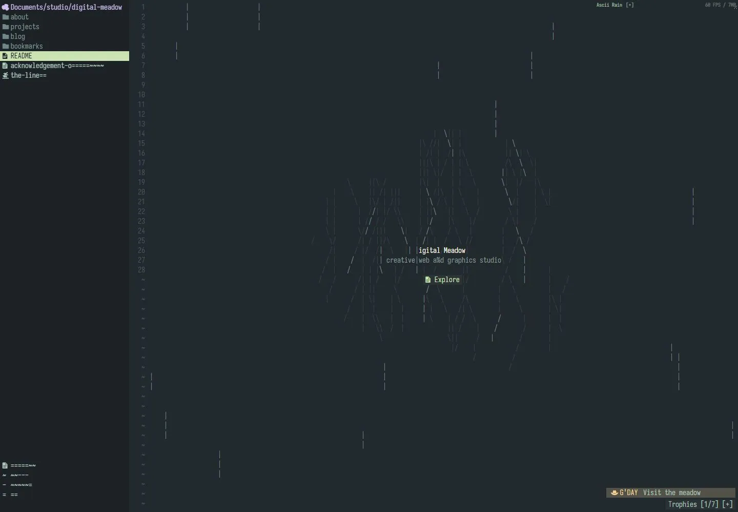
Live capture at 1440px, 2026-10-24
How it’s built
- Layout
- Warm pale field with sparse fine vertical marks; delicate grass forms and small colored dots rise from the bottom and surround tiny centered copy.
- Type
- Tiny narrow typewriter-like text with selective pink/orange words and a small upper identity.
- Color and surface
- Cream background, fine dark botanical lines, muted green, blue, pink and orange accents.
- Components
- Top identity, tiny central statement and botanical illustration along the lower edge.
What makes it work
- Tiny centered copy and delicate botanical line work in a broad warm empty field.
On a new subjectFor an astronomy notebook, place tiny centered text among delicate orbital line drawings and restrained colored points on cream.
Prompts
Create a visual direction for {{website_name}} in {{industry}} for {{audience}}, shaping {{content}} and supporting {{functionality}}.
COMPOSITION INVARIANTS: Treat the page like an expansive text workspace: a narrow directory-like rail and line index define the left edge, while sparse marks and one small identity/action sit in a large quiet field. Keep large areas of open space. Preserve the observed visual hierarchy and spacing relationships, not the source-specific object inventory.
TYPE: Use tiny monospaced-style interface labels and numerals, with the central identity only modestly brighter or larger. Maintain readable contrast without adding a promotional display headline. Set a readable scale step between display text, supporting copy, captions, and utilities. Do not name a font family.
SURFACE AND COMPONENTS: Use deep charcoal with a subtle green-blue cast, subdued gray marks, and one pale selection accent. Avoid bright fields or ornamental gradients. Component roles: Left navigation rail, line/index gutter, sparse content marks, central identity and action, and a few peripheral status labels. Keep controls visually distinct and subordinate to the main content.
IMAGE DIRECTION: Use abstract glyphs, data fragments, or content-specific notation; do not reproduce the source folder names or exact character pattern. Proportion estimate from the selected still: Visual estimate: left rail about 18% width; identity at visual center; remaining field mostly empty. Treat it as an estimate, not fixed CSS geometry.
VARIABLES: Adapt names, details, image subjects, palette accents, and working actions to {{website_name}}, {{industry}}, {{audience}}, {{content}}, and {{functionality}}.
PROHIBITIONS: Use original copy and assets. Do not reproduce the source brand, exact wording, photographs, illustrations, products, people, or signature artwork; source-specific objects and motifs are optional only when they genuinely fit the new subject.
CONTINUATION: Continue with a simple workspace/content view that preserves the rail and open field without adding dense decorative panels.
RESPONSIVE PROPOSAL: Collapse the rail into a compact menu or top selector; keep the identity centered and simplify surrounding marks to avoid clutter on a small screen. These are design proposals, not observed mobile behavior. The selected still does not establish source fonts, CSS, implementation technology, motion, or control behavior. Do not present any of those as observed. Implement requested {{functionality}} as working new behavior without implying source validation.
Implement a responsive page for {{website_name}} in {{industry}} for {{audience}}, presenting {{content}} and working {{functionality}}.
INVARIANTS: Treat the page like an expansive text workspace: a narrow directory-like rail and line index define the left edge, while sparse marks and one small identity/action sit in a large quiet field. Keep large areas of open space. Keep the same relative prominence and spacing without requiring the same source objects.
TYPE AND SURFACES: Use tiny monospaced-style interface labels and numerals, with the central identity only modestly brighter or larger. Maintain readable contrast without adding a promotional display headline. Use deep charcoal with a subtle green-blue cast, subdued gray marks, and one pale selection accent. Avoid bright fields or ornamental gradients. Maintain clear display/body/utility scale, readable line lengths, and sufficient contrast. Components: Left navigation rail, line/index gutter, sparse content marks, central identity and action, and a few peripheral status labels.
IMAGERY AND SCALE: Use abstract glyphs, data fragments, or content-specific notation; do not reproduce the source folder names or exact character pattern. Visual estimate only: Visual estimate: left rail about 18% width; identity at visual center; remaining field mostly empty. Use flexible widths and content-led dimensions; do not copy this screenshot's coordinates as fixed values.
VARIABLES: Adapt names, details, image subjects, palette accents, and working actions to {{website_name}}, {{industry}}, {{audience}}, {{content}}, and {{functionality}}.
PROHIBITIONS: Use original copy and assets. Do not reproduce the source brand, exact wording, photographs, illustrations, products, people, or signature artwork; source-specific objects and motifs are optional only when they genuinely fit the new subject.
CONTINUATION: Continue with a simple workspace/content view that preserves the rail and open field without adding dense decorative panels.
RESPONSIVE PROPOSAL: Collapse the rail into a compact menu or top selector; keep the identity centered and simplify surrounding marks to avoid clutter on a small screen. Use semantic content, keyboard-operable controls, visible focus, meaningful alt text, and no clipped content. The selected still does not establish source fonts, CSS, implementation technology, motion, or control behavior. Do not present any of those as observed. Implement requested {{functionality}} as working new behavior without implying source validation.
Measured
Fonts loadedIosevka Term NF, IosevkaTermNF
H114px / 400
Body text14px
Page background#1c2225
Text color#f8f9e8
Page height1,010px
Computed CSS at 1440px, 2026-10-24.
Live behavior
- Today
- Digital Meadow is captured as a dark editor-like environment with a fixed file-tree sidebar, line numbers, compact monospaced labels and a large ASCII-like rain/figure field. Small central identity, descriptor and Explore cue sit within the graphic; tiny utility labels occupy upper and lower right. The selected README row is pale green. Tablet/mobile hide the file-tree column off-screen and expose a small Menu label at upper right, allowing the central text/character field to fill the width. Individual characters, figure arrangement and vertical streaks change across frames.
- Responsive
- Desktop uses a252px sidebar beside the1188px remaining column. At768px and390px the sidebar rectangle has x-252 and right0, with a Menu control visible instead; it is not painted despite appearing in sampled DOM lists. Central identity and Explore remain while the character artwork reflows. The off-screen menu was not opened.
- Scroll
- The desktop document measures1010px at a1000px viewport; the requested scroll reaches only10px. The main editor-like scene remains; no separate content section was exposed. This is a small actual scroll, not a750px progression.


