
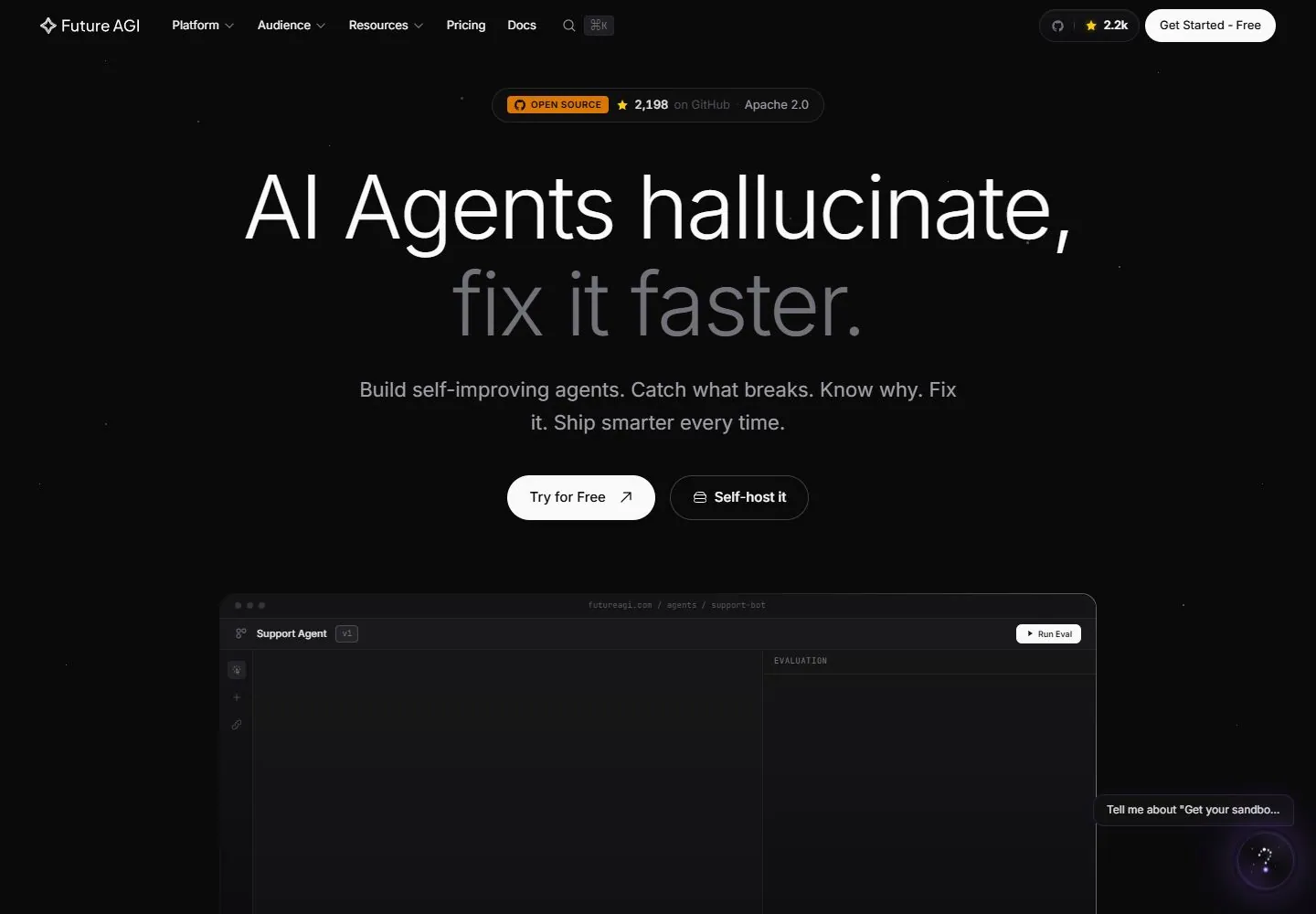
Live capture at 1440px, 2026-10-24
How it’s built
- Layout
- Near-black field; centered very large regular white first line and gray second line, small orange status badge, paired white/outline pills, cropped dark dashboard below.
- Type
- Large regular sans heading, white first line and subdued gray second line; compact sans utilities and support.
- Color and surface
- Near-black page, white primary type and action, muted gray support, a small orange badge and restrained thin dark borders.
- Components
- Thin header, compact status capsule, centered statement, paired solid/outline pills and a broad dark dashboard illustration.
What makes it work
- Two-tone regular centered statement and small capsule cues over a near-black field, followed by a dark interface preview.
On a new subjectFor a public transit archive, use a two-tone central statement, compact service-status capsule, paired actions and a dark route-map preview.
Measured
Fonts loadedInter
H196px / 300 / -2.4px
Body text16px
Page background#0a0a0a
Text color#fafafa
Page height15,569px
Computed CSS at 1440px, 2026-10-24.
Live behavior
- Today
- Current desktop capture is a dark Future AGI marketing page. Compact brand/navigation and account actions span the top; an open-source badge, very large centered two-line headline, supporting copy, and two pill actions form the hero. A dark product-demo panel begins below the hero. At tablet, navigation collapses to brand and menu and a prominent eBook lead form covers the central hero. The mobile capture is also dominated by this lead-form overlay, which becomes a tall vertical panel with artwork above form fields and a close control; the reduced-motion fresh-load instead shows the underlying hero without that panel. Desktop-scroll at scrollY=750 shows the demo's lower controls, then a second centered heading and supporting copy. The modal's differing presence between separate mobile captures is recorded, but not attributed to reduced motion.
- Responsive
- Captured at 1440×1000, 768×1024, and 390×844. Desktop uses a full navigation row, centered hero text/actions, and a wide product-demo panel. Tablet/mobile replace desktop navigation with a menu control and reflow the hero and product demo vertically. In the normal tablet/mobile saved states, an eBook overlay obscures much of the page; the reduced-motion fresh-load capture shows the hero instead. These snapshots do not isolate the cause of that difference.
- Scroll
- Desktop-scroll is a successful capture at scrollY=750 in a 1440×1000 viewport. It shows the lower portion of the product-demo panel, a centered 'Powering teams from prototype to production' heading and supporting line, and the beginning of a customer proof/logo area. The sampled document height is 15569px. No navigation or CTA was activated.


