
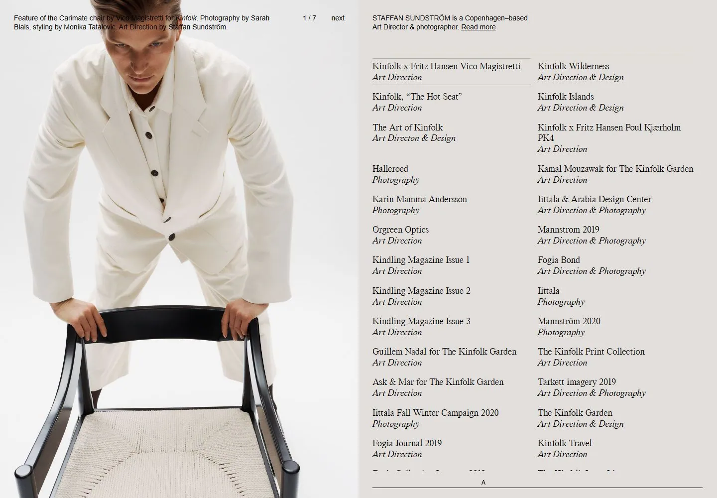
Live capture at 1440px, 2026-10-24
How it’s built
- Layout
- Two-panel portfolio page. Left half is a large cropped fashion portrait on a pale neutral ground with small project caption and 1/6 plus next controls along its top. Right half is a pale yellow project index: short bio at top, then two text columns of project names and italic disciplines, separated by generous vertical spacing; a thin rule closes the lower edge.
- Type
- Compact sans caption at top left; right column combines serif project titles with italic serif discipline labels. Small uppercase/slash metadata and pagination controls use sans. Exact families not established.
- Color and surface
- Off-white portrait side contrasts with pale yellow index field. Dark text and hairline dividers; no cards or shadows.
- Components
- Large editorial portrait, project caption, carousel pagination/next label, short biography, two-column project list with role labels, thin footer rule.
What makes it work
- Large image field
- Separate project index field
- Small project identification
- Editorial listing hierarchy
On a new subjectPair one representative image with a structured list of works or categories. Preserve the clear division between visual proof and text index, replacing project content and palette.
Prompts
Create an original visual direction for {{website_name}} in {{industry}}, for {{audience}}, presenting {{content}} and supporting {{functionality}}. Composition invariant: Balance one large vertically cropped relevant image on the left with a separately colored text/index field on the right. Let a short introduction lead a dense two-column list separated by fine rules; keep credits small at the image edge. Typography: Use an expressive readable serif for list titles and a quieter italic or weight change for subordinate labels; keep bio and credits small sans. Palette and contrast: Separate image and index with distinct light tones, dark type and fine understated rules; choose the two fields' hues for the target content. Image and component hierarchy: Choose an appropriate visual for {{content}} instead of requiring a person or portrait; use a subject-specific index/list with concise detail labels. Visual estimate from the supplied reference, not measured CSS: Visual estimate: photo/index each occupy about half width; photo nearly full height; dense project list fills right. Scale the relationships to the target content and viewport. Variables: replace source identity, wording, industry-specific objects, people, imagery, exact colors and controls with original material for {{website_name}}, {{industry}}, {{audience}}, {{content}} and {{functionality}}. Retain only the composition and hierarchy described above. No source logo, product, person, artwork or exact phrase is a required asset. Do not infer typeface, framework, CSS values, motion or tested behavior from a static image. Continue the visual system using relevant content sections, keeping the same relative spacing and contrast without adding generic cards or decoration where none are described. Place the image, intro and list in sequence; collapse list columns while retaining title/detail grouping and comfortable line lengths.
Implement a responsive page for {{website_name}} in {{industry}} for {{audience}}, with real {{content}} and working {{functionality}}. Wide-screen structure: Balance one large vertically cropped relevant image on the left with a separately colored text/index field on the right. Let a short introduction lead a dense two-column list separated by fine rules; keep credits small at the image edge. Type hierarchy: Use an expressive readable serif for list titles and a quieter italic or weight change for subordinate labels; keep bio and credits small sans. Surface treatment: Separate image and index with distinct light tones, dark type and fine understated rules; choose the two fields' hues for the target content. Component and image roles: Choose an appropriate visual for {{content}} instead of requiring a person or portrait; use a subject-specific index/list with concise detail labels. Visual estimate from the supplied reference, not measured CSS: Visual estimate: photo/index each occupy about half width; photo nearly full height; dense project list fills right. Scale the relationships to the target content and viewport. Variables: replace source identity, wording, industry-specific objects, people, imagery, exact colors and controls with original material for {{website_name}}, {{industry}}, {{audience}}, {{content}} and {{functionality}}. Retain only the composition and hierarchy described above. No source logo, product, person, artwork or exact phrase is a required asset. Do not infer typeface, framework, CSS values, motion or tested behavior from a static image. Continue the visual system using relevant content sections, keeping the same relative spacing and contrast without adding generic cards or decoration where none are described. Place the image, intro and list in sequence; collapse list columns while retaining title/detail grouping and comfortable line lengths. Use semantic content and meaningful image descriptions. Keep each label with its image or list item, and make any new controls named, keyboard-operable and visibly focused. Implement requested functionality as new working behavior; the static reference does not verify source controls.
Measured
Fonts loadedwt-kormelink
H217.5px / 400
Body text14px
Page backgroundtransparent
Text color#000000
Page height1,000px
Computed CSS at 1440px, 2026-10-24.


