
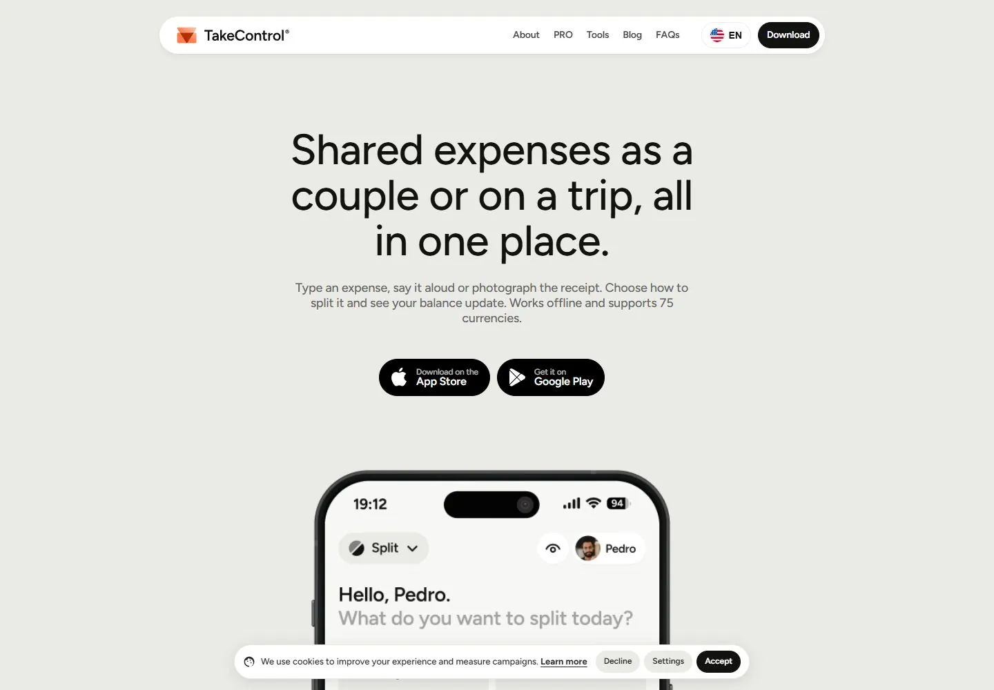
Live capture at 1440px, 2026-10-24
How it’s built
- Layout
- A pale gray background holds a centered narrow header capsule with logo, language control and download action. Below a small award badge, a large centered three-line heading and supporting paragraph form a compact text stack, followed by two dark rounded platform buttons. The top of a phone mockup enters from the bottom edge, leaving generous space between CTA and product preview.
- Type
- Large black sans-serif heading centered over smaller gray supporting copy. The wordmark is bold and compact; the award badge and platform labels are much smaller. Exact font metrics are unknown from this gallery image.
- Color and surface
- Light cool-gray page, white header capsule, black headline and pill buttons, muted gray copy, and a small warm orange logo mark. Phone frame is black. Surfaces are softly separated by subtle shadows and rounded corners.
- Components
- Floating header capsule, award marker, centered value proposition and description, two platform CTAs, and partially visible phone preview.
What makes it work
- Centered concise value proposition
- Supporting explanation directly below
- Prominent platform actions
- Product preview following the hero
On a new subjectIntroduce a tool with a centered benefit and short explanation, make the next action obvious, then show the product interface below. Replace expense-management language and marks with details for an unrelated tool or service.
Prompts
Create a visual direction for {{website_name}} in {{industry}} for {{audience}}, shaping {{content}} and supporting {{functionality}}.
COMPOSITION INVARIANTS: Center a compact identity bar, small proof label, headline, supporting text, and a compact action group. Let a large product proof image emerge from the lower area, but choose its form to suit the actual product rather than forcing a phone. Preserve the observed visual hierarchy and spacing relationships, not the source-specific object inventory.
TYPE: Use a bold centered sans headline, small secondary proof/caption, gray body text, and rounded dark actions. Make the size difference between headline and utility labels clear. Set a readable scale step between display text, supporting copy, captions, and utilities. Do not name a font family.
SURFACE AND COMPONENTS: Use a pale neutral page, dark text, white/elevated header, and dark high-contrast actions. Keep shadows soft and the proof image crisp. Component roles: Floating compact header, optional credential/proof marker, headline, short description, action group, and large product preview below. Keep controls visually distinct and subordinate to the main content.
IMAGE DIRECTION: Use a phone only when {{content}} is a mobile application; otherwise choose a product, service, or interface artifact that proves the value. Proportion estimate from the selected still: Visual estimate: phone about 35% width rising from bottom; headline about 40% width in upper middle. Treat it as an estimate, not fixed CSS geometry.
VARIABLES: Adapt names, details, image subjects, palette accents, and working actions to {{website_name}}, {{industry}}, {{audience}}, {{content}}, and {{functionality}}.
PROHIBITIONS: Use original copy and assets. Do not reproduce the source brand, exact wording, photographs, illustrations, products, people, or signature artwork; source-specific objects and motifs are optional only when they genuinely fit the new subject.
CONTINUATION: Continue with a direct explanation of the product evidence, retaining the open background and concise action language.
RESPONSIVE PROPOSAL: Reduce headline width, keep the header controls from colliding, and move the proof artifact beneath the actions with a deliberate crop. These are design proposals, not observed mobile behavior. The selected still does not establish source fonts, CSS, implementation technology, motion, or control behavior. Do not present any of those as observed. Implement requested {{functionality}} as working new behavior without implying source validation.
Implement a responsive page for {{website_name}} in {{industry}} for {{audience}}, presenting {{content}} and working {{functionality}}.
INVARIANTS: Center a compact identity bar, small proof label, headline, supporting text, and a compact action group. Let a large product proof image emerge from the lower area, but choose its form to suit the actual product rather than forcing a phone. Keep the same relative prominence and spacing without requiring the same source objects.
TYPE AND SURFACES: Use a bold centered sans headline, small secondary proof/caption, gray body text, and rounded dark actions. Make the size difference between headline and utility labels clear. Use a pale neutral page, dark text, white/elevated header, and dark high-contrast actions. Keep shadows soft and the proof image crisp. Maintain clear display/body/utility scale, readable line lengths, and sufficient contrast. Components: Floating compact header, optional credential/proof marker, headline, short description, action group, and large product preview below.
IMAGERY AND SCALE: Use a phone only when {{content}} is a mobile application; otherwise choose a product, service, or interface artifact that proves the value. Visual estimate only: Visual estimate: phone about 35% width rising from bottom; headline about 40% width in upper middle. Use flexible widths and content-led dimensions; do not copy this screenshot's coordinates as fixed values.
VARIABLES: Adapt names, details, image subjects, palette accents, and working actions to {{website_name}}, {{industry}}, {{audience}}, {{content}}, and {{functionality}}.
PROHIBITIONS: Use original copy and assets. Do not reproduce the source brand, exact wording, photographs, illustrations, products, people, or signature artwork; source-specific objects and motifs are optional only when they genuinely fit the new subject.
CONTINUATION: Continue with a direct explanation of the product evidence, retaining the open background and concise action language.
RESPONSIVE PROPOSAL: Reduce headline width, keep the header controls from colliding, and move the proof artifact beneath the actions with a deliberate crop. Use semantic content, keyboard-operable controls, visible focus, meaningful alt text, and no clipped content. The selected still does not establish source fonts, CSS, implementation technology, motion, or control behavior. Do not present any of those as observed. Implement requested {{functionality}} as working new behavior without implying source validation.
Measured
Fonts loadedFigtree
H162px / 500 / -0.62px
Body text16px
Page background#eaeae7
Text color#121211
Page height9,765px
Computed CSS at 1440px, 2026-10-24.


