
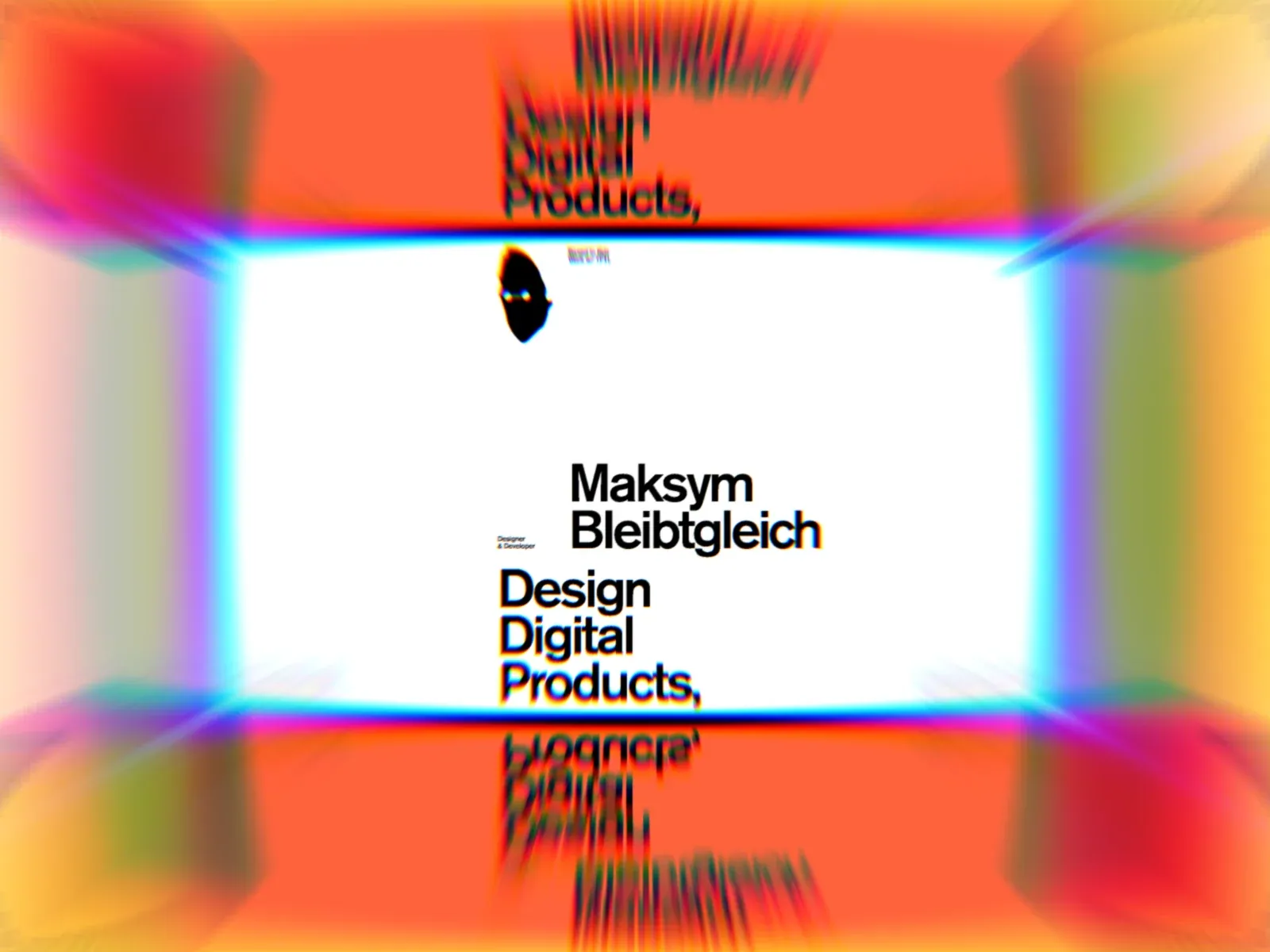
Gallery screenshot, saved 2026-10-24
How it’s built
- Layout
- A wide white central horizontal field carries a small dark mark near its upper center, a centered identity and stacked role lines. Vivid orange-red surrounds the field; rainbow cyan/magenta/green chromatic fringes and radial blur distort its edges, and vertically reflected, distorted echoes continue above and below. This is one static capture; optical treatment is visible but its animation or transition role is unconfirmed.
- Type
- Centered black sans identity and stacked discipline labels on the white field; colored aberration visibly fringes the letter edges. Small upper mark. Exact metrics unknown.
- Color and surface
- White central field; vivid orange-red surround and multicolor chromatic edge distortion; black type.
- Components
- Wide white identity field, small subordinate mark, centered identity and stacked discipline text, vivid orange-red surround, chromatic/radial edge distortion and vertically reflected echoes.
What makes it work
- Wide bright central text field with centered identity and stacked role/disciplines.
- Strong chromatic/radial distortion frames the field.
- Distorted reflected echoes repeat vertically above and below the center.
On a new subjectFor an unrelated public-library digital archive, center a new identity and a short stacked set of services on a wide white field, surrounded by an original chromatic/radial distortion with mirrored vertical echoes above and below. Adapt the colors and wording, but preserve the optical treatment; do not imply motion.
Live behavior
- Today
- Maksym Bleibtgleich’s current portfolio uses a white canvas with a black face-shaped mark, small role/location copy and a black Menu pill around extremely large, staggered black words: “Maksym Bleibtgleich,” “Design Digital Products,” then “UX/UI & Web-flow dev.” A thin vertical divider separates parts of the composition; pale gray “bleibt/gleich” words sit near the side edges. At desktop the eight-column track list is sampled as 162px columns with 16px gaps. The selected gallery reference is a separate, color-fringed zoom composition around the portfolio screen, not a clean current-page measurement.
- Responsive
- At 1440×1000 the top composition begins x=16,y=16 with a 1408px grid and sampled 162px columns/16px gaps; desktop display words measure 90px/500 in the raw CSS samples. Tablet (768×1024) retains a six-track arrangement of about 98px columns with 23.45px gaps and 87.94px display type. Phone (390×844) samples six tracks of about 49.78px with 11.91px gaps and 44.66px display type. Header text and portfolio roles reposition around these grids. Captures establish only these widths.
- Scroll
- The desktop-scroll state records actual scrollY=750 in a 1440×6807 document. It shows the continuing large type, including “Designs and builds websites, products, and digital systems with a focus on clarity, performance, and usability,” alongside small image tiles. This describes the sampled position only.


