
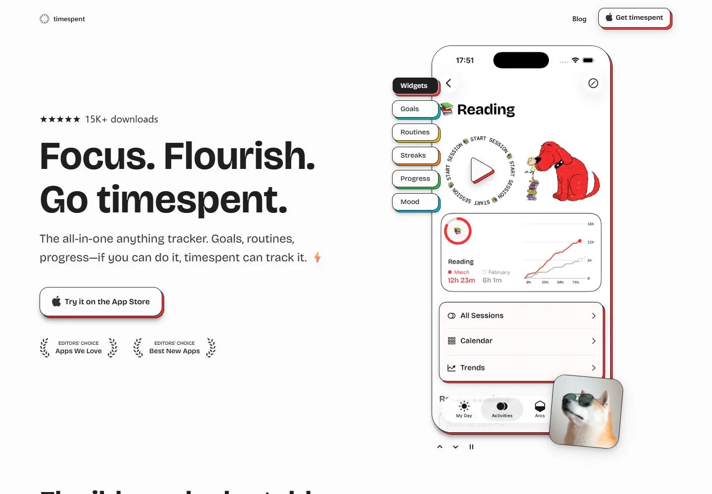
Live capture at 1440px, 2026-10-24
How it’s built
- Layout
- Bright white product page with small brand top left, Discord and outlined Get timespent action at right. Left column has rating/download proof, very large two-line headline, short descriptive copy, App Store CTA and two award badges. Right side is dominated by a tall phone mockup showing app screens, with overlapping labeled tabs/buttons.
- Type
- Bold black sans display and support, compact bold utility labels. High scale contrast between headline and header. Phone UI uses small text and chart labels.
- Color and surface
- White ground, black type, pale gray text, rounded white/outlined controls with colored red/yellow/green edge accents; phone UI includes restrained red and blue chart colors.
- Components
- Brand, Discord/get-app links, rating/download count, headline, description, store CTA, award marks, large phone mockup and floating feature tabs.
What makes it work
- Large device preview
- Clear proposition and support
- Direct acquisition action
- Visible credibility proof
On a new subjectPair a relevant product demonstration with concise explanatory copy and a clear next action. Use proof points only when they are real for the unrelated product.
Prompts
Create a visual direction for {{website_name}} in {{industry}} for {{audience}}, shaping {{content}} and supporting {{functionality}}.
COMPOSITION INVARIANTS: Balance a left column of headline, concise explanation, proof and primary action against a tall detailed product preview on the right. Attach a few small capability labels to the preview without covering its key content. Preserve the observed visual hierarchy and spacing relationships, not the source-specific object inventory.
TYPE: Use a heavy sans headline, medium body copy, compact preview labels and quiet proof captions. Keep the primary action more prominent than awards or secondary links. Set a readable scale step between display text, supporting copy, captions, and utilities. Do not name a font family.
SURFACE AND COMPONENTS: Use white space and black/gray typography; subtle colored edge accents may frame the preview but should not become the main color field. Component roles: Compact top identity, left pitch/proof/action stack, tall preview, optional attached capability chips and a small credibility row. Keep controls visually distinct and subordinate to the main content.
IMAGE DIRECTION: Choose a vertical product image or interface useful for {{content}}; do not require a phone, tracker, awards, or specific illustration. Proportion estimate from the selected still: Visual estimate: copy column about 52% width; phone about 30%; top utility under 8% height. Treat it as an estimate, not fixed CSS geometry.
VARIABLES: Adapt names, details, image subjects, palette accents, and working actions to {{website_name}}, {{industry}}, {{audience}}, {{content}}, and {{functionality}}.
PROHIBITIONS: Use original copy and assets. Do not reproduce the source brand, exact wording, photographs, illustrations, products, people, or signature artwork; source-specific objects and motifs are optional only when they genuinely fit the new subject.
CONTINUATION: Continue with related feature details, each paired with a meaningful crop from the same product or content set.
RESPONSIVE PROPOSAL: Place the preview after the message at phone width; turn attached chips into a short list below it and retain a visible primary action. These are design proposals, not observed mobile behavior. The selected still does not establish source fonts, CSS, implementation technology, motion, or control behavior. Do not present any of those as observed. Implement requested {{functionality}} as working new behavior without implying source validation.
Implement a responsive page for {{website_name}} in {{industry}} for {{audience}}, presenting {{content}} and working {{functionality}}.
INVARIANTS: Balance a left column of headline, concise explanation, proof and primary action against a tall detailed product preview on the right. Attach a few small capability labels to the preview without covering its key content. Keep the same relative prominence and spacing without requiring the same source objects.
TYPE AND SURFACES: Use a heavy sans headline, medium body copy, compact preview labels and quiet proof captions. Keep the primary action more prominent than awards or secondary links. Use white space and black/gray typography; subtle colored edge accents may frame the preview but should not become the main color field. Maintain clear display/body/utility scale, readable line lengths, and sufficient contrast. Components: Compact top identity, left pitch/proof/action stack, tall preview, optional attached capability chips and a small credibility row.
IMAGERY AND SCALE: Choose a vertical product image or interface useful for {{content}}; do not require a phone, tracker, awards, or specific illustration. Visual estimate only: Visual estimate: copy column about 52% width; phone about 30%; top utility under 8% height. Use flexible widths and content-led dimensions; do not copy this screenshot's coordinates as fixed values.
VARIABLES: Adapt names, details, image subjects, palette accents, and working actions to {{website_name}}, {{industry}}, {{audience}}, {{content}}, and {{functionality}}.
PROHIBITIONS: Use original copy and assets. Do not reproduce the source brand, exact wording, photographs, illustrations, products, people, or signature artwork; source-specific objects and motifs are optional only when they genuinely fit the new subject.
CONTINUATION: Continue with related feature details, each paired with a meaningful crop from the same product or content set.
RESPONSIVE PROPOSAL: Place the preview after the message at phone width; turn attached chips into a short list below it and retain a visible primary action. Use semantic content, keyboard-operable controls, visible focus, meaningful alt text, and no clipped content. The selected still does not establish source fonts, CSS, implementation technology, motion, or control behavior. Do not present any of those as observed. Implement requested {{functionality}} as working new behavior without implying source validation.
Measured
Fonts loadedBricolage Grotesque
H180px / 700
Body text14px
Page background#fcfcfc
Text color#1f1f1f
Page height4,339px
Computed CSS at 1440px, 2026-10-24.
Live behavior
- Today
- The Timespent landing page uses a white canvas, compact logo and upper-right Blog/App Store controls around a large “Focus. Flourish. Go timespent.” headline, short tracker description and App Store action. The right side of the desktop frame contains a phone mockup with layered feature tabs and a small dog image. The selected gallery reference shows a different phone content frame and alternate header action.
- Responsive
- Desktop is 1440×1000 with a 4339px document; tablet is 768×1024 with a 4347px document; ordinary and fresh reduced-motion phones are 390×844 with 4554px documents. At tablet and phone widths, the headline, description, download button and awards stack above the phone mockup. The saved frames show different app screens and small decorative emoji; these sampled widths do not establish breakpoints or explain the changes.
- Scroll
- The desktop-scroll state records actual scrollY=750 in a 4339px document and shows “Flexible, adaptable, for a life without limits.” above colored feature cards for habits, workouts, focus/study and supplements. This is evidence for the saved position only.


