
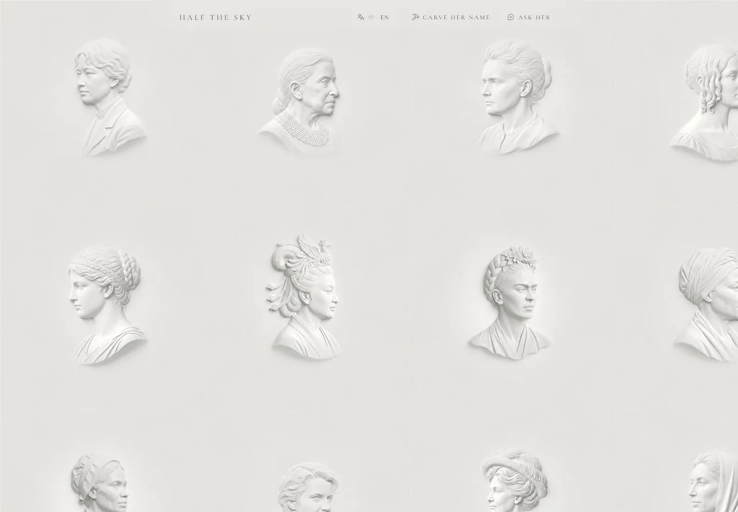
Live capture at 1440px, 2026-10-24
How it’s built
- Layout
- An off-white bounded collection panel has a tiny centered tracked identity/navigation strip above a very faint four-column, two-row grid. Each spacious cell contains a small white sculptural portrait relief with soft gray depth and abundant surrounding space; no large title or descriptions are visible in this crop. Exterior painted brown/gold texture is gallery framing.
- Type
- Very small widely tracked serif-like capitals in the centered header, with tiny line symbols/utility text. The portrait grid carries almost all attention rather than headline copy.
- Color and surface
- Extremely restrained ivory/white/gray palette, nearly invisible grid hairlines, low-relief white portraits and soft directional gray shading. No colored card fills.
- Components
- Tiny centered identity/utility strip and spacious repeated sculptural portrait cells.
What makes it work
- Near-monochrome pale field
- Spacious equal-cell grid with faint hairlines
- Small white sculptural relief forms and soft depth shading
- Tiny restrained centered header
On a new subjectFor a ceramic-materials testing service, present original white relief studies of material samples in spacious faintly ruled cells on ivory, using soft directional gray shading and no colored card fills. Keep the header tiny and centered with tracked labels. Replace memorial portraits and copy while retaining low-contrast sculptural form and grid relationships; do not reproduce the exterior painting or infer interactions.
Measured
Fonts loadedCormorant Garamond
H115px / 500 / 3.6px
Body text16px
Page background#dddcd7
Text color#000000
Page height1,000px
Computed CSS at 1440px, 2026-10-24.
Live behavior
- Today
- Nearly monochrome warm plaster-like field divided by extremely faint square rules. White sculptural portrait reliefs occupy the center of large tiles, with delicate shadow, pale highlights and generous empty ground. A tiny widely tracked serif identity and sparse language/action utilities sit across the top. There is no large marketing heading competing with the portraits; the image grid supplies almost all visual weight.
- Responsive
- Desktop shows about three complete400px-wide tile columns plus a cut fourth; tablet about two and phone roughly one, with the field cropped at viewport edges. These pitches are screenshot estimates, not a captured CSS grid declaration. Ordinary phone retains portrait IMG bounds315.21x315.21px near41.895,25.935, similar to desktop. Fresh preference phone instead shows denser roughly220px tiles and corresponding portrait IMG bounds173.01x173.01px near22.995,14.235. Header changes from880x71px centered region to390x59px, with13px identity and compact icon-only action buttons on phone. The dense fresh grid cannot be prescribed as a tested responsive/preference rule.
- Scroll
- The desktop-scroll attempt stays at actual scrollY0 and document1440x1000. The grid/header arrangement and sampled portrait geometry remain unchanged, although the saved JPEG differs slightly from t2. This does not establish a pan, infinite-grid navigation or content progression. All artwork outside the viewport remains unobserved.


