
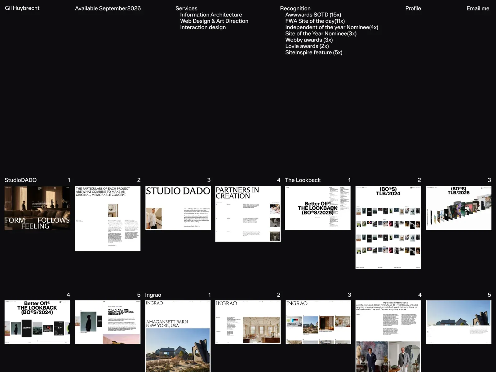
Gallery screenshot, saved 2026-10-24
How it’s built
- Layout
- A near-black page has a compact top band with identity, availability, service, awards, profile and email information in aligned screen columns. A substantial empty black interval separates it from a dense lower project index. Group titles and numbers sit above thumbnail/text entries that occupy equal-width screen columns, while individual entries have differing heights and image aspect ratios. Further rows are cut off at the bottom.
- Type
- Compact white sans metadata in the top band; small group headings, numbers and project labels below. No dominant display headline. Exact metrics unknown.
- Color and surface
- Black background with white text and mixed project image colors, including pale editorial screens and photographs.
- Components
- Top multi-column identity/services/contact band, large black vertical interval, grouped numbered project index with equal-width columns of mixed-height thumbnail/text entries; lower rows continue beyond crop.
What makes it work
- Compact multi-column identity/services/contact metadata at the top.
- Substantial dark interval separates metadata from work samples.
- Grouped, numbered project entries form a dense lower index in equal-width columns with varied item heights.
On a new subjectFor an unrelated public-health evidence archive, place compact organization/contact/service metadata in an upper band, leave a substantial dark interval, then show categorized numbered evidence cards in equal-width columns with varied image proportions. Keep the separation visible while adapting its size to the new page; use original material.
Live behavior
- Today
- The captured desktop portfolio places a narrow information row across a black canvas: Gil Huybrecht and availability at left, services and recognition lists through the middle, then Profile and Email me at right. After a large black gap, labeled project groups appear as horizontal runs of small image and page previews, including Studio DADO and The Lookback. The selected gallery reference shows a related black portfolio index with repeated project rows; it is a separate saved image, not a matched live state.
- Responsive
- Desktop measures 1440×1000 with a 4470px document; tablet 768×1024 with a 2384px document; and both phone states 390×844 with 5174px documents. The desktop and tablet frames show the same small-column index with less project content in the tablet viewport. At phone width, the top row reduces to the name and Profile/Email me, with only the first project groups entering the frame. These three samples do not establish breakpoints or unseen content.
- Scroll
- The desktop-scroll state records scrollY=750 in a 1440×1000 viewport and 4470px document. It brings later project groups, including DoThings, 53 West 53, Ross Mason and Vucko, into view. This describes the saved scrolled frame only.


