
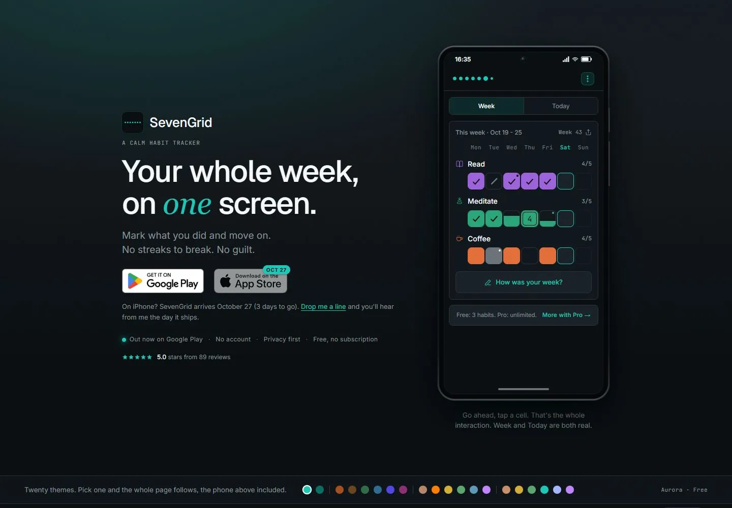
Live capture at 1440px, 2026-10-24
How it’s built
- Layout
- Dark teal-black field with left-aligned introduction and download badges, balanced by a tall phone image on the right.
- Type
- Large white sans heading with a teal italic serif word; small muted gray support.
- Color and surface
- Near-black teal gradient, white and gray type, teal accents and colorful phone content.
- Components
- Identity, headline, badges, support notes and phone mockup.
What makes it work
- Two-column dark hero with mixed-type heading and tall phone image.
On a new subjectFor a museum audio guide, pair a mixed-type heading with a tall device preview on a dark field.
Measured
Fonts loadedGeist, Inter, JetBrains Mono, Inter Fallback, JetBrains Mono Fallback
H160px / 500 / -1.5px
Body text16px
Page background#0a0f12
Text color#f5f7f8
Page height16,255px
Computed CSS at 1440px, 2026-10-24.
Live behavior
- Today
- The desktop landing page uses a near-black field, a two-column hero with concise app copy and store badges at left, and a tall phone mockup showing a dark weekly habit tracker at right. Teal accents highlight one italic word, small status text, and interface controls; a narrow bottom strip presents color swatches. The 750px scroll state reaches a second explanatory section, with text and color chips at left and a large dark habit-grid card at right. Tablet/mobile stack the hero copy, badges, proof line, then phone mockup vertically.
- Responsive
- Captured at 1440×1000, 768×1024, and 390×844. Desktop places text beside the phone; tablet centers and stacks those elements; mobile narrows and centers the same stack, with the phone UI continuing below the bottom edge. Only these sampled sizes are described.
- Scroll
- A real scroll state reports scrollY=750 in a 1440×1000 viewport. It shows the next explanatory section with a headline, explanatory copy, color options, and habit-grid example. No in-phone control or page link was activated.


