
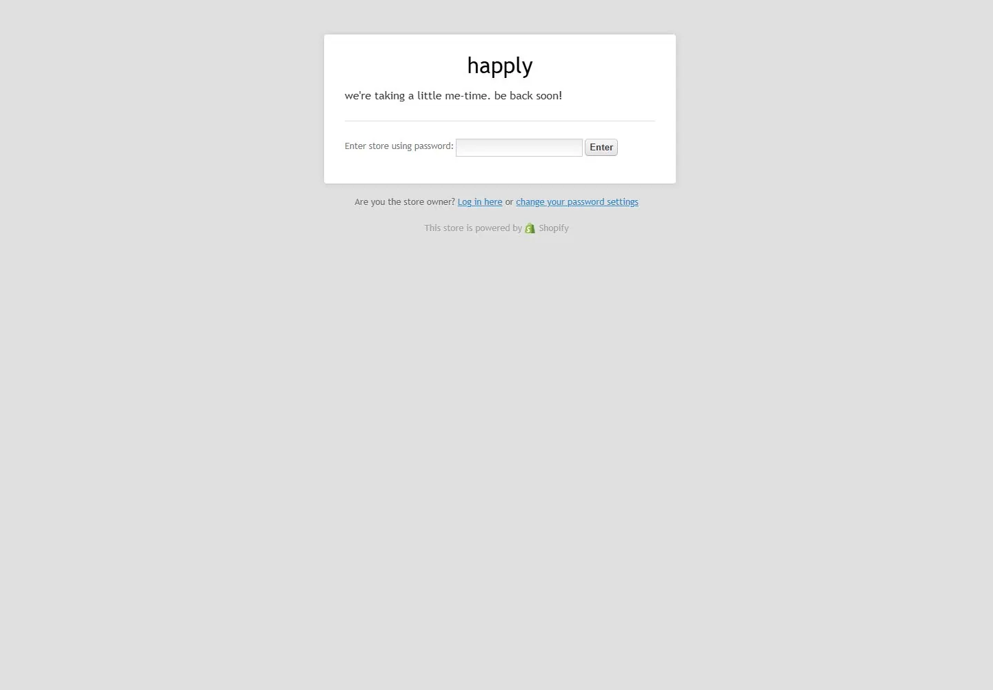
Live capture at 1440px, 2026-10-24
How it’s built
- Layout
- A photographic group fills the bounded hero under a black promotional strip and compact white navigation. A huge cream lowercase wordmark spans almost the entire width and overlays the people; a bold white lower-left message and small rounded white action at lower right complete the view. Pink candy exterior is gallery framing.
- Type
- Extremely heavy rounded geometric lowercase wordmark; bold lowercase sans message, tiny navigation and promotional strip. Exact font and metrics unknown.
- Color and surface
- Cream type over a warm lively group photograph, black strip, white action and small coral accents.
- Components
- Promotional strip, minimal navigation, immense wordmark, group photograph, lower message and pill action.
What makes it work
- Close full-field group photograph
- Immense cream lowercase wordmark over image
- Bold lower-left message and small opposite pill
- Slim top strip and navigation
On a new subjectFor a public dance education program, use an original close group photograph, overlay an immense cream lowercase program name, place a bold access message low left and a small registration pill low right beneath a compact top strip.
Measured
H132px / 400
Body text16px
Page background#e0e0e0
Text color#333333
Page height1,000px
Computed CSS at 1440px, 2026-10-24.
Live behavior
- Today
- Every saved state shows a store password/maintenance page: pale gray background, a small white shadowed panel near the top, simple centered happly heading and a short maintenance message, a fine rule, password input and Enter control. Owner-login/reset links and a powered-by Shopify line sit beneath the panel. This is diagnostic access evidence. It does not represent the distinctive storefront shown by the selected earlier visual reference.
- Responsive
- Desktop white panel is visually about510px wide, positioned near x470/y50; tablet keeps the same apparent width and top spacing. Phone document measures510px wide within390px viewport. Panel and text overflow to the right; the Enter control and password-settings link are clipped. The heading remains32px/30px and body16px/22.4px. These are gate-template measurements only, not the storefront responsive system.
- Scroll
- Attempted desktop scroll remains actual scrollY0 and document1440x1000; the gate stays at the top. It exposes no storefront sections or product components. No conclusions about storefront sticky navigation, scrolling or animation can be drawn.


