
Live capture at 1440px, 2026-10-24
How it’s built
- Layout
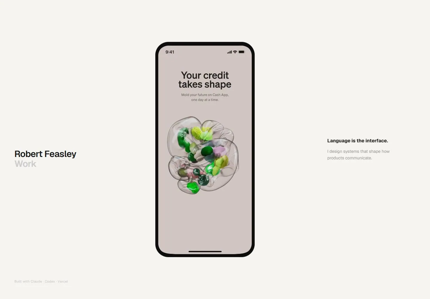
- A warm off-white page is organized in three vertical zones. Small name and Work label sit at left, a tall phone mockup showing a payment-card interface dominates the center, and a short bold statement with supporting sentence sits at right. A faint production credit rests near the lower-left edge. Broad margins and blank space surround the compact elements.
- Type
- Small bold sans-serif identity and labels at left; compact dark sans-serif statement and lighter gray support at right. The phone preview contains its own small interface text. No exact typeface or metrics inferred.
- Color and surface
- Warm white canvas, black and gray typography, black device frame, pale gray rounded interface controls, and a colorful gradient card graphic inside the phone. The page itself has no visible panel borders or shadows.
- Components
- Small identity/navigation label, centered phone product mockup, right-side value statement/support, faint lower-left attribution.
What makes it work
- Light open canvas
- Prominent central product/artifact preview
- Compact identity and concise support copy at the sides
On a new subjectShow one representative interface or artifact in the center, with a brief statement and identity at the edges. Replace the financial interface and personal details with an unrelated product or service.
Prompts
Create a visual direction for {{website_name}} in {{industry}} for {{audience}}, shaping {{content}} and supporting {{functionality}}.
COMPOSITION INVARIANTS: Center one tall, legible proof artifact within broad pale space, with a brief identity/work label on one side and a short explanation on the other. Keep credits quiet and near an edge. Preserve the observed visual hierarchy and spacing relationships, not the source-specific object inventory.
TYPE: Use small bold sans labels and a compact body line; make secondary labels pale gray but readable. Avoid introducing a giant headline. Set a readable scale step between display text, supporting copy, captions, and utilities. Do not name a font family.
SURFACE AND COMPONENTS: Use a white or soft neutral ground, dark type and restrained secondary text. Let the proof artifact supply any additional color. Component roles: One centered vertical artifact, two concise side labels, and minimal credits. Keep controls visually distinct and subordinate to the main content.
IMAGE DIRECTION: A phone is suitable only if the new subject is a mobile product; otherwise use a relevant vertical object, sample, or interface preview. Proportion estimate from the selected still: Visual estimate: phone roughly 22% frame width and 70% height; side text zones narrow with broad gaps. Treat it as an estimate, not fixed CSS geometry.
VARIABLES: Adapt names, details, image subjects, palette accents, and working actions to {{website_name}}, {{industry}}, {{audience}}, {{content}}, and {{functionality}}.
PROHIBITIONS: Use original copy and assets. Do not reproduce the source brand, exact wording, photographs, illustrations, products, people, or signature artwork; source-specific objects and motifs are optional only when they genuinely fit the new subject.
CONTINUATION: Continue with a similarly sparse detail section or linked work item, preserving generous margins.
RESPONSIVE PROPOSAL: Move the labels above and below the artifact in a simple stack; keep the artifact large enough to recognize and remove side-by-side overflow. These are design proposals, not observed mobile behavior. The selected still does not establish source fonts, CSS, implementation technology, motion, or control behavior. Do not present any of those as observed. Implement requested {{functionality}} as working new behavior without implying source validation.
Implement a responsive page for {{website_name}} in {{industry}} for {{audience}}, presenting {{content}} and working {{functionality}}.
INVARIANTS: Center one tall, legible proof artifact within broad pale space, with a brief identity/work label on one side and a short explanation on the other. Keep credits quiet and near an edge. Keep the same relative prominence and spacing without requiring the same source objects.
TYPE AND SURFACES: Use small bold sans labels and a compact body line; make secondary labels pale gray but readable. Avoid introducing a giant headline. Use a white or soft neutral ground, dark type and restrained secondary text. Let the proof artifact supply any additional color. Maintain clear display/body/utility scale, readable line lengths, and sufficient contrast. Components: One centered vertical artifact, two concise side labels, and minimal credits.
IMAGERY AND SCALE: A phone is suitable only if the new subject is a mobile product; otherwise use a relevant vertical object, sample, or interface preview. Visual estimate only: Visual estimate: phone roughly 22% frame width and 70% height; side text zones narrow with broad gaps. Use flexible widths and content-led dimensions; do not copy this screenshot's coordinates as fixed values.
VARIABLES: Adapt names, details, image subjects, palette accents, and working actions to {{website_name}}, {{industry}}, {{audience}}, {{content}}, and {{functionality}}.
PROHIBITIONS: Use original copy and assets. Do not reproduce the source brand, exact wording, photographs, illustrations, products, people, or signature artwork; source-specific objects and motifs are optional only when they genuinely fit the new subject.
CONTINUATION: Continue with a similarly sparse detail section or linked work item, preserving generous margins.
RESPONSIVE PROPOSAL: Move the labels above and below the artifact in a simple stack; keep the artifact large enough to recognize and remove side-by-side overflow. Use semantic content, keyboard-operable controls, visible focus, meaningful alt text, and no clipped content. The selected still does not establish source fonts, CSS, implementation technology, motion, or control behavior. Do not present any of those as observed. Implement requested {{functionality}} as working new behavior without implying source validation.
Measured
Fonts loadedGeistSans
H124px / 600 / -0.24px
Body text16px
Page background#f5f4f1
Text color#1a1a1a
Page height1,000px
Computed CSS at 1440px, 2026-10-24.
Live behavior
- Today
- Robert Feasley’s captured page uses an off-white field with “Robert Feasley / Work” at left, the statement “Language is the interface” and a short design-systems description at right, and a large centered phone mockup. Desktop t0 shows a bright green blank phone screen; desktop t2 shows an eBay search for “psa lugia 10” with trading-card listings; the desktop-scroll-labeled frame shows an eBay home feed with recently viewed/watched items. Tablet shows a Cash App “Spend benefits” screen with a green monthly-spend chart. Ordinary and reduced-motion phone frames show only “Robert Feasley / NARRATIVE · SYSTEMS · AI TOOLING” and a down arrow on the otherwise blank off-white screen. The selected gallery image is a separate Cash App card/rewards screen.
- Responsive
- All six captures use viewport-sized documents and report actual scrollY=0: desktop 1440×1000, tablet 768×1024, and phone 390×844. The desktop and tablet frames include different phone mockup screens; the ordinary and reduced-motion phone states show the identity/category label without the mockup. Sampled animation counts are 5 in desktop/tablet and 12 in both phone states. These saved frames do not establish breakpoints or explain the differing content.
- Scroll
- The file labeled desktop-scroll is measured at actual scrollY=0 in a viewport-sized 1440×1000 document. It retains the same overall portfolio/phone-mockup composition but shows an eBay home feed with recently viewed and watched items inside the phone. It does not show a lower page position or establish scroll behavior.


