
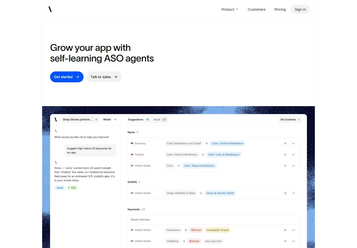
Live capture at 1440px, 2026-10-24
How it’s built
- Layout
- Dark charcoal field with centered white two-line headline, gray paragraph and blue pill, with small top navigation and muted logo row below.
- Type
- Medium-large bold white sans title and smaller gray sans copy.
- Color and surface
- Charcoal, white, gray and bright blue.
- Components
- Header, centered headline, paragraph, blue action and logo row.
What makes it work
- Centered white headline and blue action on a dark field with understated navigation.
On a new subjectFor a public learning platform, center a white headline and blue action on charcoal.
Live behavior
- Today
- The desktop page places a thin logo/navigation row inside a centered, lightly bordered white page. A left-aligned two-line acquisition headline and adjacent blue and pale-gray pill CTAs occupy a spacious white hero. A wide product-interface mockup follows on a dark navy field flecked with blue; below it, the scroll capture shows a grid of customer wordmarks in thinly divided cells and supporting copy. The desktop image area has generous framing and rounded interface corners.
- Responsive
- Captured at 1440×1000, 768×1024, and 390×844. The 768 view retains the full navigation and left-aligned hero with two side-by-side CTAs. At 390 the header reduces to logo, Sign in, and hamburger; the headline wraps more tightly, buttons remain side-by-side, and the product mockup shrinks within the dark blue frame. The captured mobile view continues into a two-column customer logo grid. Only these widths are covered.
- Scroll
- The desktop-scroll measurement records scrollY=750 at 1440×1000. Its screenshot shows lower rows of the product dashboard mockup followed by the customer-logo grid and supporting line. The logos are page content, not evidence of their linked destinations; no links were activated.


