
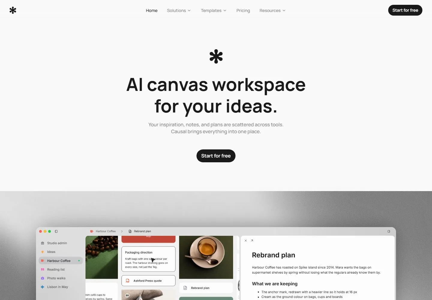
Live capture at 1440px, 2026-10-24
How it’s built
- Layout
- Light gray page with minimal top navigation and centered icon, bold two-line headline, gray supporting copy and black pill; image begins below.
- Type
- Bold black sans headline with smaller gray sans body.
- Color and surface
- Pale gray, black, white and blue image below.
- Components
- Header, centered icon, headline, text and pill.
What makes it work
- Centered bold two-line headline and black pill on a pale minimal field.
On a new subjectFor a public note-taking workshop, center a bold introduction and pill on a pale field.
Live behavior
- Today
- The desktop page has a sparse near-white hero, a small black star-like brand mark, thin centered navigation and a dark rounded primary CTA. A large centered two-line headline, subdued supporting copy, and another dark CTA sit above a broad gray-grain-backed product workspace mockup. The scroll capture is dominated by a large rounded canvas mockup with a document panel overlay. The mobile view reduces navigation to the brand mark and hamburger, stacks a centered headline/support/CTA, then presents the mockup as a compact landscape card.
- Responsive
- Captured at 1440×1000, 768×1024, and 390×844. Tablet retains full horizontal navigation and centered hero with the mockup below; at 390 navigation becomes a hamburger and the title/support/buttons stack in a narrower column, with the workspace preview below. This describes sampled widths only.
- Scroll
- The scroll measurement records a nonzero scrollY (750) at 1440×1000. Its screenshot moves the viewport into the workspace product mockup and document panel. No UI within the mockup was activated.


