
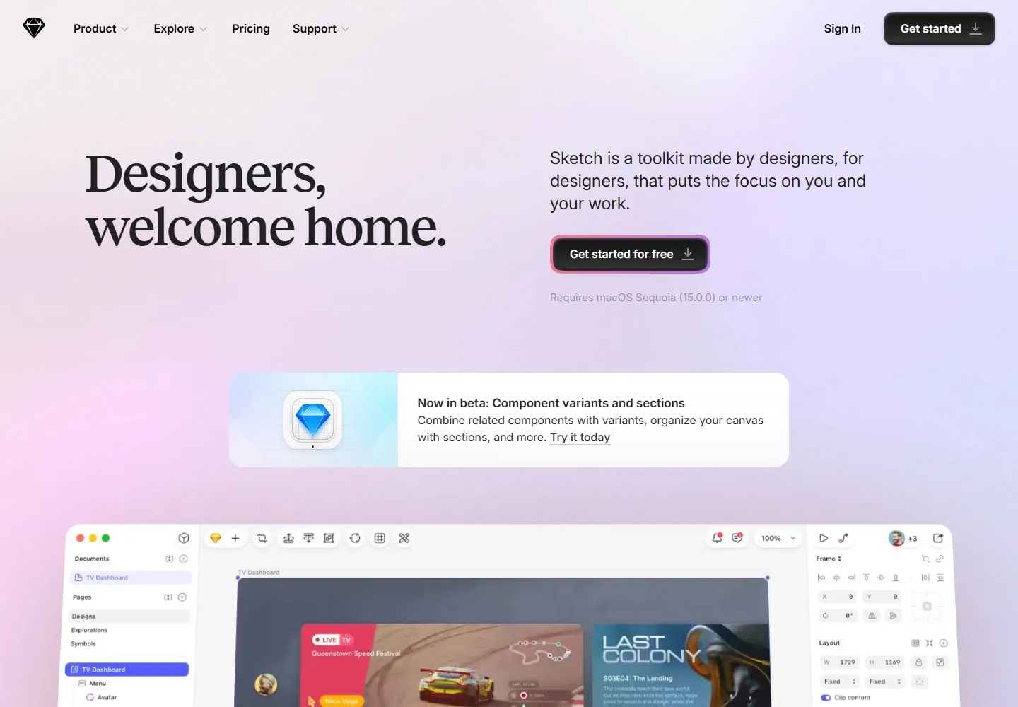
Live capture at 1440px, 2026-10-24
How it’s built
- Layout
- Near-white page with a centered outlined text panel, colorful images around its edges, curved connector lines and conventional header above.
- Type
- Bold and regular black sans text, with orange handwritten-looking words and numerals.
- Color and surface
- Near-white, black, orange and colorful image accents.
- Components
- Central outlined text panel, surrounding artwork, curved connectors, top navigation and actions.
What makes it work
- Outlined central text panel
- orange handwritten-looking accents
- surrounding colorful images and curved connectors
On a new subjectFor a public learning platform, frame a central outlined explanation with colorful specimen images, curved connectors and orange handwritten-looking accents on near-white.
Measured
Fonts loadedReckless, InterVariable, Inter
H176px / 500 / -1.5px
Body text16px
Page background#f5f5f5
Text color#212123
Page height8,356px
Computed CSS at 1440px, 2026-10-24.
Live behavior
- Today
- Sketch saved current hero uses a soft pale pink/lilac field, large dark medium-weight serif greeting at left and smaller dark sans explanation at right. Black rounded download-like actions have inset highlights/shadows; the main action has a thick pink-to-purple surrounding edge. A white rounded horizontal announcement card pairs a tactile app-icon illustration and compact sans text. A large slightly tilted application demonstration follows below. The design combines editorial serif hierarchy with soft dimensional controls; the depicted application is media inside the marketing page, not evidence that the page exposes those app tools.
- Responsive
- Desktop navigation is a horizontal text row with identity left and sign-in/action right. At768px and390px it becomes a pale64px header with left menu cue, centered diamond and right sign-in. Tablet retains side-by-side serif heading/support and horizontal announcement card. Phone stacks heading, supporting paragraph, prominent action and pale requirements line, then announcement illustration above text. Phone hero text has36px margins while announcement has16px margins; exact breakpoint/menu operation unknown.
- Scroll
- Actual desktop scroll750px in8356px document moves the opening navigation out of view and shows the large tilted application demonstration, fading into the pale lower page and the top of a rounded testimonial card. Cursor/name markers change between timed states. This does not test the depicted application controls, later section interactions or a full scrolling sequence.


