
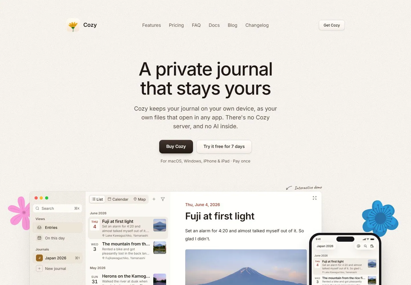
Live capture at 1440px, 2026-10-24
How it’s built
- Layout
- Warm cream page with a single horizontal header: small flower mark and name at left, centered navigation links, and dark action button at right. A large centered two-line headline sits above a centered explanatory paragraph, primary button, secondary text link and two lines of purchase/platform details. A large product interface preview starts near the bottom, flanked by colorful flower illustrations at the outer edges.
- Type
- Dark near-black sans-serif headline with generous scale and compact line spacing; smaller gray sans-serif supporting copy and fine print. Primary and secondary actions use medium-size labels. Typeface and exact metrics are not measured from this gallery image.
- Color and surface
- Warm cream background, near-black text and controls, muted gray explanatory details, and bright pink/blue floral illustrations. The interface preview is a pale windowed panel with a thin border and soft shadow.
- Components
- Brand/navigation header, centered headline and explanation, primary and secondary actions, platform/purchase note, interface preview, decorative side flowers.
What makes it work
- Warm uncluttered ground
- Centered headline and supporting explanation
- Clear primary action
- Interface preview below the hero
On a new subjectUse a calm background, a concise centered explanation and one primary action, then show the product or service in context below. Replace journaling content and floral decoration with an unrelated subject's own visual example.
Prompts
Create a visual direction for {{website_name}} in {{industry}} for {{audience}}, shaping {{content}} and supporting {{functionality}}.
COMPOSITION INVARIANTS: Center concise product copy and actions on a warm pale field, then introduce a broad, meaningful interface preview below. Use small side illustrations only as supporting accents, not as the main proof. Preserve the observed visual hierarchy and spacing relationships, not the source-specific object inventory.
TYPE: Use a medium-large centered sans headline, restrained body text, and one dark primary button beside a quieter link. Availability or pricing notes should be small and legible. Set a readable scale step between display text, supporting copy, captions, and utilities. Do not name a font family.
SURFACE AND COMPONENTS: Use cream, peach, or another light warm neutral with dark ink and limited illustration accents. Keep the product preview visually separate from background decoration. Component roles: Compact navigation, central headline/body, two actions, brief availability note, and a wide interface preview. Keep controls visually distinct and subordinate to the main content.
IMAGE DIRECTION: Show an original, readable product interface. Decorative flowers or a journal are optional and should be replaced by imagery relevant to the new subject. Proportion estimate from the selected still: Visual estimate: nav under 10% height; copy/action cluster in middle 40%; preview begins in lower fifth. Treat it as an estimate, not fixed CSS geometry.
VARIABLES: Adapt names, details, image subjects, palette accents, and working actions to {{website_name}}, {{industry}}, {{audience}}, {{content}}, and {{functionality}}.
PROHIBITIONS: Use original copy and assets. Do not reproduce the source brand, exact wording, photographs, illustrations, products, people, or signature artwork; source-specific objects and motifs are optional only when they genuinely fit the new subject.
CONTINUATION: Follow with product benefits or a detail view that repeats the warm surface and restrained interface framing.
RESPONSIVE PROPOSAL: Constrain headline line length, wrap or stack actions, and show a recognizable preview crop immediately after the copy. These are design proposals, not observed mobile behavior. The selected still does not establish source fonts, CSS, implementation technology, motion, or control behavior. Do not present any of those as observed. Implement requested {{functionality}} as working new behavior without implying source validation.
Implement a responsive page for {{website_name}} in {{industry}} for {{audience}}, presenting {{content}} and working {{functionality}}.
INVARIANTS: Center concise product copy and actions on a warm pale field, then introduce a broad, meaningful interface preview below. Use small side illustrations only as supporting accents, not as the main proof. Keep the same relative prominence and spacing without requiring the same source objects.
TYPE AND SURFACES: Use a medium-large centered sans headline, restrained body text, and one dark primary button beside a quieter link. Availability or pricing notes should be small and legible. Use cream, peach, or another light warm neutral with dark ink and limited illustration accents. Keep the product preview visually separate from background decoration. Maintain clear display/body/utility scale, readable line lengths, and sufficient contrast. Components: Compact navigation, central headline/body, two actions, brief availability note, and a wide interface preview.
IMAGERY AND SCALE: Show an original, readable product interface. Decorative flowers or a journal are optional and should be replaced by imagery relevant to the new subject. Visual estimate only: Visual estimate: nav under 10% height; copy/action cluster in middle 40%; preview begins in lower fifth. Use flexible widths and content-led dimensions; do not copy this screenshot's coordinates as fixed values.
VARIABLES: Adapt names, details, image subjects, palette accents, and working actions to {{website_name}}, {{industry}}, {{audience}}, {{content}}, and {{functionality}}.
PROHIBITIONS: Use original copy and assets. Do not reproduce the source brand, exact wording, photographs, illustrations, products, people, or signature artwork; source-specific objects and motifs are optional only when they genuinely fit the new subject.
CONTINUATION: Follow with product benefits or a detail view that repeats the warm surface and restrained interface framing.
RESPONSIVE PROPOSAL: Constrain headline line length, wrap or stack actions, and show a recognizable preview crop immediately after the copy. Use semantic content, keyboard-operable controls, visible focus, meaningful alt text, and no clipped content. The selected still does not establish source fonts, CSS, implementation technology, motion, or control behavior. Do not present any of those as observed. Implement requested {{functionality}} as working new behavior without implying source validation.
Measured
Fonts loadedInter, Caveat
H164px / 500 / -1.92px
Body text16px
Page backgroundoklch(0.982 0.005 85)
Text coloroklch(0.215 0.018 53)
Page height11,208px
Computed CSS at 1440px, 2026-10-24.


