
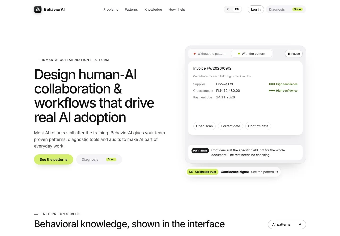
Live capture at 1440px, 2026-10-24
How it’s built
- Layout
- A broad white header precedes a bold two-line left title and smaller right explanatory paragraph. Large unequal rounded reference images begin immediately below; their detailed software screens are nested imagery.
- Type
- Large heavy black sans title, smaller regular black paragraph, compact logo and modest rounded-action labels.
- Color and surface
- White ground, black type, lightly edged white login pill and solid black join pill; colorful image content sits inside broad rounded frames.
- Components
- Logo, funding mark, paired header pills, split title/support row and large rounded visual-reference tiles.
What makes it work
- A bold left title with separate right support above oversized unequal rounded image tiles on white.
On a new subjectFor a public craft-pattern library, place a bold left collection title and right description over oversized unequal rounded process-reference photographs.
Prompts
Create a visual direction for {{website_name}} in {{industry}} for {{audience}}, shaping {{content}} and supporting {{functionality}}.
COMPOSITION INVARIANTS: Use a spacious pale page with a two-column hero: explanatory copy and actions on one side, a detailed rounded interface example on the other. Introduce the next section with a fine divider below the hero. Preserve the observed visual hierarchy and spacing relationships, not the source-specific object inventory.
TYPE: Set a large black sans headline, tiny uppercase eyebrow, medium gray supporting text, and compact pill controls. Use labels inside the demo at a smaller but still legible scale. Set a readable scale step between display text, supporting copy, captions, and utilities. Do not name a font family.
SURFACE AND COMPONENTS: Keep a white or very pale neutral ground, light-gray demo surfaces, subtle shadow, and one restrained accent for selected or positive states. Component roles: Slim header, eyebrow, text/action column, realistic interface panel with meaningful sample content, a small explanatory callout, and divider. Keep controls visually distinct and subordinate to the main content.
IMAGE DIRECTION: Populate the demo with original examples from {{content}}; do not retain invoice, person, locale, or source product details. Proportion estimate from the selected still: Visual estimate: text and demo each use about 44% content width; panel takes roughly 55% frame height. Treat it as an estimate, not fixed CSS geometry.
VARIABLES: Adapt names, details, image subjects, palette accents, and working actions to {{website_name}}, {{industry}}, {{audience}}, {{content}}, and {{functionality}}.
PROHIBITIONS: Use original copy and assets. Do not reproduce the source brand, exact wording, photographs, illustrations, products, people, or signature artwork; source-specific objects and motifs are optional only when they genuinely fit the new subject.
CONTINUATION: Continue into a content section that explains the demonstrated pattern, using the same pale surface and small accent chips.
RESPONSIVE PROPOSAL: Stack copy above the interface card. Convert any side-by-side controls into wrapped rows and keep the most informative sample fields visible. These are design proposals, not observed mobile behavior. The selected still does not establish source fonts, CSS, implementation technology, motion, or control behavior. Do not present any of those as observed. Implement requested {{functionality}} as working new behavior without implying source validation.
Implement a responsive page for {{website_name}} in {{industry}} for {{audience}}, presenting {{content}} and working {{functionality}}.
INVARIANTS: Use a spacious pale page with a two-column hero: explanatory copy and actions on one side, a detailed rounded interface example on the other. Introduce the next section with a fine divider below the hero. Keep the same relative prominence and spacing without requiring the same source objects.
TYPE AND SURFACES: Set a large black sans headline, tiny uppercase eyebrow, medium gray supporting text, and compact pill controls. Use labels inside the demo at a smaller but still legible scale. Keep a white or very pale neutral ground, light-gray demo surfaces, subtle shadow, and one restrained accent for selected or positive states. Maintain clear display/body/utility scale, readable line lengths, and sufficient contrast. Components: Slim header, eyebrow, text/action column, realistic interface panel with meaningful sample content, a small explanatory callout, and divider.
IMAGERY AND SCALE: Populate the demo with original examples from {{content}}; do not retain invoice, person, locale, or source product details. Visual estimate only: Visual estimate: text and demo each use about 44% content width; panel takes roughly 55% frame height. Use flexible widths and content-led dimensions; do not copy this screenshot's coordinates as fixed values.
VARIABLES: Adapt names, details, image subjects, palette accents, and working actions to {{website_name}}, {{industry}}, {{audience}}, {{content}}, and {{functionality}}.
PROHIBITIONS: Use original copy and assets. Do not reproduce the source brand, exact wording, photographs, illustrations, products, people, or signature artwork; source-specific objects and motifs are optional only when they genuinely fit the new subject.
CONTINUATION: Continue into a content section that explains the demonstrated pattern, using the same pale surface and small accent chips.
RESPONSIVE PROPOSAL: Stack copy above the interface card. Convert any side-by-side controls into wrapped rows and keep the most informative sample fields visible. Use semantic content, keyboard-operable controls, visible focus, meaningful alt text, and no clipped content. The selected still does not establish source fonts, CSS, implementation technology, motion, or control behavior. Do not present any of those as observed. Implement requested {{functionality}} as working new behavior without implying source validation.
Measured
Fonts loadedInter
H158px / 500 / -2.9px
Body text15px
Page background#ffffff
Text color#111112
Page height6,764px
Computed CSS at 1440px, 2026-10-24.


