
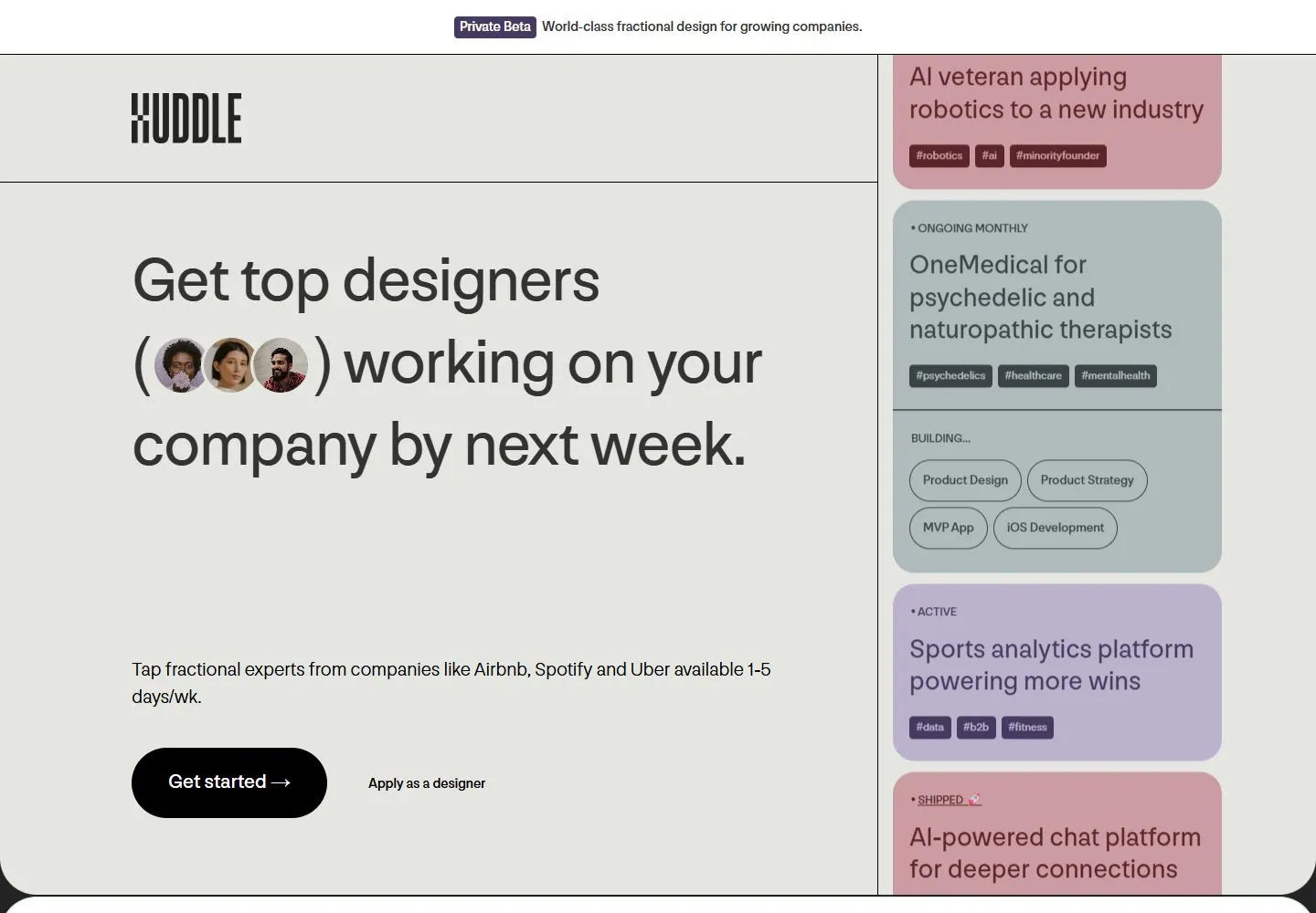
Live capture at 1440px, 2026-10-24
How it’s built
- Layout
- A pale near-white canvas is divided by thin dark rules into a wide left area and a narrower right rail. A centered announcement sits above a spacious logo/navigation header. Below, the left column gives most of its height to a large three-line proposition with three circular headshots inserted directly into the line, followed by a short paragraph and primary/secondary actions. The right side stacks colored status cards, each with a small status label, short project title, and compact rounded tags. Cards are vertically clipped at the bottom, suggesting continuation beyond this frame, but no scrolling behavior is proven.
- Type
- The main proposition uses large dark sans text with relatively open leading. The embedded portraits interrupt a phrase as inline visual tokens. The explanatory copy is compact and left aligned. Right-rail status, title, and tags step down into smaller sizes; title is still large enough to scan. The Huddle mark is condensed display lettering, distinct from the regular navigation and body text. Font identities and exact metrics are unavailable from the gallery still.
- Color and surface
- Warm pale gray is the main ground, divided by black hairlines. The right rail uses pastel blue-gray, lavender, muted rose, and amber cards. Fine outlines define rounded tags; cards have rounded lower corners and flat fills, without obvious soft shadows. A black pill-shaped primary CTA creates the strongest dark accent.
- Components
- Announcement line, logo/navigation header, large integrated portrait headline, paragraph, a pill primary action plus text link, and a vertical set of project-status cards with tags. The thin vertical divider makes the second column feel like a live inventory beside the recruiting proposition.
What makes it work
- Two-column hierarchy with a clearly wider message area.
- Repeated status cards use the same internal label/title/tag order.
- Thin dividers define the page regions.
On a new subjectFor a nonprofit volunteer page, use one generous column for the mission and signup action, with a narrow side rail of a few real upcoming initiatives and their status tags. Replace portrait insertions with a genuinely relevant image treatment and keep the rail narrower than the core message.
Prompts
Measured
Fonts loadedModerat
H140px / 400 / -0.32px
Body text14px
Page background#232323
Text color#333333
Page height5,024px
Computed CSS at 1440px, 2026-10-24.
Live behavior
- Today
- Huddle uses a pale gray-green hero panel below a narrow white “Private Beta” announcement strip. The tall compressed Huddle wordmark sits at upper left. A large dark headline with three circular portrait cutouts occupies the left side, followed by a short supporting sentence and black “Get started” button with a secondary designer link. The right side contains a vertical stack of large rounded project cards in muted blue-gray, lavender, rose and gold, with project summaries, tags and service pills. Tablet keeps the announcement and logo above a stacked headline, support copy and actions; phone uses a shorter headline and a horizontally cropped strip of project cards below the hero.
- Responsive
- At 1440×1000 the hero is split between left-side copy/actions and a right-side vertical project-card column. At 768×1024 the message is stacked in a single broad column and the project-card column is outside the captured viewport. At 390×844 the headline copy changes to “Fast, flexible teams of top designers and builders,” and the project cards appear in a horizontally arranged strip below the hero. The sampled document width is 391px at a 390px phone viewport; this single pixel does not establish a broader overflow problem.
- Scroll
- At actual scrollY 750 the screenshot shows the end of the hero and the beginning of a white “STEP 1 · THE BRIEF” section. The section pairs “Tell us what you need” copy and a customer quote on the left with a large lavender project card on the right. No fixed-header behavior is inferred.


