
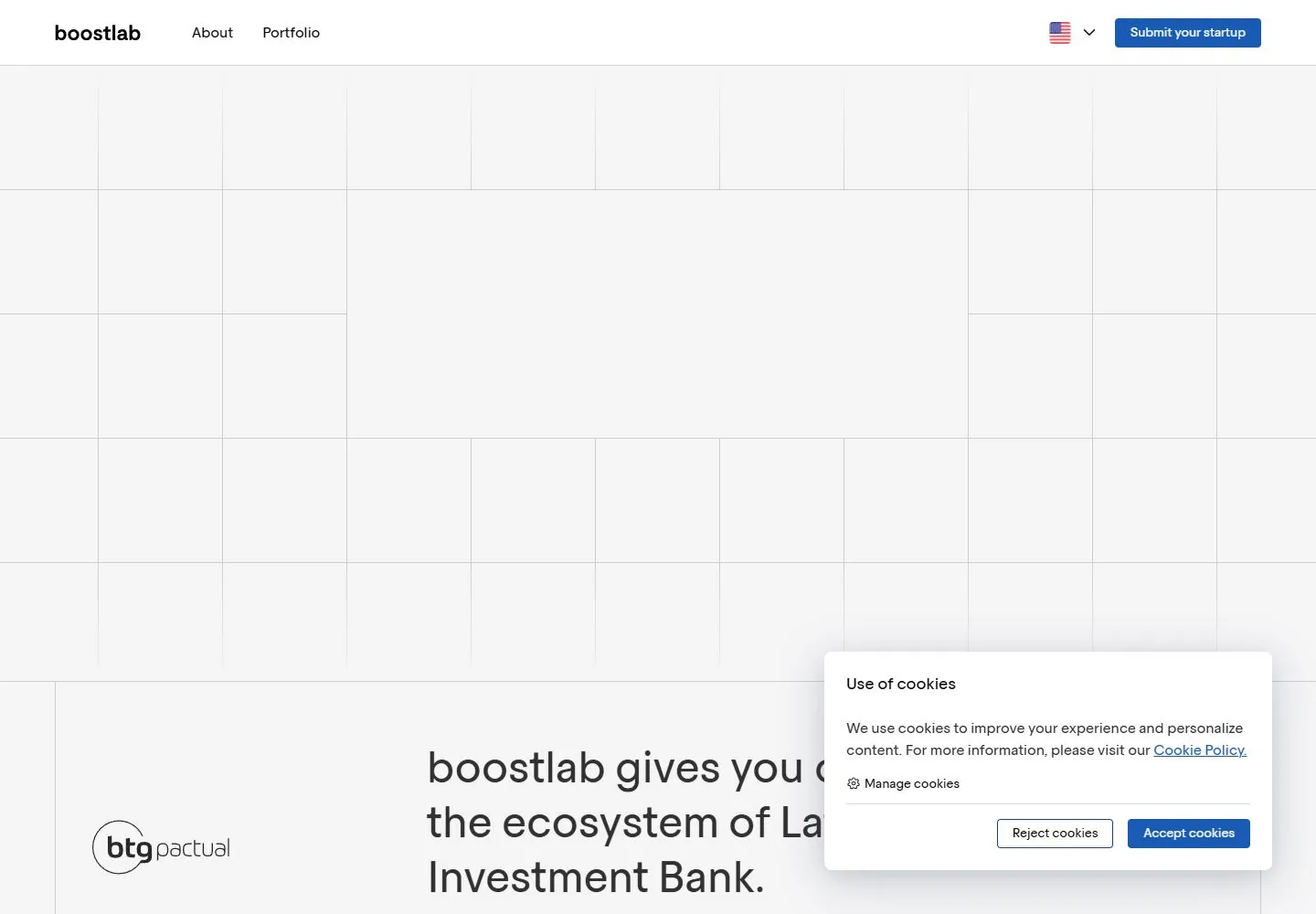
Live capture at 1440px, 2026-10-24
How it’s built
- Layout
- Inside the browser mockup, a pale page uses a precise uniform square grid. A large merged central area holds a centered two-line message, first black and second blue; isolated blue logo cells punctuate surrounding empty squares. A simple white header contains identity and two links at left, language selector and blue submission action at right. Browser chrome and outer blue field are staging.
- Type
- Large regular/medium-weight clean sans statement, small sans navigation and white partner-logo marks inside colored cells. Exact fonts/metrics unknown.
- Color and surface
- Pale near-white grid field, very fine gray/blue rules, black/blue headline and a few solid blue square cells; no photographic imagery needed.
- Components
- Minimal header, ruled square matrix, merged message area, sparse logo tiles and compact action.
What makes it work
- Pale regular square grid with fine rules and many empty cells
- Merged central large two-line sans message with one accent line
- Sparse solid accent cells carrying compact white marks
- Plain compact header
On a new subjectFor a civic library consortium, use a pale square matrix with scattered accent branch-symbol cells surrounding a merged central two-line access promise. Retain fine rules, abundant empty cells and one accent text line; replace investment copy/logos and omit browser staging.
Measured
H264px / 400
Body text16px
Page backgroundtransparent
Text color#000000
Page height8,822px
Computed CSS at 1440px, 2026-10-24.
Live behavior
- Today
- Very pale gray field divided by thin light-gray square-like rules. A centered two-line regular sans statement uses black first line and blue second line in a clear rectangular opening in the grid. White compact header, small blue rectangular action, and sparse dark identity accompany it. The next section uses an oversized editorial statement beside a small logo, followed by thinly divided benefit columns and fine blue line artwork. A white consent card overlays the lower right.
- Responsive
- Desktop navigation72px tall becomes a57px compact header with hamburger at tablet/phone. Hero text changes64px/80px to32px/40px at both narrow widths while retaining the two-line centered composition. The visible grid has fewer columns across the smaller viewport. Consent changes from a490x239px lower-right card to a full-width bottom panel, obscuring subsequent content; underlying sampled32px statement words on phone are not claimed visible.
- Scroll
- At actual scrollY750 the72px header remains at the top. The48px/60px regular statement is partly behind it near the top edge, followed by a small blue action and three thinly divided benefit columns. Fine blue circular linework appears in the middle column. Consent covers much of the right column. Some raw card text rectangles are taller than their line-height, so element boxes are not treated as glyph bounds.


