
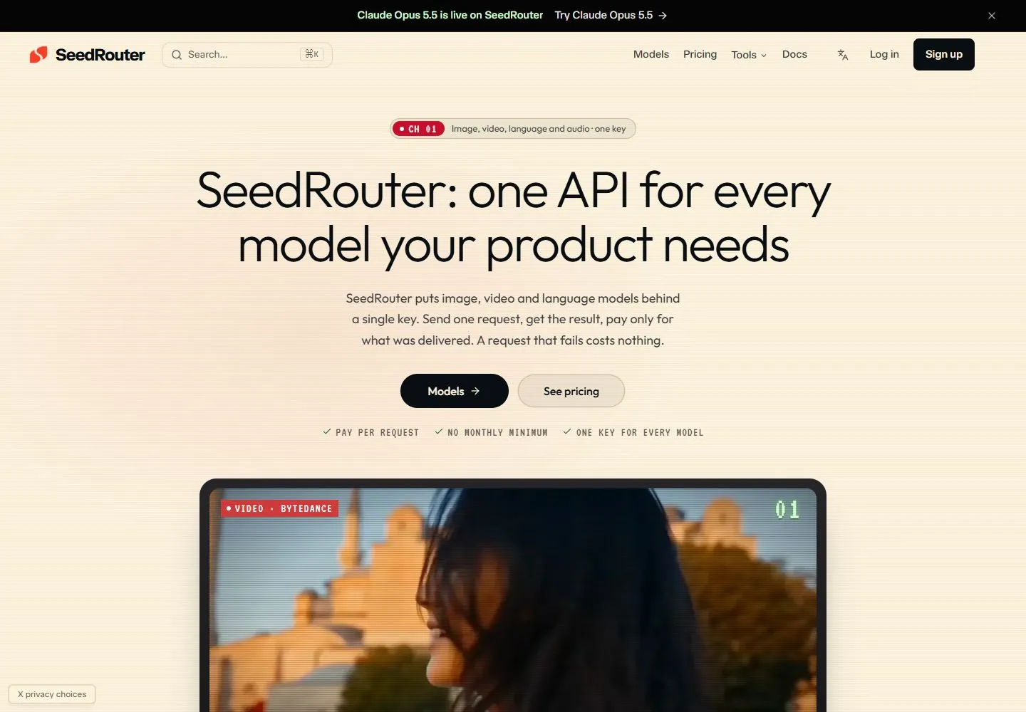
Live capture at 1440px, 2026-10-24
How it’s built
- Layout
- A white software page uses two columns: a large left headline, compact explanation, paired green/outlined actions and three proof labels; a large rounded nighttime musician image occupies right. Logo row and three outlined feature cards begin below.
- Type
- Large regular sans headline with close leading, smaller regular body, bold action labels and compact uppercase proof labels. Exact font and metrics unknown.
- Color and surface
- White background, black text, mint green action and icon fills, dark photo and light gray borders.
- Components
- Pair a large black sans headline and green/outlined actions on white with a large rounded photographic-looking image at right, then add a logo strip and outlined feature cards below.
What makes it work
- White split hero with left headline and support
- Large rounded photographic-looking image right
- Green and outlined paired actions plus proof labels
- Lower logo strip and outlined feature cards
On a new subjectFor a public music-education service, pair a large black left invitation and green/outlined actions with an original rounded musician photograph, then use a partner-logo strip and outlined program cards.
Measured
Fonts loadedJetBrains Mono, JetBrains Mono Fallback, TASA Orbiter
H172px / 300 / -2.16px
Body text16px
Page background#fdf3dd
Text color#090e12
Page height13,652px
Computed CSS at 1440px, 2026-10-24.
Live behavior
- Today
- A warm pale cream surface with fine horizontal scanline-like texture hosts a centered geometric sans heading with a red brand fragment, brief explanatory paragraph and paired rounded buttons. A small red channel badge sits above; tiny tracked labels and green checks sit below. The next black rounded media frame contains image material and technical red/pixel-style tags. A black announcement bar and a functional navigation row frame the top.
- Responsive
- Tablet and phone replace desktop navigation and search field with a search icon and circular menu; title wraps into three centered lines and paired buttons persist. Heading declares Outfit 72px desktop, 56px tablet and 38px phone; supporting copy declares Outfit 18px desktop/tablet and 16px phone. The media card fills the available narrower column.
- Scroll
- At actual scrollY750 the bottom of the dark media card shows a heading, small technical price and description with a white rounded action; a new cream section follows with a large left-aligned heading and media card row. The navigation row stays at the top. Product capabilities and prices are unverified source claims.


