
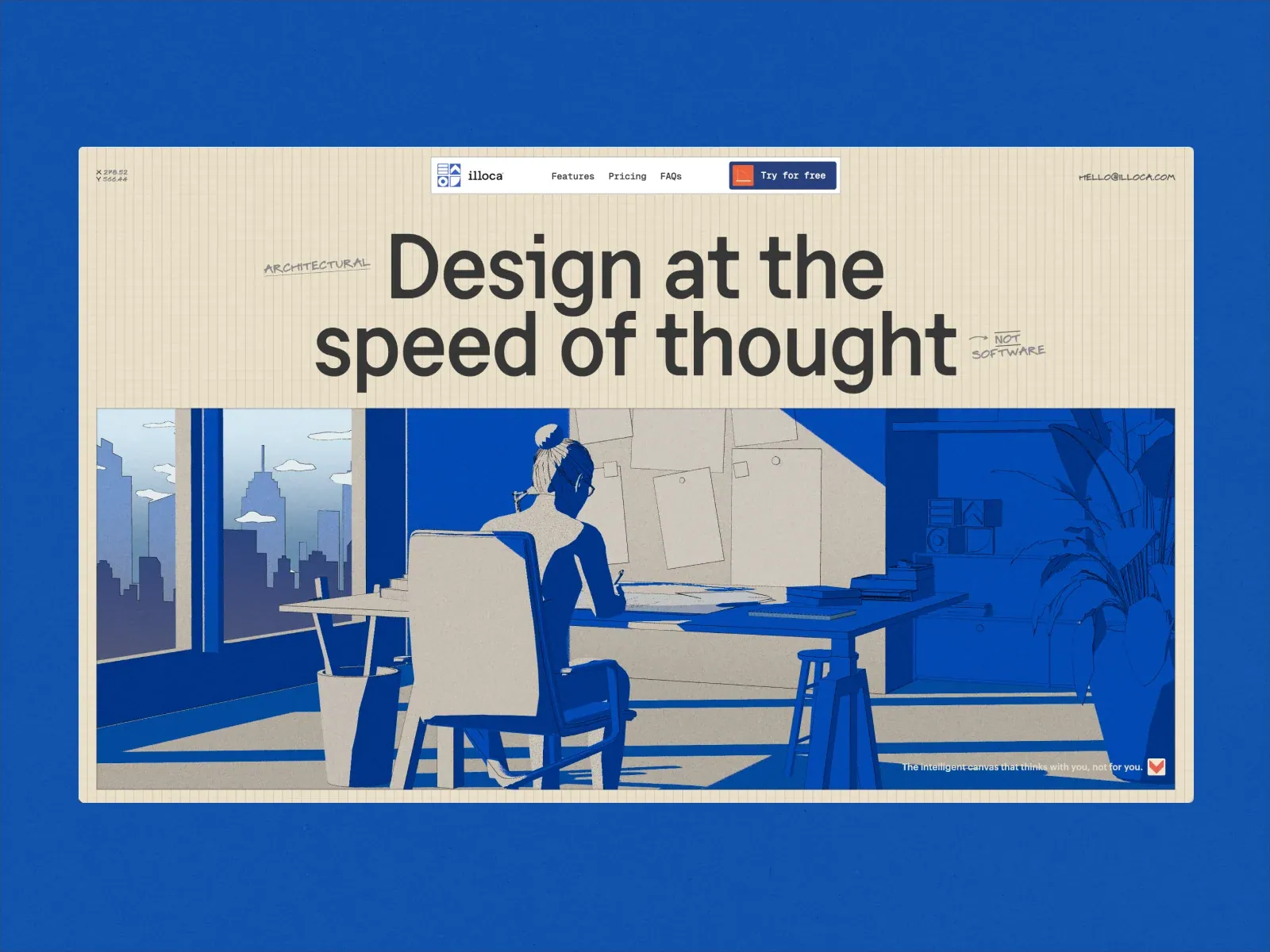
Gallery screenshot, saved 2026-10-24
How it’s built
- Layout
- Bounded cream graph-paper canvas within cobalt surround, compact top navigation/action, huge two-line headline, small handwritten annotations, and one broad blue/cream illustrated scene filling the lower half.
- Type
- The display lettering is visually dominant; smaller navigation, labels or supporting copy are secondary where legible. Exact typeface, rendered font identity and CSS metrics are unknown.
- Color and surface
- Cream grid canvas with black text and limited cobalt/cream illustration, set within a saturated cobalt surround. No numeric color values measured.
- Components
- Paper-like grid canvas, compact navigation/action, large headline, marginal handwritten notes, single broad architectural illustration.
What makes it work
- Paper-like ruled canvas
- Large upper headline
- One broad scene illustration below
- Compact top navigation
On a new subjectFor a public-health explainer, pair a large headline with one broad original diagram beneath it on a bounded ruled-paper canvas.
Live behavior
- Today
- The desktop page combines a cream graph-paper field, a large centered dark sans-serif headline, hand-drawn annotation marks, a compact framed navigation bar, and a wide illustration dominated by saturated blue and off-white. A small cookie notice overlays the lower left. The gallery reference presents the same hero within an additional blue outer frame; that outer frame may be promotional packaging.
- Responsive
- Tablet and phone change the full desktop navigation into a compact identity, action and menu bar. The headline wraps into three centered lines, the illustration is cropped to a tall narrow panel on phone, and the cookie notice shifts toward the bottom center. The screenshots do not establish exact breakpoint thresholds.
- Scroll
- The scroll-labeled desktop frame reports scrollY 0 and a viewport-height document, so the still does not establish a successful scroll or the appearance of later sections.


