
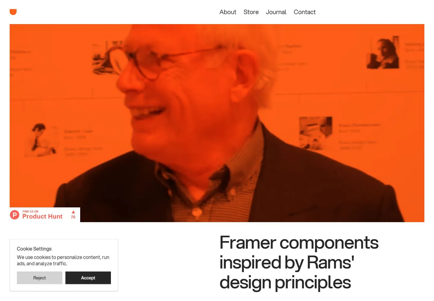
Live capture at 1440px, 2026-10-24
How it’s built
- Layout
- Black page with a large orange-toned image above and a large white statement positioned toward the lower right, balanced by a small orange action at lower left.
- Type
- Large white regular sans statement, tiny white navigation, small orange action.
- Color and surface
- Black field, orange image and accent, white type.
- Components
- Sparse header, dominant warm image, large lower-right statement and small lower-left action.
What makes it work
- Black field
- orange-toned broad image
- asymmetrical white statement and orange accent
On a new subjectFor a public astronomy program, pair an orange-toned observatory image with a large white lower-right statement and small orange lower-left action on black.
Measured
Fonts loadedAspekta 450, Aspekta 400, Aspekta 500, Aspekta 600
H160px / 400 / -1.8px
Body text12px
Page background#ffffff
Text color#000000
Page height18,133px
Computed CSS at 1440px, 2026-10-24.
Live behavior
- Today
- The Drams desktop opening has a slim white navigation band with a small orange mark at left and About, Store, Journal, Contact at right. A very large hero image below is tinted orange and overlaid with a photograph; the oversized headline “Framer components inspired by Rams’ design principles” begins in a two-column area beneath it. The desktop scroll capture shows the headline, “Sound on & play” cue, category links, and the start of a two-column component gallery. The tablet and phone captures show the hero image with the headline continuing below; a cookie settings panel overlays the lower area in both ordinary responsive captures.
- Responsive
- At 1440×1000 the nav is horizontal, the hero spans almost the full content width, and the large headline is aligned in a right-hand column below it. At 768×1024 the hero fills most of the width and the headline is partly below the fold; at 390×844 the hero is a tall, nearly full-width image and the headline begins below. The nav is represented by a compact mark and hamburger at the top of the reduced-motion phone capture. The sampled widths do not establish breakpoint thresholds.
- Scroll
- The scroll-labeled screenshot displays the “Sound on & play” cue, headline, category row (All, Buttons, Switches, Sliders, Dials, Other), and the first product cards. It shows a later page position than the opening hero; the header is not visible in this frame. Sticky or fixed positioning is not established.


