
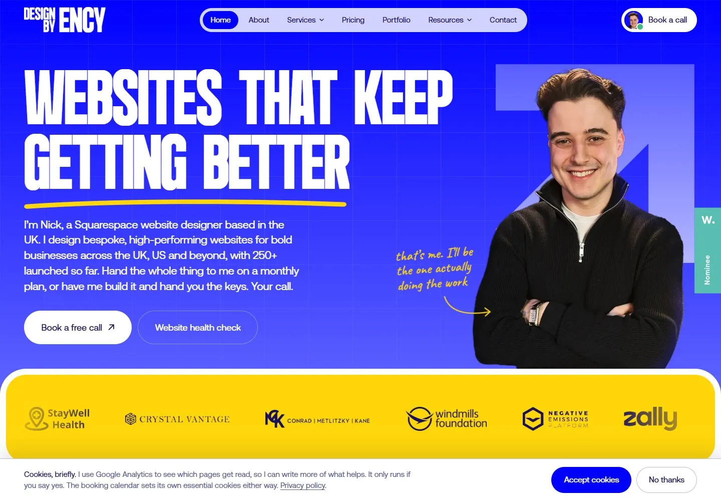
Live capture at 1440px, 2026-10-24
How it’s built
- Layout
- Gallery presentation places a laptop on a dark blue field under enormous promotional lettering and a yellow annotation. Inside its screen, a saturated blue page uses a pale rounded top navigation capsule, a large condensed uppercase underlined headline and short paragraph at left, a cutout person against angular blue shapes at right, paired pill actions and a wide yellow client-logo strip below. Exterior laptop and promotional graphic elements are excluded from webpage structure.
- Type
- In-screen white heavy condensed uppercase headline with a yellow underline; smaller clean sans paragraph/navigation and compact pill actions. A small handwritten arrow note appears near the portrait. Exact font/metrics unknown.
- Color and surface
- In-screen vivid blue with faint square grid, white text/pills, pale navigation capsule, yellow underline/client band and darker/lighter blue geometric portrait backdrop. Exterior fabric-like field is staging.
- Components
- In-screen capsule header, condensed headline/underline, explanation and paired actions, cutout portrait with angular backing and yellow logo strip.
What makes it work
- Saturated blue grid/geometric field
- Heavy condensed white uppercase headline with contrasting underline
- Cutout subject with angular backdrop
- Wide contrasting proof/partner band
On a new subjectFor a regional apprenticeship program, place a condensed white opportunity statement and yellow underline on blue, pair it with an original apprentice portrait over angular blue shapes, and add a yellow training-partner band below. Replace designer copy and logos; omit laptop staging.
Measured
Fonts loadedCaveat, Geist Mono, Aeonik, Bigger Display
H116px / 400
Body text16px
Page background#ffffff
Text color#34376b
Page height19,151px
Computed CSS at 1440px, 2026-10-24.
Live behavior
- Today
- Saturated blue gridded hero, huge condensed white uppercase headline, yellow underline and handwritten annotation, portrait at right and bright yellow client strip. Cookie banner overlays the bottom.
- Responsive
- Tablet preserves portrait with smaller stacked text; phone crops portrait from frame and wraps headline, with cookie banner covering lower content.


