
Live capture at 1440px, 2026-10-24
How it’s built
- Layout
- White page with compact black header above a huge vertical-cutout image motif and a large black statement below.
- Type
- Bold small sans identity and very large regular black sans statement.
- Color and surface
- White, black and muted gray landscape image.
- Components
- Header, search/menu cues, segmented image motif and headline.
What makes it work
- Large landscape image interrupted by white vertical cutouts above a broad black statement.
On a new subjectFor a conservation trust, cut a landscape image into tall vertical forms above a large statement.
Live behavior
- Today
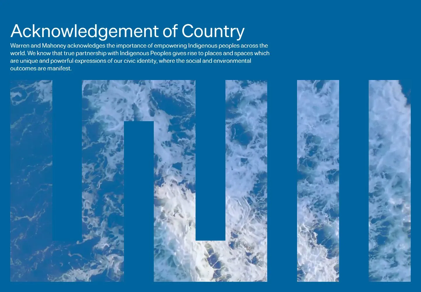
- Desktop t0 shows a blue acknowledgement screen with white sans copy and an oversized segmented monogram filled with ocean imagery. At t2 a white screen shows a compact black header above a huge abstract vertical monogram built from saturated rectangular blocks. These are separate captured phases; the gallery reference instead shows landscape imagery within a similar segmented form.
- Responsive
- Tablet t2-like state crops the colored monogram within a narrower frame and places a large line of copy underneath. The ordinary phone frame shows a reduced/cropped colored graphic and large spaced text; the separately loaded reduced-motion phone shows the blue acknowledgement state. Different phases preclude treating all differences as viewport effects.
- Scroll
- At actual desktop scrollY 750 the capture shows the compact header and large, widely spaced black sans statement and paragraph on white. One saved scroll position cannot establish the full page sequence.


