
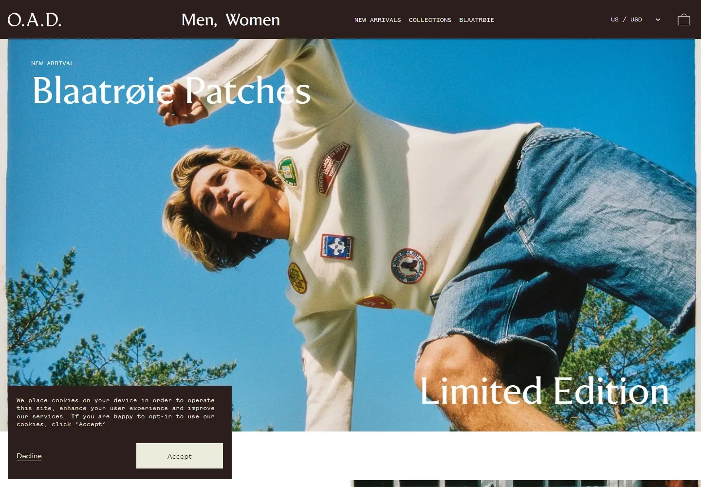
Live capture at 1440px, 2026-10-24
How it’s built
- Layout
- Muted olive canvas divides into a left text column and a large right lifestyle photograph. A thin top navigation row spans the width with split monogram, gender links, small uppercase information links, currency selector and bag. Left column contains a small season label, large two-line serif heading, compact paragraph, closing sentence and three underlined links.
- Type
- Cream serif headline and links contrast with a small tracked monospaced-looking utility layer and compact readable body copy. Raster supports visual classification only; exact font and metrics unknown.
- Color and surface
- Flat muted olive ground and warm cream type; right photograph contributes glacier gray, water, stone and knitwear colors. No panels or shadows interrupt the split.
- Components
- Editorial navigation, seasonal eyebrow, large headline, paragraph, standalone closing line, three underlined destination links, full-height campaign photo, currency and bag controls.
What makes it work
- Restrained solid copy field
- One dominant adjacent photograph
- Editorial headline and supporting text
- Sparse independent navigation
On a new subjectUse one relevant photo beside an editorial copy column; preserve open space, restrained contrast, and the hierarchy from eyebrow through headline to supporting links. Replace product and place-specific imagery.
Prompts
Create an original website image for {{website_name}} in {{industry}}, serving {{audience}}, presenting {{content}} and making {{functionality}} apparent.
INVARIANTS: Pair a muted colored text panel with a full-height photograph at roughly equal width; align small navigation across both, then stack a label, serif heading, paragraphs and short links within the text panel.
TYPOGRAPHY: Use a restrained serif heading, small readable body type and compact utility labels with generous vertical pauses.
COLORS AND SURFACES: Muted earth-toned panel and light text beside natural photographic values; exact earth hue is adaptable.
IMAGERY: Choose one new tactile outdoor or physical-context image; source person, garments and landscape are variables.
VARIABLES: Supply original identity, writing, imagery, accent hues and tasks for {{website_name}}, {{industry}}, {{audience}}, {{content}} and {{functionality}}.
PROHIBITIONS: Do not copy source branding, wording, photographs or signature artwork. Do not turn privacy notices, submission frames or cut-off essential text into style rules. Avoid generic card stacks, extra decorative panels or an unrelated large hero heading when they erase the specified hierarchy.
CONTINUATION: Translate the same relative type scale, alignment and image treatment into the next real content section; give that section a clear purpose rather than duplicating the hero.
RESPONSIVE PROPOSAL: Stack the text panel and photo, shorten the top navigation, and keep the link list grouped with its explanatory copy. Render clear, readable original text and subject-appropriate controls with consistent spacing. These proportions are visual reproduction targets, not common measured CSS. The selected still does not establish source fonts, technology, motion, hover or responsive behavior. Preserve those evidence limits; this prompt remains unvalidated.
Build a functioning responsive website for {{website_name}} in {{industry}} for {{audience}}, using {{content}} and working {{functionality}}.
INVARIANTS: Pair a muted colored text panel with a full-height photograph at roughly equal width; align small navigation across both, then stack a label, serif heading, paragraphs and short links within the text panel.
TYPOGRAPHY: Use a restrained serif heading, small readable body type and compact utility labels with generous vertical pauses.
COLORS AND SURFACES: Muted earth-toned panel and light text beside natural photographic values; exact earth hue is adaptable.
IMAGERY: Choose one new tactile outdoor or physical-context image; source person, garments and landscape are variables.
VARIABLES: Supply original identity, writing, imagery, accent hues and tasks for {{website_name}}, {{industry}}, {{audience}}, {{content}} and {{functionality}}.
PROHIBITIONS: Do not copy source branding, wording, photographs or signature artwork. Do not turn privacy notices, submission frames or cut-off essential text into style rules. Avoid generic card stacks, extra decorative panels or an unrelated large hero heading when they erase the specified hierarchy.
CONTINUATION: Carry the relative type scale, alignment and image treatment into appropriate content sections without repeating the hero or inventing irrelevant features.
RESPONSIVE PROPOSAL: Stack the text panel and photo, shorten the top navigation, and keep the link list grouped with its explanatory copy. Use semantic reading order, meaningful image descriptions, keyboard-operable controls and visible focus. Check display text bounds after the chosen fonts load at desktop and phone widths; keep complete essential text inside its container. Verify the actual requested actions rather than styling inert controls. Respect reduced-motion preferences if new motion is added. These proportions are visual reproduction targets, not common measured CSS. The selected still does not establish source fonts, technology, motion, hover or responsive behavior. Preserve those evidence limits; this prompt remains unvalidated.
Measured
Fonts loadedViktor, Founders Grotesk Mono, Founders Grotesk Text
H232px / 400
Body text16px
Page background#ffffff
Text color#2d1e1e
Page height5,677px
Computed CSS at 1440px, 2026-10-24.
Live behavior
- Today
- The O.A.D./Devold capture opens on a dark brown header with a white serif wordmark and navigation above a bright blue-sky product photograph. White “Blaatrøie Patches” and “Limited Edition” text overlays the hero; the captured desktop frame also includes cookie controls and a cart panel. The selected gallery reference is a distinct, muted editorial composition, not the same live hero.
- Responsive
- Desktop is 1440×1000 with a 5677px document; tablet is 768×1024 with a 9826px document; phone states are 390×844 with 6831px documents. Tablet and phone frames reflow the hero and navigation into narrow vertical compositions. The sampled widths do not establish breakpoint thresholds or full page order.
- Scroll
- The desktop-scroll state records scrollY=750 in a 5677px document and shows the editorial section “Some things are made to travel,” supporting copy and a “Shop the Limited Edition” action. Cookie and cart overlays remain visible in this saved frame.


