
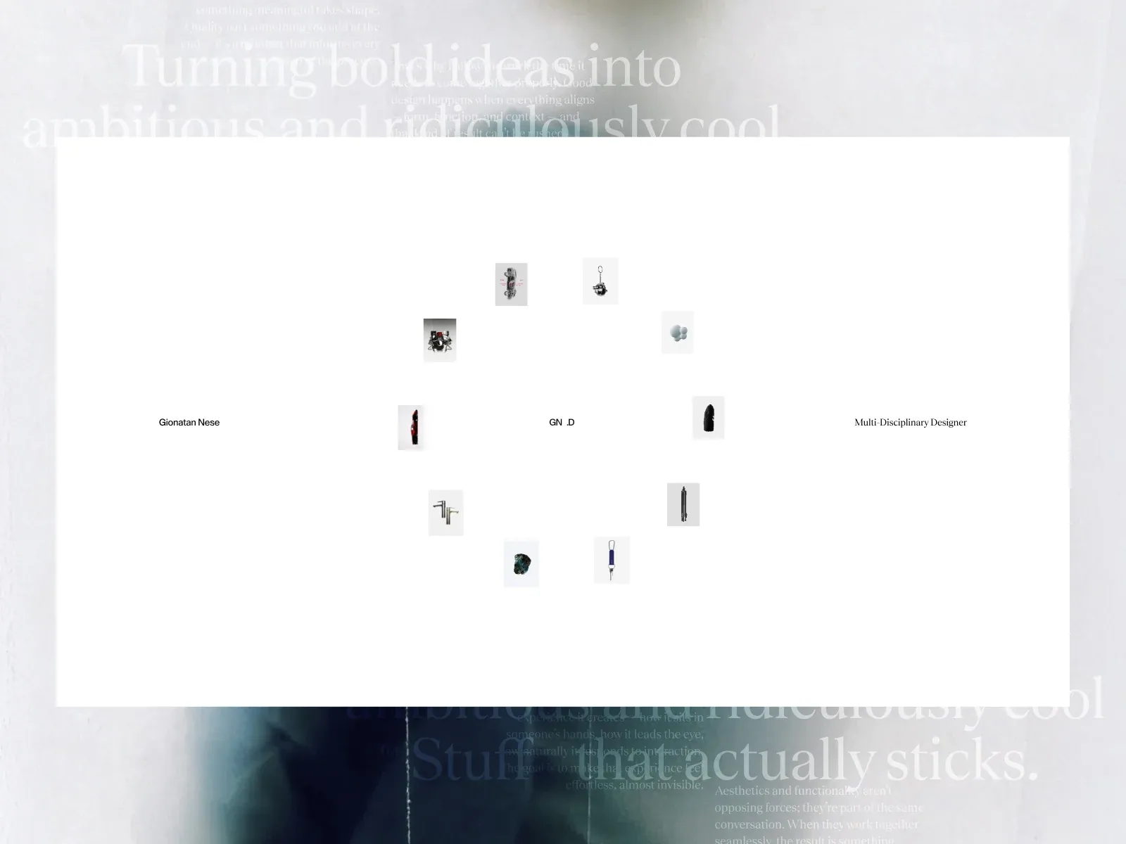
Gallery screenshot, saved 2026-10-24
How it’s built
- Layout
- The screenshot contains an open pale central rectangle with a loose orbit of tiny product and object thumbnails around the center. The gallery presentation includes oversized faint serif statements behind and below this light rectangle; those layers appear to be part of the captured page, while the black outside area is submission framing. Inside the central area, images vary in shape and orientation and sit around a sparse identity row: designer name, initials, and role. The products occupy separate small islands, not a tight rectangular grid. The larger composition is unusually airy and has extensive empty space around the miniatures.
- Type
- Pale, very large serif text is visible in the background but has low contrast and appears partially obscured by the white central field. The identity row uses small, plain dark text. The captured type cannot be confidently identified; no typeface name is assigned. The hierarchy relies on scale and opacity: ghosted oversized prose, tiny labels, and small object imagery. No clear body paragraph or button label appears in the central panel.
- Color and surface
- A nearly white canvas contrasts with faint gray text and delicate small thumbnails. Around the central region, a photographic/typographic background shifts to dark blue-green near the bottom and pale gray above. The black border beyond the page image is a gallery frame. Surfaces are mostly flat; the image shows no visible shadows or outlines on the center panel. Small product images supply muted pink, blue, and dark accents.
- Components
- A compact identity line has designer name, abbreviated signature, and occupational label. Several independent product thumbnails surround it. There are no visible nav links, buttons, or obvious icon controls in this selected frame. While the thumbnail positions suggest an orbital gallery, the pattern is open and irregular rather than a perfect ring.
What makes it work
- many independent small project/object images
- large surrounding whitespace
- quiet identity labels
- non-grid placement
On a new subjectUse a handful of relevant artifacts placed as separated islands around a name or short descriptor; keep the spacing irregular but balanced and the identity quiet.
Prompts
Create a transferable visual direction for {{website_name}} in {{industry}}, for {{audience}}, presenting {{content}} and supporting {{functionality}}. Composition rule: A pale field contains tiny isolated artifacts on a closed upright elliptical path around a clear center, with three small horizontally separated identity labels. Faint outer type belongs to the submitted presentation and is optional. Type character and hierarchy: Use a quiet serif-like background voice at very low contrast and simple small dark labels; keep background display text subordinate. Palette and contrast: Use white and pale gray with restrained dark type; colorful accents belong to the new subject's specimens. Image/component role: Show a few small subject-relevant examples or artifacts, each distinct and surrounded by generous empty space; avoid prescribing a product category. Visual estimate from this selected image, not measured CSS: Visual estimate: thumbnails collectively under 10% central panel area; field about 75% width; large typography across upper/lower bands. Treat the proportions as guidance rather than fixed geometry. Variables: choose new identity, wording, subject, imagery, palette and actions for {{website_name}}, {{industry}}, {{audience}}, {{content}} and {{functionality}}. Do not reuse source brands, exact phrases, logos, people, products, photography, artwork, or other distinctive source assets. Do not infer a named typeface, technology, CSS value, motion or untested behavior. Build any continuation from the target's actual content while preserving the stated hierarchy and contrast. Keep the specimens sparse but sequence them vertically; ensure low-contrast background lettering never competes with labels.
TRANSFER BOUNDARY: Preserve the closed ellipse and sparse item scale; avoid an unstructured constellation or a filled sphere. On phones, a compact ring or a documented readable ordered adaptation is proposed; this is not an observed responsive rule.
Implement a responsive page for {{website_name}} in {{industry}} for {{audience}}, presenting {{content}} and making {{functionality}} work. Desktop layout: A pale field contains tiny isolated artifacts on a closed upright elliptical path around a clear center, with three small horizontally separated identity labels. Faint outer type belongs to the submitted presentation and is optional. Typography: Use a quiet serif-like background voice at very low contrast and simple small dark labels; keep background display text subordinate. Surface contrast: Use white and pale gray with restrained dark type; colorful accents belong to the new subject's specimens. Media and components: Show a few small subject-relevant examples or artifacts, each distinct and surrounded by generous empty space; avoid prescribing a product category. Visual estimate from this selected image, not measured CSS: Visual estimate: thumbnails collectively under 10% central panel area; field about 75% width; large typography across upper/lower bands. Treat the proportions as guidance rather than fixed geometry. Variables: choose new identity, wording, subject, imagery, palette and actions for {{website_name}}, {{industry}}, {{audience}}, {{content}} and {{functionality}}. Do not reuse source brands, exact phrases, logos, people, products, photography, artwork, or other distinctive source assets. Do not infer a named typeface, technology, CSS value, motion or untested behavior. Build any continuation from the target's actual content while preserving the stated hierarchy and contrast. Keep the specimens sparse but sequence them vertically; ensure low-contrast background lettering never competes with labels. Use semantic content, useful image descriptions, and labels linked to the correct item. Any new controls need accessible names, keyboard operation and visible focus; the reference's controls and behavior remain untested.
TRANSFER BOUNDARY: Preserve the closed ellipse and sparse item scale; avoid an unstructured constellation or a filled sphere. On phones, a compact ring or a documented readable ordered adaptation is proposed; this is not an observed responsive rule.
Live behavior
- Today
- The recovered desktop sequence uses a white full-viewport field, a centered loose cluster of small rectangular project images, and compact top-center identity and segmented navigation. Initial and later frames show different cluster arrangements.
- Responsive
- Tablet and phone retain the centered thumbnail cluster and compact top navigation in the sampled normal-motion frames. The fresh reduced-motion phone image shows a more dispersed circular arrangement and central identity without the top navigation, possibly a different phase. Still frames do not establish exact breakpoint rules.
- Scroll
- The desktop scroll-labeled state reports scrollY 0 and a viewport-height document. Thumbnail positions differ from earlier stills, but that is insufficient evidence of scrolling.


