
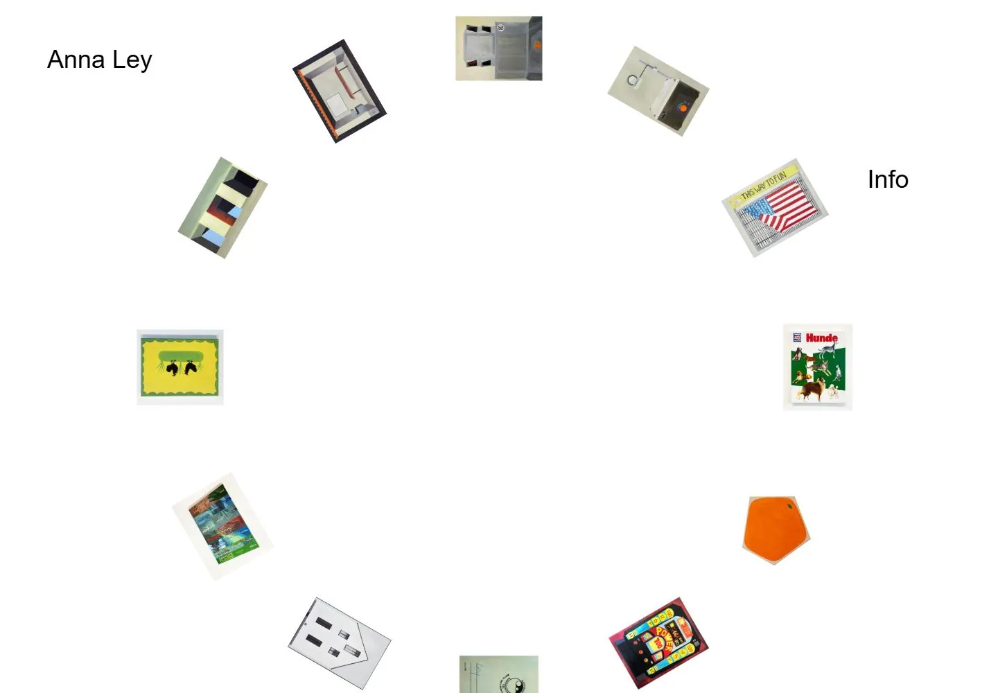
Live capture at 1440px, 2026-10-25
How it’s built
- Layout
- Small tilted image cards loosely ring a generous empty center on white; small identity and information sit near the upper corners.
- Type
- Small restrained black sans text; imagery dominates.
- Color and surface
- White field with muted colorful image cards and black text.
- Components
- Scattered tilted small cards around an open center, with tiny corner text.
What makes it work
- Tilted small image cards
- broad central void
- restrained corner text
On a new subjectFor a meteorological archive, arrange small tilted cloud studies around a broad white central void with restrained corner labels.
Prompts
Measured
Body text25px
Page background#ffffff
Text color#000000
Page height1,000px
Computed CSS at 1440px, 2026-10-25.
Live behavior
- Today
- White canvas shows Anna Ley at upper-left, Info near upper-right, and separate small artwork thumbnails placed around a large empty center. Desktop t0/t2/scroll screenshots are identical, and the recorded scroll state remains at y=0. Tablet rearranges the thumbnails into a looser centered set; mobile compresses them into a small circular/peripheral cluster beneath the sparse labels. No hover capture exists in the six recorded states.
- Responsive
- At desktop 1440×1000, thumbnails are widely scattered around the white field; tablet 768×1024 places them closer to center; mobile 390×844 compresses the same pieces into a tight cluster with wide blank margins. All captured document heights equal viewport height and scrollY remains 0.
- Scroll
- The state labeled desktop-scroll reports scrollY 0 and its screenshot matches the initial frame. No actual scrolling was captured.


