
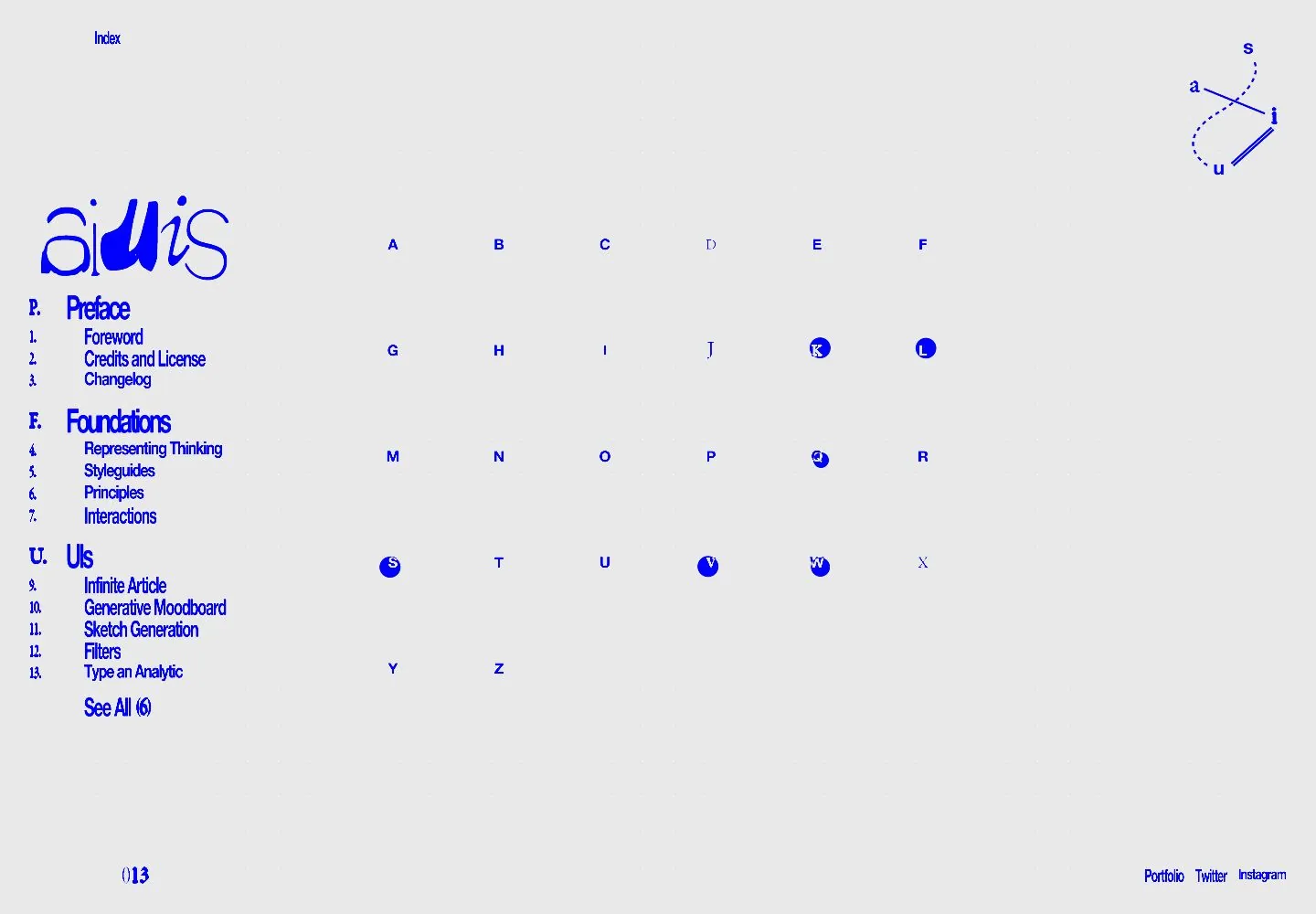
Live capture at 1440px, 2026-10-24
How it’s built
- Layout
- A large pale publication-like panel dominates. A narrow left index lists numbered chapters and sections; the broad right reading column carries dense cobalt-blue prose and headings with upright, bold and italic treatments. Prominent lines visibly undulate in curved/rippled baselines while the panel boundary and narrow index remain straight. A hand-drawn letterform and folio sit in the rail; tiny utility links appear near lower right. Surrounding dark editor windows are capture context, not site DNA.
- Type
- Dense cobalt-blue text with visibly wavy/rippled baselines and warped line construction in prominent passages, varied upright/bold/italic emphasis, narrow blue index labels and folio. Exact font and live-page versus publication-preview status are unverified; the still does not establish animation.
- Color and surface
- Pale paper-like field and vivid cobalt type; surrounding dark desktop/editor excluded.
- Components
- Narrow numbered index, long-form reading column, section hierarchy, folio and small utility links.
What makes it work
- Pale publication-like reading surface with narrow numbered index
- Broad dense cobalt text column with visible wavy/rippled line construction
- Varied upright, bold and italic emphasis
- Small folio/utility details
On a new subjectFor a public building-code reference service, place sourced guidance on a pale reading surface with a narrow numbered topic index and a broad dense cobalt column whose selected lines visibly ripple or curve. Use bold and italic emphasis for definitions and cautions while keeping the index straight; replace the thesis content. Do not imply animation or that every page section uses the effect.
Measured
Fonts loadedalte-haas, garara
H116px / 400 / -0.96px
Body text16px
Page background#e9e9ea
Text color#0000ff
Page height1,000px
Computed CSS at 1440px, 2026-10-24.
Live behavior
- Today
- Pale gray lightly speckled field with intensely blue type and marks. A dense left index uses narrow irregular-looking section labels and numbered links beneath a mixed-letterform wordmark. The middle contains a widely spaced six-column alphabet with several letters inside small blue discs. A small connected-letter diagram anchors the top right and tiny social links sit bottom right. Typography appears stretched or disturbed in places, rather than uniformly typeset.
- Responsive
- Desktop left navigation region measures264px wide with32px left padding, while the letter field occupies the center. Tablet and phone emphasize the alphabet field and retain the small Index control, corner diagram and bottom social links. A lossless tablet crop verifies the former sidebar area contains spaced letters rather than the desktop index. Narrow grids measure six119px tracks on tablet and six56px tracks on phone, each with6px gaps; the phone grid sits at12,270 with366x304px bounds. Its tiny letters and large surrounding blank field are visually observed, not a conventional readable body-text scale.
- Scroll
- The desktop-scroll attempt remains at actual scrollY0 and document1440x1000, retaining the index, alphabet and corner elements. Small slants in bottom social text are visible in that frame; no scroll-driven transformation or additional section is established.


