
Gallery screenshot, saved 2026-10-24
How it’s built
- Layout
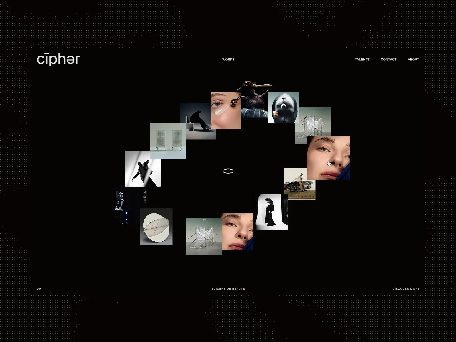
- A black page with a dotted world-map-like pattern near the outer margins frames a large loose circle of image tiles. The central area inside the orbit stays mostly black and empty except for a small white oval mark. Project images overlap lightly and vary in size, crop, and aspect ratio; the ring is broad, imperfect, and encircles a conspicuous central void. A wordmark is at upper left, short nav items run along the top, and tiny index/category/discover labels anchor the bottom edge. The orbit occupies the middle two-thirds of the canvas with large black gutters around it.
- Type
- The logo is a simple lowercase white wordmark. Navigation and footer labels use small, widely spaced uppercase sans/mono-like text. The only central mark is tiny; image thumbnails carry more visual weight than text. The screenshot does not expose a readable large heading. Exact fonts and metrics are unknown from this gallery image and are not claimed.
- Color and surface
- Black dominates. A subtle dotted map pattern is low contrast and largely peripheral. The image thumbnails provide the palette: desaturated fashion, beauty, architecture, and object imagery with occasional skin tones and muted color. No cards sit behind thumbnails; they appear as floating rectangular image crops against black. White text and central emblem provide restrained points of contrast.
- Components
- Top navigation: wordmark, Works, Talents, Contact, About. Bottom rail includes an item number, work label, and underlined Discover More action. Repeated media tiles form an orbit rather than a conventional card grid. Small central brand icon sits inside the empty center. The dotted outer pattern behaves as a background texture, not a project tile.
What makes it work
- closed orbital arrangement of multiple media tiles
- visible center void or tiny identity mark
- dark plain field
- peripheral quiet navigation/index
On a new subjectArrange a selected set of project images along a broken ellipse around a concise identity mark; keep the center open and controls peripheral.
Prompts
Create a transferable visual direction for {{website_name}} in {{industry}}, for {{audience}}, presenting {{content}} and supporting {{functionality}}. Composition rule: A dark neutral field contains a closed tilted elliptical ring of small separate rectangular previews around a large clear center; small labels stay at the top and bottom edges. Type character and hierarchy: Use tiny spaced uppercase sans labels; keep the center and thumbnails visually dominant over utility text. Palette and contrast: Use a very dark field, dim edge texture and crisp readable labels; let new content imagery provide controlled color. Image/component role: Use small subject-appropriate visual previews of varied content, not source projects; keep each rectangular and legible at reduced scale. Visual estimate from this selected image, not measured CSS: Visual estimate: thumbnail orbit spans ~55% width and 60% height; tiny images; dotted texture forms broad border. Treat the proportions as guidance rather than fixed geometry. Variables: choose new identity, wording, subject, imagery, palette and actions for {{website_name}}, {{industry}}, {{audience}}, {{content}} and {{functionality}}. Do not reuse source brands, exact phrases, logos, people, products, photography, artwork, or other distinctive source assets. Do not infer a named typeface, technology, CSS value, motion or untested behavior. Build any continuation from the target's actual content while preserving the stated hierarchy and contrast.
RESPONSIVE PROPOSAL: At desktop keep the closed elliptical ring. On phones preserve a compact ring where previews remain readable; if an ordered list is necessary, explicitly treat it as an alternate phone layout with labels attached to each item.
TRANSFER BOUNDARY: Keep the ring closed rather than replacing it with an open arc or dense scatter; preserve visible gaps and the empty center. On phones, a compact ring or a documented readable ordered adaptation is proposed; this is not an observed responsive rule.
Implement a responsive page for {{website_name}} in {{industry}} for {{audience}}, presenting {{content}} and making {{functionality}} work. Desktop layout: A dark neutral field contains a closed tilted elliptical ring of small separate rectangular previews around a large clear center; small labels stay at the top and bottom edges. Typography: Use tiny spaced uppercase sans labels; keep the center and thumbnails visually dominant over utility text. Surface contrast: Use a very dark field, dim edge texture and crisp readable labels; let new content imagery provide controlled color. Media and components: Use small subject-appropriate visual previews of varied content, not source projects; keep each rectangular and legible at reduced scale. Visual estimate from this selected image, not measured CSS: Visual estimate: thumbnail orbit spans ~55% width and 60% height; tiny images; dotted texture forms broad border. Treat the proportions as guidance rather than fixed geometry. Variables: choose new identity, wording, subject, imagery, palette and actions for {{website_name}}, {{industry}}, {{audience}}, {{content}} and {{functionality}}. Do not reuse source brands, exact phrases, logos, people, products, photography, artwork, or other distinctive source assets. Do not infer a named typeface, technology, CSS value, motion or untested behavior. Build any continuation from the target's actual content while preserving the stated hierarchy and contrast.
RESPONSIVE PROPOSAL: At desktop keep the closed elliptical ring. On phones preserve a compact ring where previews remain readable; if an ordered list is necessary, explicitly treat it as an alternate phone layout with labels attached to each item. Use semantic content, useful image descriptions, and labels linked to the correct item. Any new controls need accessible names, keyboard operation and visible focus; the reference's controls and behavior remain untested.
TRANSFER BOUNDARY: Keep the ring closed rather than replacing it with an open arc or dense scatter; preserve visible gaps and the empty center. On phones, a compact ring or a documented readable ordered adaptation is proposed; this is not an observed responsive rule.
Live behavior
- Today
- The desktop screenshots show a black viewport with an asymmetrical collage of overlapping rectangular project stills surrounding a broad central gap. The images include fashion portraits, interiors, products and staged scenes; a small outlined oval mark appears in the center in some frames. At desktop-t0, desktop-hover and desktop-scroll, a white wordmark is visible at the upper left, compact white navigation spans the top, and a small studio credit/link appears at the lower right. These three elements are absent in desktop-t2. Their presence and absence are state-specific; the zero-scroll captures do not establish persistence or positioning behavior. These composition and image descriptions are visual observations; exact collage geometry is not measured.
- Responsive
- The measured document dimensions equal the viewport at desktop (1440x1000), tablet (768x1024) and phone (390x844), with scrollY 0 in all sampled states. The mobile screenshot places the logo at the top left and the four navigation labels in a compact row beneath it; its project collage is only a small central patch in the captured normal-motion frame. The tablet screenshot is predominantly black with a central outlined mark and a “100%” indicator near the bottom, so it does not provide a usable view of the intended collage layout at that width. These are single captured states, not a complete responsive audit.
- Scroll
- The desktop-scroll capture reports actual scrollY 0 and a 1440x1000 document matching its viewport. Its collage composition differs from the t0 frame, but this capture does not show a scroll-driven transition or lower page content.


