
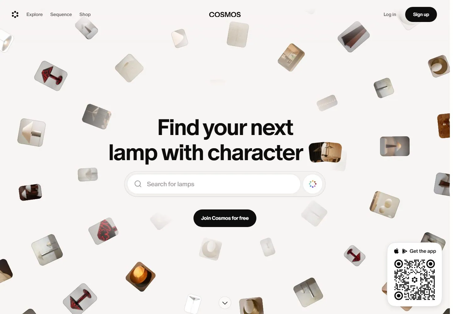
Live capture at 1440px, 2026-10-24
How it’s built
- Layout
- Black field with scattered image rectangles around a centered serif statement; a compact email bar appears top center and a quote card upper right.
- Type
- Fine white serif heading with gray sans support and small interface labels.
- Color and surface
- Black, charcoal and muted grayscale imagery.
- Components
- Scattered images, centered text, signup bar and quote card.
What makes it work
- Centered fine serif statement surrounded by scattered images on black.
On a new subjectFor a visual history archive, scatter artifact images around a centered serif statement on black.
Live behavior
- Today
- The captured desktop opening centers a bold black two-line sans headline, long rounded search field and black pill action on a pale field. Numerous small, tilted, rounded image thumbnails surround the central stack with varying apparent opacity. Navigation is split across the top, with a floating QR card at lower right. The older gallery image shows a different dark composition and remains separate evidence.
- Responsive
- Tablet keeps a centered search and thumbnail field but condenses left navigation to Menu. Phone uses a smaller centered headline and search, a Download action and compact header; the QR card is absent in the saved phone frames. Sampled viewports do not establish precise breakpoints.
- Scroll
- At actual desktop scrollY 750 the frame shows a white feature section with a large heading and a horizontal row of pale rounded visual panels with captions. The upper navigation and QR card remain visible in that saved frame; this does not establish their behavior over the full page.


