
Live capture at 1440px, 2026-10-24
How it’s built
- Layout
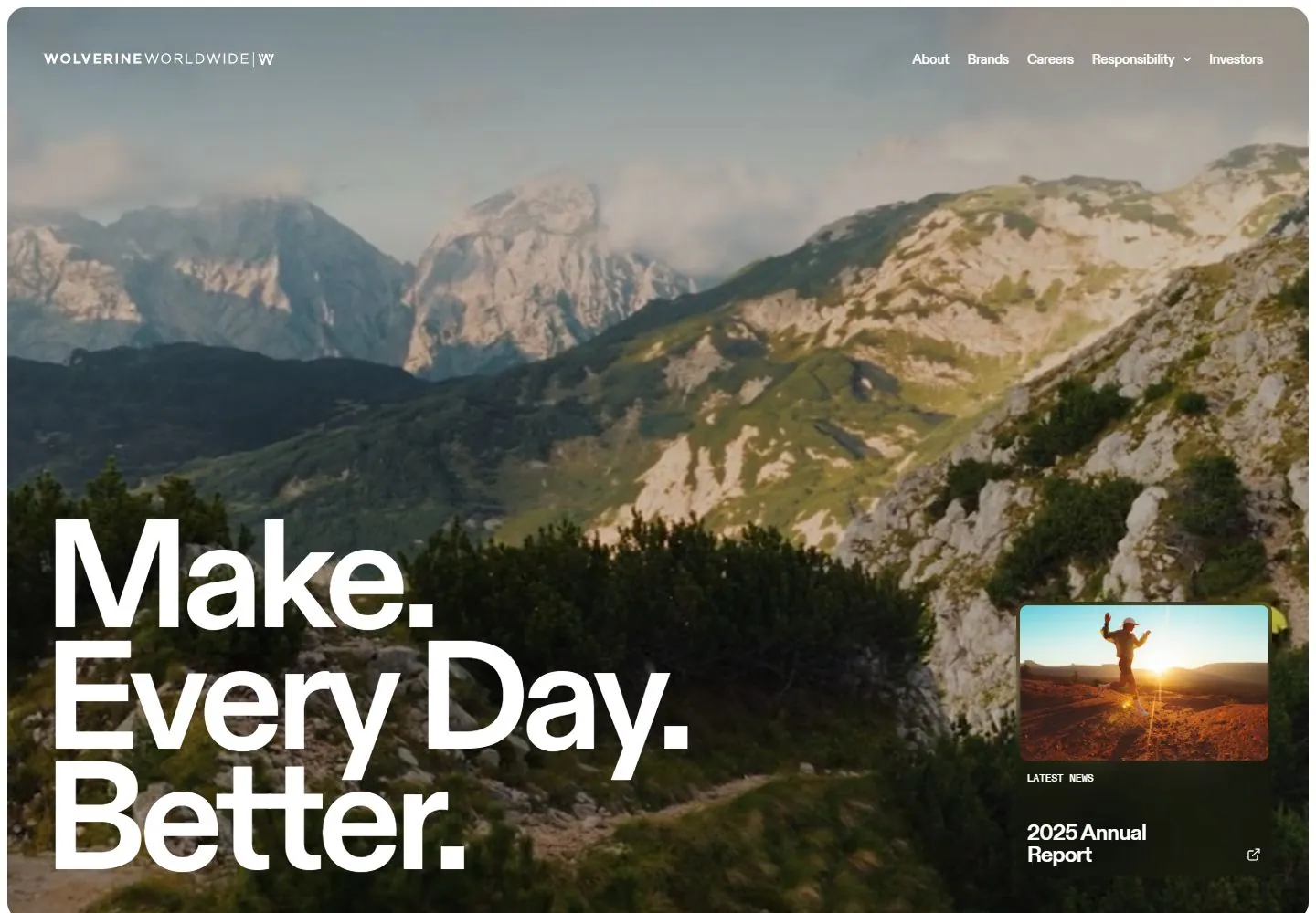
- A rounded page panel sits over a blurred photographic surround. Inside, a darkened outdoor runner image supports compact pill navigation, a huge three-line white slogan at left, and a small annual-report news card at lower-right. The outer photograph is gallery staging.
- Type
- Large white modern sans display slogan; small white sans navigation and card labels. Exact face and metrics are unknown.
- Color and surface
- Warm dark terrain and sky with a bright orange jacket; white type and a dark translucent-looking news card sit over the image.
- Components
- Rounded bounded hero, compact nav pill, giant left slogan, lower-right story card with thumbnail and label.
What makes it work
- Expansive outdoor image
- Large multi-line proposition
- Compact top navigation
- One subordinate corner story card
On a new subjectFor a coastal cleanup nonprofit, use an original shoreline volunteer image, place a clear multi-line participation proposition at left, keep navigation compact, and add one small event or impact story card at lower right. Replace the apparel imagery and claims; treat the gallery surround as framing.
Prompts
Create an original website image for {{website_name}} in {{industry}}, serving {{audience}}, presenting {{content}} and making {{functionality}} apparent.
INVARIANTS: Place a huge multi-line message in the lower-left half of a nearly full-field photograph; keep fine navigation at the top and a small secondary news/content tile at the lower right.
TYPOGRAPHY: Use heavy plain sans display type with tight line spacing and a pronounced jump down to tiny navigation and tile captions.
COLORS AND SURFACES: Light display text against a photograph with darker supporting areas; little opaque chrome.
IMAGERY: Use a new broad environmental image and one small related content preview. Mountain scenery is optional.
VARIABLES: Supply original identity, writing, imagery, accent hues and tasks for {{website_name}}, {{industry}}, {{audience}}, {{content}} and {{functionality}}.
PROHIBITIONS: Do not copy source branding, wording, photographs or signature artwork. Do not turn privacy notices, submission frames or cut-off essential text into style rules. Avoid generic card stacks, extra decorative panels or an unrelated large hero heading when they erase the specified hierarchy.
CONTINUATION: Translate the same relative type scale, alignment and image treatment into the next real content section; give that section a clear purpose rather than duplicating the hero.
RESPONSIVE PROPOSAL: Keep the headline large with intentional breaks; move the small content tile below the hero when it would collide with the message. Render clear, readable original text and subject-appropriate controls with consistent spacing. These proportions are visual reproduction targets, not common measured CSS. The selected still does not establish source fonts, technology, motion, hover or responsive behavior. Preserve those evidence limits; this prompt remains unvalidated.
Build a functioning responsive website for {{website_name}} in {{industry}} for {{audience}}, using {{content}} and working {{functionality}}.
INVARIANTS: Place a huge multi-line message in the lower-left half of a nearly full-field photograph; keep fine navigation at the top and a small secondary news/content tile at the lower right.
TYPOGRAPHY: Use heavy plain sans display type with tight line spacing and a pronounced jump down to tiny navigation and tile captions.
COLORS AND SURFACES: Light display text against a photograph with darker supporting areas; little opaque chrome.
IMAGERY: Use a new broad environmental image and one small related content preview. Mountain scenery is optional.
VARIABLES: Supply original identity, writing, imagery, accent hues and tasks for {{website_name}}, {{industry}}, {{audience}}, {{content}} and {{functionality}}.
PROHIBITIONS: Do not copy source branding, wording, photographs or signature artwork. Do not turn privacy notices, submission frames or cut-off essential text into style rules. Avoid generic card stacks, extra decorative panels or an unrelated large hero heading when they erase the specified hierarchy.
CONTINUATION: Carry the relative type scale, alignment and image treatment into appropriate content sections without repeating the hero or inventing irrelevant features.
RESPONSIVE PROPOSAL: Keep the headline large with intentional breaks; move the small content tile below the hero when it would collide with the message. Use semantic reading order, meaningful image descriptions, keyboard-operable controls and visible focus. Check display text bounds after the chosen fonts load at desktop and phone widths; keep complete essential text inside its container. Verify the actual requested actions rather than styling inert controls. Respect reduced-motion preferences if new motion is added. These proportions are visual reproduction targets, not common measured CSS. The selected still does not establish source fonts, technology, motion, hover or responsive behavior. Preserve those evidence limits; this prompt remains unvalidated.
Measured
Fonts loadedABCDiatype, ABCDiatype-Mono
H116px / 400
Body text16px
Page backgroundtransparent
Text color#000000
Page height8,259px
Computed CSS at 1440px, 2026-10-24.


