
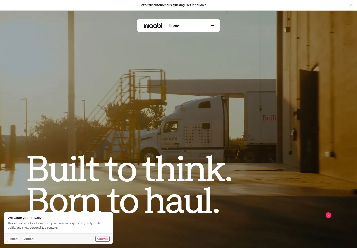
Live capture at 1440px, 2026-10-24
How it’s built
- Layout
- A photographic-looking truck scene fills a rounded page, with a small centered white navigation capsule and a very large white two-line serif headline anchored lower left.
- Type
- High contrast upright serif headline, compact sans navigation; exact fonts unknown.
- Color and surface
- Muted green-gray sky and road imagery, white type and navigation, tiny pink circular cue.
- Components
- A full-field scene carries a large lower-left two-line white serif heading beneath a centered compact white navigation capsule.
What makes it work
- Full-field photographic-looking scene
- Oversized lower-left white serif statement
- Centered white compact navigation capsule
On a new subjectFor a public botanical archive, use a full-field photographic-looking garden scene, a large two-line lower-left white serif statement and centered white navigation capsule.
Prompts
Create an original website image for {{website_name}} in {{industry}}, serving {{audience}}, presenting {{content}} and making {{functionality}} apparent.
INVARIANTS: Use a full-width low-key photograph, a slim announcement strip and a compact floating navigation pill; place a very large multi-line statement low on the image.
TYPOGRAPHY: Use a substantial high-contrast serif statement with tight leading and tiny plain sans utilities.
COLORS AND SURFACES: Warm dark photographic values with pale display text and small white navigation surfaces; exact warm hue is variable.
IMAGERY: Choose one new subject image with clear space behind the lower statement. Trucks, consent overlays and cropped letters are incidental.
VARIABLES: Supply original identity, writing, imagery, accent hues and tasks for {{website_name}}, {{industry}}, {{audience}}, {{content}} and {{functionality}}.
PROHIBITIONS: Do not copy source branding, wording, photographs or signature artwork. Do not turn privacy notices, submission frames or cut-off essential text into style rules. Avoid generic card stacks, extra decorative panels or an unrelated large hero heading when they erase the specified hierarchy.
CONTINUATION: Translate the same relative type scale, alignment and image treatment into the next real content section; give that section a clear purpose rather than duplicating the hero.
RESPONSIVE PROPOSAL: Rebreak and fit the complete serif headline after fonts load, move the pill into safe margins, and place the announcement above rather than over essential content. Render clear, readable original text and subject-appropriate controls with consistent spacing. These proportions are visual reproduction targets, not common measured CSS. The selected still does not establish source fonts, technology, motion, hover or responsive behavior. Preserve those evidence limits; this prompt remains unvalidated.
Build a functioning responsive website for {{website_name}} in {{industry}} for {{audience}}, using {{content}} and working {{functionality}}.
INVARIANTS: Use a full-width low-key photograph, a slim announcement strip and a compact floating navigation pill; place a very large multi-line statement low on the image.
TYPOGRAPHY: Use a substantial high-contrast serif statement with tight leading and tiny plain sans utilities.
COLORS AND SURFACES: Warm dark photographic values with pale display text and small white navigation surfaces; exact warm hue is variable.
IMAGERY: Choose one new subject image with clear space behind the lower statement. Trucks, consent overlays and cropped letters are incidental.
VARIABLES: Supply original identity, writing, imagery, accent hues and tasks for {{website_name}}, {{industry}}, {{audience}}, {{content}} and {{functionality}}.
PROHIBITIONS: Do not copy source branding, wording, photographs or signature artwork. Do not turn privacy notices, submission frames or cut-off essential text into style rules. Avoid generic card stacks, extra decorative panels or an unrelated large hero heading when they erase the specified hierarchy.
CONTINUATION: Carry the relative type scale, alignment and image treatment into appropriate content sections without repeating the hero or inventing irrelevant features.
RESPONSIVE PROPOSAL: Rebreak and fit the complete serif headline after fonts load, move the pill into safe margins, and place the announcement above rather than over essential content. Use semantic reading order, meaningful image descriptions, keyboard-operable controls and visible focus. Check display text bounds after the chosen fonts load at desktop and phone widths; keep complete essential text inside its container. Verify the actual requested actions rather than styling inert controls. Respect reduced-motion preferences if new motion is added. These proportions are visual reproduction targets, not common measured CSS. The selected still does not establish source fonts, technology, motion, hover or responsive behavior. Preserve those evidence limits; this prompt remains unvalidated.
Measured
Fonts loadedZagma, NeueHaas, NeueHaas Fallback
H1150px / 400 / -7.2px
Body text10px
Page background#ffffff
Text color#191818
Page height11,969px
Computed CSS at 1440px, 2026-10-24.
Live behavior
- Today
- Cinematic truck/road imagery fills hero under dark wash. Floating white nav pill sits near top center; oversized white serif two-line headline anchors low left; pink scroll cue and top announcement add small accents. Timed states change footage frame. Hover opens white rounded section menu with thumbnail tiles.
- Responsive
- Desktop 1440x1000 with large two-line overlay; tablet retains floating nav and image, with consent covering content. Mobile wraps title into several lines near bottom; consent occupies much of lower view and occludes text. Sampled desktop, tablet and mobile document heights are 11969, 12475 and 9416 CSS px respectively.
- Scroll
- At y750 headline is partially above viewport; footage, announcement/nav persist and consent stays lower left.


