
Live capture at 1440px, 2026-10-24
How it’s built
- Layout
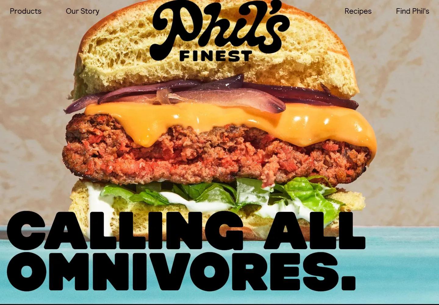
- Gallery-version close photograph fills the opening with a huge stacked sandwich; a compact custom-script identity sits over its upper area and small navigation stays at the top edges. A heavy two-line uppercase slogan overlays the lower food photograph; the bottom of the second line reaches the turquoise strip. Preserve this cross-boundary relationship rather than treating all copy as confined to a lower band.
- Type
- Oversized custom script identity, compact bold uppercase submark, small clean sans navigation and very heavy rounded uppercase slogan. Metrics unknown from gallery raster.
- Color and surface
- Warm bun, cheese and greens against pale backdrop; turquoise band anchors black type. No separate cards or shadows.
- Components
- Top commerce links/basket, logo, full-width food photo, lower band and slogan; no grid in this target.
What makes it work
- Keep the photograph and oversized display lettering as co-dominant layers
- Choose crop and line breaks together so the short message remains readable
- Keep upper utilities small and avoid an opaque text card separating the message from the image
On a new subjectFor a community literacy campaign, use one very large original reading-related photograph with a compact identity high in the composition. Let a short emphatic message cross the lower photographic area and continue onto a contrasting color field, retaining huge rounded display lettering and much smaller utility navigation. Books, people and copy are new content; a burger and the source mark are not requirements.
Prompts
Create a visual direction for {{website_name}} in {{industry}} for {{audience}}, shaping {{content}} and supporting {{functionality}}.
COMPOSITION INVARIANTS: Use a full-bleed close crop of a relevant subject with a narrow top navigation. Place an identity near the upper image area and a very large display statement across the lower foreground, allowing both to overlap the photo. Preserve the observed visual hierarchy and spacing relationships, not the source-specific object inventory.
TYPE: Contrast a bold rounded or expressive display voice with a compact clean sans nav. Keep the statement dominant but legible over image texture. Set a readable scale step between display text, supporting copy, captions, and utilities. Do not name a font family.
SURFACE AND COMPONENTS: Let the photograph set the palette; use dark or light type according to the crop and add a strong contrasting foreground band only if needed. Component roles: Thin top utility row, one close image, small identity, and oversized lower statement. Keep controls visually distinct and subordinate to the main content.
IMAGE DIRECTION: Use a new image that communicates {{content}}; do not retain the sandwich, source mark, or exact food photograph. Proportion estimate from the selected still: Visual estimate: image fills the frame; nav under 6% height; lower statement about 30% height and overlaps photo. Treat it as an estimate, not fixed CSS geometry.
VARIABLES: Adapt names, details, image subjects, palette accents, and working actions to {{website_name}}, {{industry}}, {{audience}}, {{content}}, and {{functionality}}.
PROHIBITIONS: Use original copy and assets. Do not reproduce the source brand, exact wording, photographs, illustrations, products, people, or signature artwork; source-specific objects and motifs are optional only when they genuinely fit the new subject.
CONTINUATION: Continue below the hero with readable detail on a calmer surface so the full-bleed image does not carry every message.
RESPONSIVE PROPOSAL: Re-crop around the new subject, shorten the headline into controlled lines, and move navigation to a clear edge without hiding key content. These are design proposals, not observed mobile behavior. The selected still does not establish source fonts, CSS, implementation technology, motion, or control behavior. Do not present any of those as observed. Implement requested {{functionality}} as working new behavior without implying source validation.
Implement a responsive page for {{website_name}} in {{industry}} for {{audience}}, presenting {{content}} and working {{functionality}}.
INVARIANTS: Use a full-bleed close crop of a relevant subject with a narrow top navigation. Place an identity near the upper image area and a very large display statement across the lower foreground, allowing both to overlap the photo. Keep the same relative prominence and spacing without requiring the same source objects.
TYPE AND SURFACES: Contrast a bold rounded or expressive display voice with a compact clean sans nav. Keep the statement dominant but legible over image texture. Let the photograph set the palette; use dark or light type according to the crop and add a strong contrasting foreground band only if needed. Maintain clear display/body/utility scale, readable line lengths, and sufficient contrast. Components: Thin top utility row, one close image, small identity, and oversized lower statement.
IMAGERY AND SCALE: Use a new image that communicates {{content}}; do not retain the sandwich, source mark, or exact food photograph. Visual estimate only: Visual estimate: image fills the frame; nav under 6% height; lower statement about 30% height and overlaps photo. Use flexible widths and content-led dimensions; do not copy this screenshot's coordinates as fixed values.
VARIABLES: Adapt names, details, image subjects, palette accents, and working actions to {{website_name}}, {{industry}}, {{audience}}, {{content}}, and {{functionality}}.
PROHIBITIONS: Use original copy and assets. Do not reproduce the source brand, exact wording, photographs, illustrations, products, people, or signature artwork; source-specific objects and motifs are optional only when they genuinely fit the new subject.
CONTINUATION: Continue below the hero with readable detail on a calmer surface so the full-bleed image does not carry every message.
RESPONSIVE PROPOSAL: Re-crop around the new subject, shorten the headline into controlled lines, and move navigation to a clear edge without hiding key content. Use semantic content, keyboard-operable controls, visible focus, meaningful alt text, and no clipped content. The selected still does not establish source fonts, CSS, implementation technology, motion, or control behavior. Do not present any of those as observed. Implement requested {{functionality}} as working new behavior without implying source validation.
Measured
Fonts loadedHammer, Relative, Relative Pitch, Plinc Cooper Nouveau
H1180px / 300 / -0.48px
Body text16px
Page backgroundtransparent
Text color#000000
Page height7,349px
Computed CSS at 1440px, 2026-10-24.
Live behavior
- Today
- Desktop t0 shows a close sandwich photograph with huge two-line CALLING ALL OMNIVORES slogan crossing into turquoise, script identity above and nav at the upper edge. At t2 the same hero photograph, slogan and turquoise field remain visible. At y=750, a sticky pale-blue nav sits above a new blue section with bold black headline and hand-drawn illustration. Tablet switches to hamburger and shows the burger image, with slogan lower on a turquoise region. Mobile stacks identity, image and slogan; reduced-motion frame resembles normal mobile. Hover locator timed out on a product text target.
- Responsive
- Desktop 1440x1000 uses full-bleed hero and edge navigation; tablet 768x1024 uses hamburger and vertically separated image/large title; mobile 390x844 stacks logo, burger image, turquoise slogan field and down arrow. Document heights 7349, 8807, and 7112 CSS px.
- Scroll
- At y=750 a pale-blue sticky nav remains while the next blue content section shows a large black slogan and hand-drawn food illustration.


