
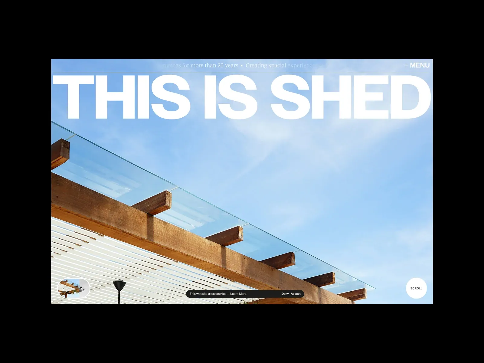
Gallery screenshot, saved 2026-10-24
How it’s built
- Layout
- Architectural photo in black surround, with hairline and small caption above enormous white uppercase words. Timber roof crosses diagonally beneath against open sky. Small round controls anchor lower corners; narrow consent strip overlays bottom. Transfer oversized type on calm photo with edge controls. Surround may be capture framing; consent is transient. Crop does not prove intentional clipping; responsive behavior unknown. The title occupies the top portion of the photo while the building’s diagonal timber edge supplies a counter-direction below it. Large type is aligned close to the image edges; small controls and metadata remain subordinate. The sky offers low-detail contrast behind the headline, while the architecture contributes the subject below. Any new composition should choose a photograph with enough calm area behind the text rather than assume a white title works on every image. The circular lower controls create clear corner anchors, but their function and fixed positioning are unknown. The consent text is visibly an overlay and should not be confused with core page content. This frame is insufficient to decide whether the giant heading scales down, wraps, or changes placement on smaller screens. Avoid treating the screenshot’s crop as a validated responsive state.
- Type
- A very large heavy white uppercase statement nearly spans the photograph’s width and sits across the open sky. Tiny caption and menu labels occupy the top rule; lower corner controls use compact sans text. The hierarchy is extreme, from near-edge display type to micro-utility. Exact family and metrics are unknown.
- Color and surface
- A calm blue sky sits behind the white type; a warm timber roof enters diagonally across the lower area. The image appears inside a black surround. Small white circular controls and a thin top rule are visible. A narrow dark cookie prompt overlays the bottom and is transient.
- Components
- Top caption/rule and menu, oversized headline, small circular image/scroll controls, lower-left thumbnail and consent strip. Consent UI is not an essential page component.
What makes it work
- Reserve adequate contrast behind display copy
- Use one dominant statement and a supporting subject image
- Keep navigation and controls far smaller than the headline
On a new subjectFor an outdoor gear announcement, choose a landscape where the trail or structure counterbalances a large readable headline. Place compact navigation at the edge and preserve contrast with image selection or a measured overlay. Do not copy the cookie strip or assume the crop should clip text.
Prompts
Create an original website image for {{website_name}} in {{industry}}, serving {{audience}}, presenting {{content}} and making {{functionality}} apparent.
INVARIANTS: Use a wide architecture-like photographic plane beneath a fine top rule and tiny utilities, with a monumental uppercase statement spanning nearly the image width.
TYPOGRAPHY: Use heavy plain uppercase sans for the statement and very small neutral utility labels.
COLORS AND SURFACES: Bright pale letters over a clear colored image; retain dark/light separation at letter edges.
IMAGERY: Use an original spatial photograph with strong planes and room for the headline; gallery surround and consent controls are incidental.
VARIABLES: Supply original identity, writing, imagery, accent hues and tasks for {{website_name}}, {{industry}}, {{audience}}, {{content}} and {{functionality}}.
PROHIBITIONS: Do not copy source branding, wording, photographs or signature artwork. Do not turn privacy notices, submission frames or cut-off essential text into style rules. Avoid generic card stacks, extra decorative panels or an unrelated large hero heading when they erase the specified hierarchy.
CONTINUATION: Translate the same relative type scale, alignment and image treatment into the next real content section; give that section a clear purpose rather than duplicating the hero.
RESPONSIVE PROPOSAL: Preserve the bold overlay at a large readable scale, fit complete words within safe bounds, and crop the photograph independently of the text. Render clear, readable original text and subject-appropriate controls with consistent spacing. These proportions are visual reproduction targets, not common measured CSS. The selected still does not establish source fonts, technology, motion, hover or responsive behavior. Preserve those evidence limits; this prompt remains unvalidated.
Build a functioning responsive website for {{website_name}} in {{industry}} for {{audience}}, using {{content}} and working {{functionality}}.
INVARIANTS: Use a wide architecture-like photographic plane beneath a fine top rule and tiny utilities, with a monumental uppercase statement spanning nearly the image width.
TYPOGRAPHY: Use heavy plain uppercase sans for the statement and very small neutral utility labels.
COLORS AND SURFACES: Bright pale letters over a clear colored image; retain dark/light separation at letter edges.
IMAGERY: Use an original spatial photograph with strong planes and room for the headline; gallery surround and consent controls are incidental.
VARIABLES: Supply original identity, writing, imagery, accent hues and tasks for {{website_name}}, {{industry}}, {{audience}}, {{content}} and {{functionality}}.
PROHIBITIONS: Do not copy source branding, wording, photographs or signature artwork. Do not turn privacy notices, submission frames or cut-off essential text into style rules. Avoid generic card stacks, extra decorative panels or an unrelated large hero heading when they erase the specified hierarchy.
CONTINUATION: Carry the relative type scale, alignment and image treatment into appropriate content sections without repeating the hero or inventing irrelevant features.
RESPONSIVE PROPOSAL: Preserve the bold overlay at a large readable scale, fit complete words within safe bounds, and crop the photograph independently of the text. Use semantic reading order, meaningful image descriptions, keyboard-operable controls and visible focus. Check display text bounds after the chosen fonts load at desktop and phone widths; keep complete essential text inside its container. Verify the actual requested actions rather than styling inert controls. Respect reduced-motion preferences if new motion is added. These proportions are visual reproduction targets, not common measured CSS. The selected still does not establish source fonts, technology, motion, hover or responsive behavior. Preserve those evidence limits; this prompt remains unvalidated.


