
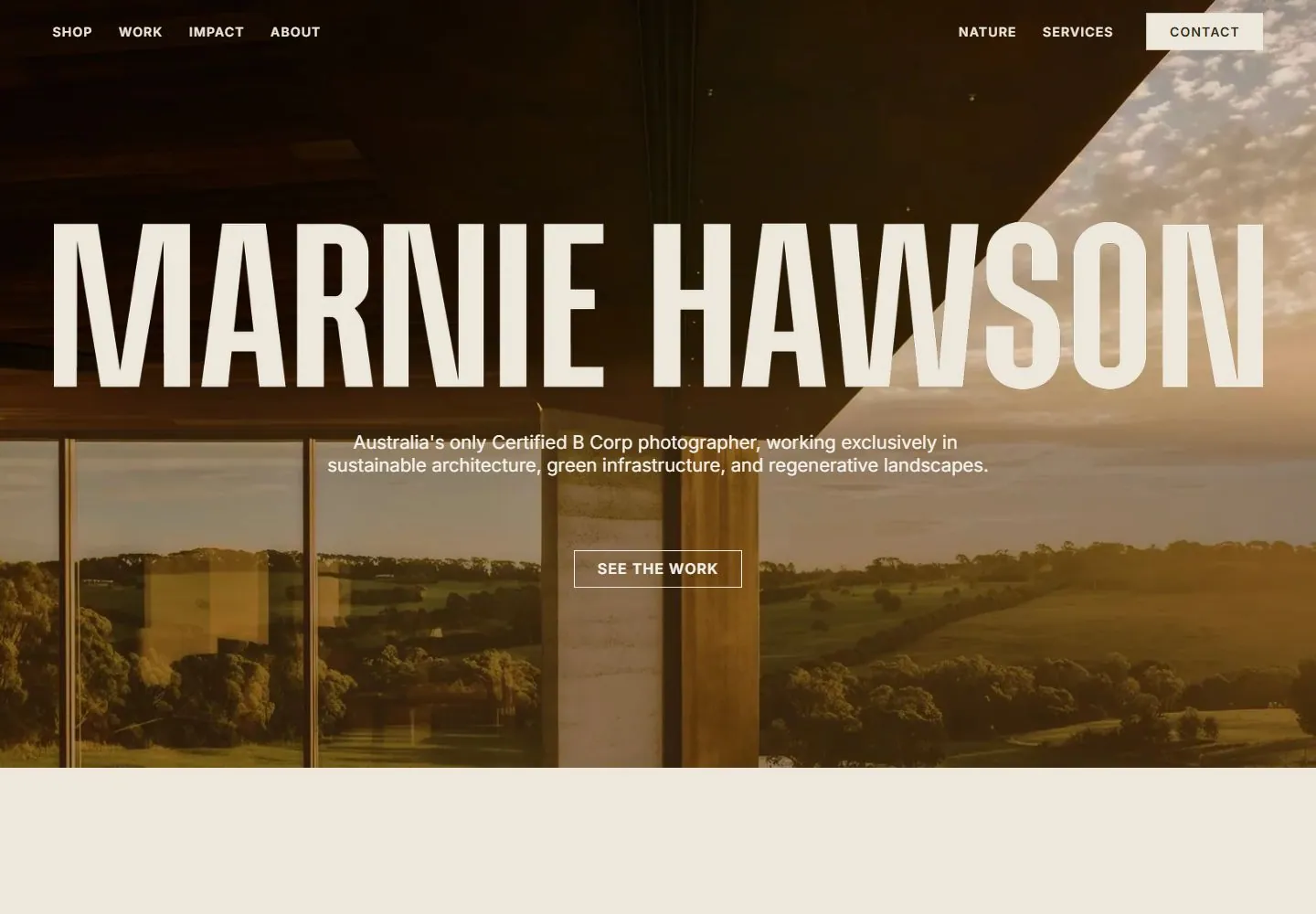
Live capture at 1440px, 2026-10-24
How it’s built
- Layout
- Muted olive-green field with a widely tracked white name centered at top, hamburger at upper left and two social icons at upper right. Lower composition splits into a tall rectangular architectural photograph at left and a large four-line white statement at right. Broad negative space fills the area around these elements.
- Type
- Thin, widely tracked uppercase name at top and large clean sans sentence at right. Exact family and dimensions unavailable in the gallery raster.
- Color and surface
- Uniform olive ground with white text; photo contributes pale stone, gray-blue sky and muted city tones. No visible cards, borders or shadows.
- Components
- Menu glyph, centered personal wordmark, social icons, one architectural photo and adjacent statement.
What makes it work
- Solid muted ground
- One tall image
- Adjacent statement
- Sparse edge navigation
On a new subjectPair one portrait-format example with a concise adjacent statement on a quiet background. Keep the margins generous; substitute a relevant image and identity.
Prompts
Create an original website image for {{website_name}} in {{industry}}, serving {{audience}}, presenting {{content}} and making {{functionality}} apparent.
INVARIANTS: Overlay a near-full-width condensed identity across a wide image; center a short narrow introduction and outlined action beneath the name; keep small utilities at opposite upper corners.
TYPOGRAPHY: Use very tall condensed uppercase identity type and small quiet sans supporting text.
COLORS AND SURFACES: A warm or muted tonal photograph supports pale lettering; use one subdued neutral band below if content continues.
IMAGERY: Use one original environmental photograph; architecture and the source identity are variables.
VARIABLES: Supply original identity, writing, imagery, accent hues and tasks for {{website_name}}, {{industry}}, {{audience}}, {{content}} and {{functionality}}.
PROHIBITIONS: Do not copy source branding, wording, photographs or signature artwork. Do not turn privacy notices, submission frames or cut-off essential text into style rules. Avoid generic card stacks, extra decorative panels or an unrelated large hero heading when they erase the specified hierarchy.
CONTINUATION: Translate the same relative type scale, alignment and image treatment into the next real content section; give that section a clear purpose rather than duplicating the hero.
RESPONSIVE PROPOSAL: Break the identity deliberately while keeping substantial letter height, then center the short introduction and action below it without shrinking all text together. Render clear, readable original text and subject-appropriate controls with consistent spacing. These proportions are visual reproduction targets, not common measured CSS. The selected still does not establish source fonts, technology, motion, hover or responsive behavior. Preserve those evidence limits; this prompt remains unvalidated.
Build a functioning responsive website for {{website_name}} in {{industry}} for {{audience}}, using {{content}} and working {{functionality}}.
INVARIANTS: Overlay a near-full-width condensed identity across a wide image; center a short narrow introduction and outlined action beneath the name; keep small utilities at opposite upper corners.
TYPOGRAPHY: Use very tall condensed uppercase identity type and small quiet sans supporting text.
COLORS AND SURFACES: A warm or muted tonal photograph supports pale lettering; use one subdued neutral band below if content continues.
IMAGERY: Use one original environmental photograph; architecture and the source identity are variables.
VARIABLES: Supply original identity, writing, imagery, accent hues and tasks for {{website_name}}, {{industry}}, {{audience}}, {{content}} and {{functionality}}.
PROHIBITIONS: Do not copy source branding, wording, photographs or signature artwork. Do not turn privacy notices, submission frames or cut-off essential text into style rules. Avoid generic card stacks, extra decorative panels or an unrelated large hero heading when they erase the specified hierarchy.
CONTINUATION: Carry the relative type scale, alignment and image treatment into appropriate content sections without repeating the hero or inventing irrelevant features.
RESPONSIVE PROPOSAL: Break the identity deliberately while keeping substantial letter height, then center the short introduction and action below it without shrinking all text together. Use semantic reading order, meaningful image descriptions, keyboard-operable controls and visible focus. Check display text bounds after the chosen fonts load at desktop and phone widths; keep complete essential text inside its container. Verify the actual requested actions rather than styling inert controls. Respect reduced-motion preferences if new motion is added. These proportions are visual reproduction targets, not common measured CSS. The selected still does not establish source fonts, technology, motion, hover or responsive behavior. Preserve those evidence limits; this prompt remains unvalidated.
Measured
Fonts loadedsöhne-schmal-xhvmpo, Poppins
H120.2px / 400
Body text16px
Page background#eee8dc
Text color#2d2e1c
Page height16,319px
Computed CSS at 1440px, 2026-10-24.
Live behavior
- Today
- The current live landing view uses a full-bleed warm architectural/landscape photograph with dark overlay, a very large centered cream MARNIE HAWSON name, centered professional summary, outlined SEE THE WORK action, and compact white navigation across the top. Desktop t0 and t2 screenshots appear visually identical at saved resolution. Hovering SHOP adds an underline; no menu is visible. At scrollY 750, a pale WORK section appears with bold/italic editorial heading, short text, and large project photographs; the top navigation remains at the viewport top. Tablet retains the hero but switches to a menu icon and shows the next section below; mobile stacks description/action beneath a reduced single-line name and exposes the next section.
- Responsive
- Captured at 1440×1000, 768×1024, and 390×844. Desktop has full horizontal navigation and a large centered name. Tablet uses a menu icon and retains a broad hero with the next section beginning below. Mobile uses a menu icon, a smaller single-line name, wrapped centered copy and action, then a stacked editorial section. These are captured-state descriptions only.
- Scroll
- Desktop scroll state reports scrollY 750 and visibly shows the WORK heading, explanatory text, and two large project-image cards. Navigation remains across the top of the viewport in the captured state.


