
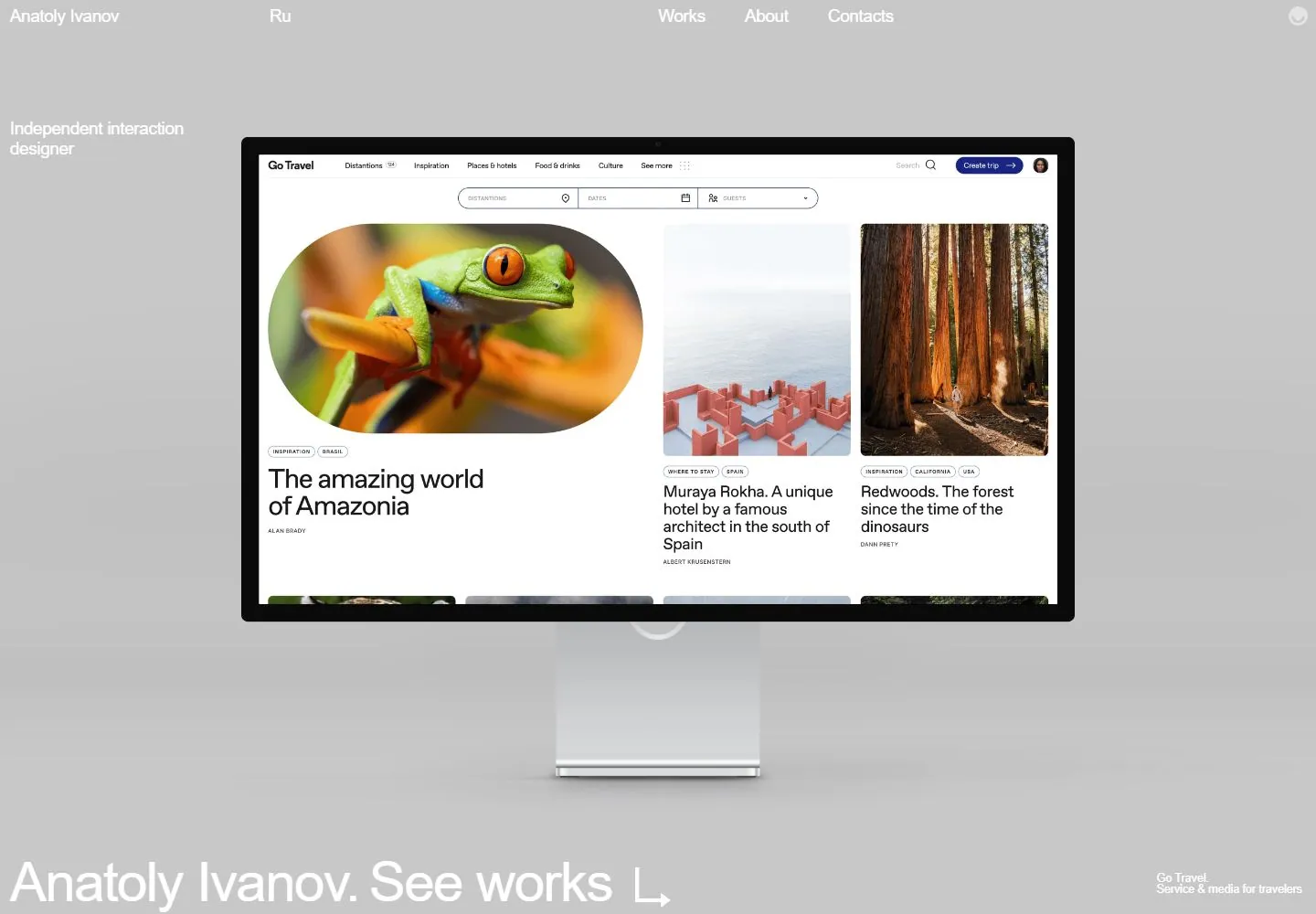
Live capture at 1440px, 2026-10-24
How it’s built
- Layout
- Black field; large central tilted laptop project image, sparse white top links/left role, large lower-left name/action; nested website text belongs to depicted project.
- Type
- Small regular white sans navigation and role; large regular lower-left identity/action. Type within the laptop is depicted project content.
- Color and surface
- Black photographic field, white enclosing text and a dark metallic laptop carrying a bright nested project image.
- Components
- Distributed header links, small left role, central angled laptop, low identity/action and tiny project credit.
What makes it work
- Large angled laptop project image on black with sparse white edge labels and a low identity/action.
On a new subjectFor a digital manuscript archive, feature an angled reader-device image on black with sparse white metadata and a large low collection action.
Measured
H118.72px / 450 / -1.8px
Body text18px
Page background#ffffff
Text color#000000
Page height7,227px
Computed CSS at 1440px, 2026-10-24.
Live behavior
- Today
- The desktop opening frame uses a flat pale-gray field, a very sparse top row (Anatoly Ivanov, Ru, Works, About, Contacts), a small “Independent interaction designer” label at left, and a large centered monitor mockup containing a travel-site design. A very large white “Anatoly Ivanov. See works” line anchors the bottom edge. The recorded hover frame is near-black with the same sparse header and bottom line, while the monitor is not visible. At actual desktop scrollY 750, a white introduction section appears with a large career statement and project captions. Tablet and phone use a compact header, left-aligned bio, and project imagery; phone images differ between the ordinary and fresh reduced-motion reloads. The separately selected gallery page depicts a different studio and artwork.
- Responsive
- The desktop viewport is 1440×1000 with document height 7227px; the measured scroll frame is at scrollY 750. Tablet is 768×1024 with document height 21740px, and phone is 390×844 with document height 13433px. The measured career statement on the desktop scroll frame uses a 60.48px line height; the phone bio uses 23.4px, and the phone “Anatoly Ivanov. See works” line uses 35.178px. Captured text samples report Arial. These viewport samples do not establish breakpoints.
- Scroll
- The desktop-scroll screenshot is measured at actual scrollY 750 in a 7227px document. It shows the large career statement, a “Learn more” link, company-name copy, and the start of three project columns. This single capture does not establish sticky navigation or the scrolling mechanism.


