
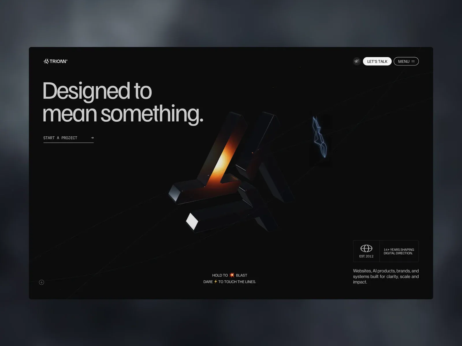
Screenshot from Awwwards, saved 2026-10-24
How it’s built
- Layout
- A dark almost-black rounded rectangular page sits on a soft gray-blue outer field. Inside, navigation is a compact row at the top: wordmark left, then sound toggle, Let's Talk, and outlined Menu at right. The main heading sits left in the upper quarter, broken into two lines and aligned to a generous inner margin. A subtle abstract angular object glows at center-right; fine diagonal lines traverse the field and a small lightning motif marks the object. Bottom information is divided into an age/experience box at right, a short description below it, a two-line playful instruction near center, and a small circular scroll hint at lower left. The layout preserves extensive black space around the copy and object.
- Type
- The headline uses a large clean sans in light-to-regular weight, pale gray, with compact line spacing. Small navigation labels are uppercase, while the descriptor and footer copy are small sans with more relaxed leading. A mono-like uppercase start-project link has a thin underline and right arrow. The typography has a clear size hierarchy but no decorative serif contrast. Exact font identity is not readable from the screenshot and is not asserted.
- Color and surface
- Deep black page surface contrasts with a cool blue-gray outside background. The abstract central shape is predominantly black, with controlled amber-orange internal light, one bright white facet, and a faint electric-blue line/bolt. Most copy is light gray instead of pure white. Borders are fine and dark gray. The top action is white filled with dark lettering; Menu is a transparent dark pill with light outline. No noticeable shadow beyond the lighting on the central object.
- Components
- Top-left brand; right-side sound control, filled contact CTA, and outlined menu. One underlined project action sits below the heading. At bottom right, a divided rectangular trust/experience panel pairs a simple globe-like icon with short tenure text. Small scroll icon and slogan support page orientation. The central abstract render supports rather than replaces the headline.
What makes it work
- dark spacious canvas
- left-aligned two-line message
- one restrained illuminated abstract form
- compact action/navigation set
On a new subjectPair a studio proposition with a single subdued abstract representation of the work; use one crisp contact action and small perimeter controls, avoiding extra decorative panels.
Live behavior
- Today
- The dated live captures show a near-black hero with a compact white TRIONN wordmark and outlined utility controls. The desktop hero places the large, pale “Designed to mean something.” heading at upper left with two small contact links beneath it, balanced by a dark angular central object crossed by fine orbit-like lines. Amber-orange light appears on parts of the central mark/object. At the measured y=750 state, an oversized About statement crosses the dark field with the studio credentials and short description toward the upper right. Tablet and phone frames show more partial, softened headline lettering and a large faint mark. The separate reduced-motion fresh-load screenshot is a pale-gray mark-and-tagline splash; it is retained as a separate frame, not merged with the dark responsive hero states.
- Responsive
- Paired measurements report viewports of 1440×1000 desktop, 768×1024 tablet, and 390×844 phone; each screenshot JPEG has matching dimensions. The logged desktop-scroll measurement is at actual document scroll_y=750. Desktop t0 reports document height 7104 px, while later desktop t2/hover/scroll report 28104 px; this captured difference means document height is not treated as a stable page-layout invariant. Tablet and ordinary phone measurements report 5 sampled Web Animations entries each; desktop t0/t2/hover/scroll and the separate reduced-motion fresh load report 0. The usual phone capture reports reduced_motion=false; the distinct fresh-load phone reports true. These are four discrete responsive/preference samples, not breakpoint boundaries or a controlled preference comparison.
- Scroll
- The desktop-scroll measurement and log both record scroll_y=750 in a 1440×1000 viewport. The screenshot shows the ABOUT label and large studio statement over the dark visual field, while the top-right credentials/description remain in view. A single saved position establishes neither a scroll-trigger nor intervening page behavior.


