
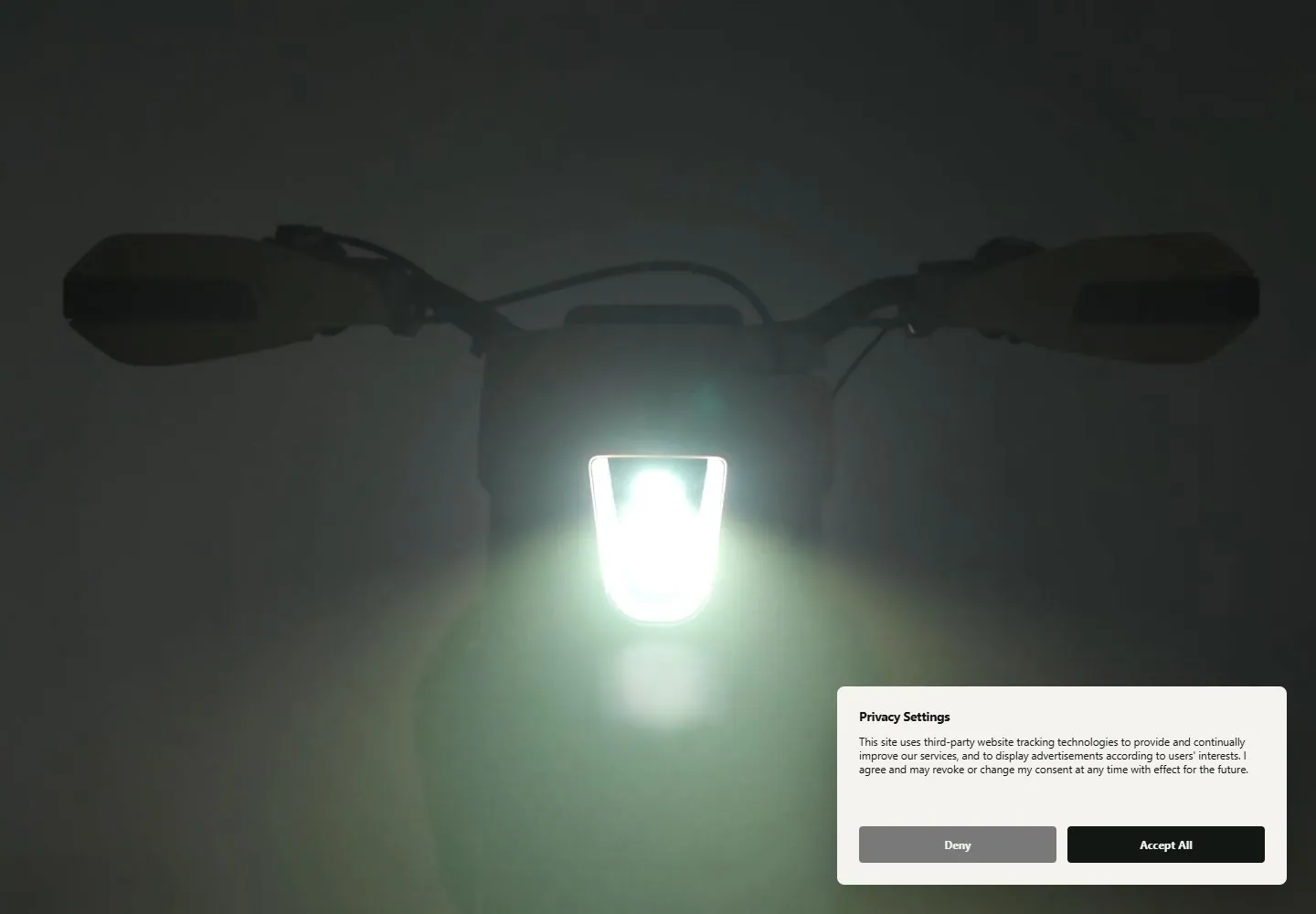
Live capture at 1440px, 2026-10-24
How it’s built
- Layout
- A large yellow enduro motorcycle faces forward at center on a neutral gray page. A compact header spans the top; small copy and actions sit at lower left, a riding-video thumbnail at lower right, and a scroll cue near the lower center. Rounded edge is likely presentation framing.
- Type
- Compact sans navigation and body text are subordinate to the central product image. Exact font and metrics unknown.
- Color and surface
- Neutral gray canvas, vivid yellow motorcycle, dark accents, and small muted content blocks.
- Components
- Centered full product view, compact top navigation, lower-left text/actions, lower-right video tile and lower-center scroll cue.
What makes it work
- Single dominant centered product view
- Small navigation
- Separated lower-corner information and media
On a new subjectFor a diagnostic-imaging equipment maker, center one complete scanner or instrument as the main page image, keep navigation compact, and place concise information with one explanatory media preview in separated lower corners. Replace the motorcycle and riding content with clinical equipment and substantiated details.
Prompts
Create a transferable visual direction for {{website_name}} in {{industry}} for {{audience}}, presenting {{content}} and supporting {{functionality}}. Composition rule: Use a very dark hero with one central low-key silhouette or subject and a concentrated luminous focal point that creates a soft surrounding halo. Keep generous dark negative space and avoid adding unrelated overlays to the visual recipe. Type character/hierarchy: If copy is included, make it restrained and secondary to the illuminated subject; do not force a headline absent from the reference. Palette and contrast: Use charcoal or near-black against a bright contained light, with a gentle cool halo; select a target-appropriate light color. Image/component hierarchy: Use new subject-appropriate photography or illustration and lighting; do not require a lamp, the same device silhouette or a consent panel. Visual estimate from the selected reference image, not a measured CSS value: Visual estimate: silhouette spans about 80% width but is dim; the bright focal light occupies under 10% of the area. Consent-panel dimensions are incidental and excluded from the transfer targets. Treat it as a flexible proportion. Variables: provide original identity, wording, imagery, hues and working actions for {{website_name}}, {{industry}}, {{audience}}, {{content}} and {{functionality}}. Source people, objects, products, exact artwork, logo shapes and text must never be required; select imagery specifically suited to the new subject. Do not infer named typefaces, technology, CSS values, effects or control behavior from a still. Continue the same scale and spacing logic into relevant lower content. Preserve the central glow while lowering surrounding detail and keeping any new controls outside the focal light area.
Implement a responsive page for {{website_name}} in {{industry}} for {{audience}}, with {{content}} and functional {{functionality}}. Desktop layout: Use a very dark hero with one central low-key silhouette or subject and a concentrated luminous focal point that creates a soft surrounding halo. Keep generous dark negative space and avoid adding unrelated overlays to the visual recipe. Typography: If copy is included, make it restrained and secondary to the illuminated subject; do not force a headline absent from the reference. Surface contrast: Use charcoal or near-black against a bright contained light, with a gentle cool halo; select a target-appropriate light color. Image and component roles: Use new subject-appropriate photography or illustration and lighting; do not require a lamp, the same device silhouette or a consent panel. Visual estimate from the selected reference image, not a measured CSS value: Visual estimate: silhouette spans about 80% width but is dim; the bright focal light occupies under 10% of the area. Consent-panel dimensions are incidental and excluded from the transfer targets. Treat it as a flexible proportion. Variables: provide original identity, wording, imagery, hues and working actions for {{website_name}}, {{industry}}, {{audience}}, {{content}} and {{functionality}}. Source people, objects, products, exact artwork, logo shapes and text must never be required; select imagery specifically suited to the new subject. Do not infer named typefaces, technology, CSS values, effects or control behavior from a still. Continue the same scale and spacing logic into relevant lower content. Preserve the central glow while lowering surrounding detail and keeping any new controls outside the focal light area. Use semantic text, useful image descriptions, and meaningful control labels. Provide keyboard operation and visible focus for new controls. Do not implement cookie or consent overlays as part of the style; behavior shown in static reference controls remains unverified.
Measured
Fonts loadedIbmplexmono, Instrumentsans
H160px / 500 / -1.5px
Body text12px
Page background#f5f3ef
Text color#121714
Page height12,180px
Computed CSS at 1440px, 2026-10-24.
Live behavior
- Today
- Desktop hero centers front-on yellow/black bike on gray. Header and small utility nav sit high; headline/actions anchor bottom left; privacy dialog covers lower right. Hover over Discover EXR visibly adds a dark translucent nav band. Scroll y750 shows side-profile bike on light background with privacy panel still open.
- Responsive
- Desktop 1440x1000 shows the frontal bike. Tablet and ordinary mobile captures are sparse and light with a small video tile and partially obscuring privacy dialog. The separate fresh reduced-motion mobile load shows the frontal bike and consent sheet; both mobile captures report scrollY 0. Initialization and preference are confounded; neither the missing ordinary image nor the fresh image establishes a preference effect.
- Scroll
- At y750 side-on bike render and lighter stage replace the front view. Consent panel remains.


