
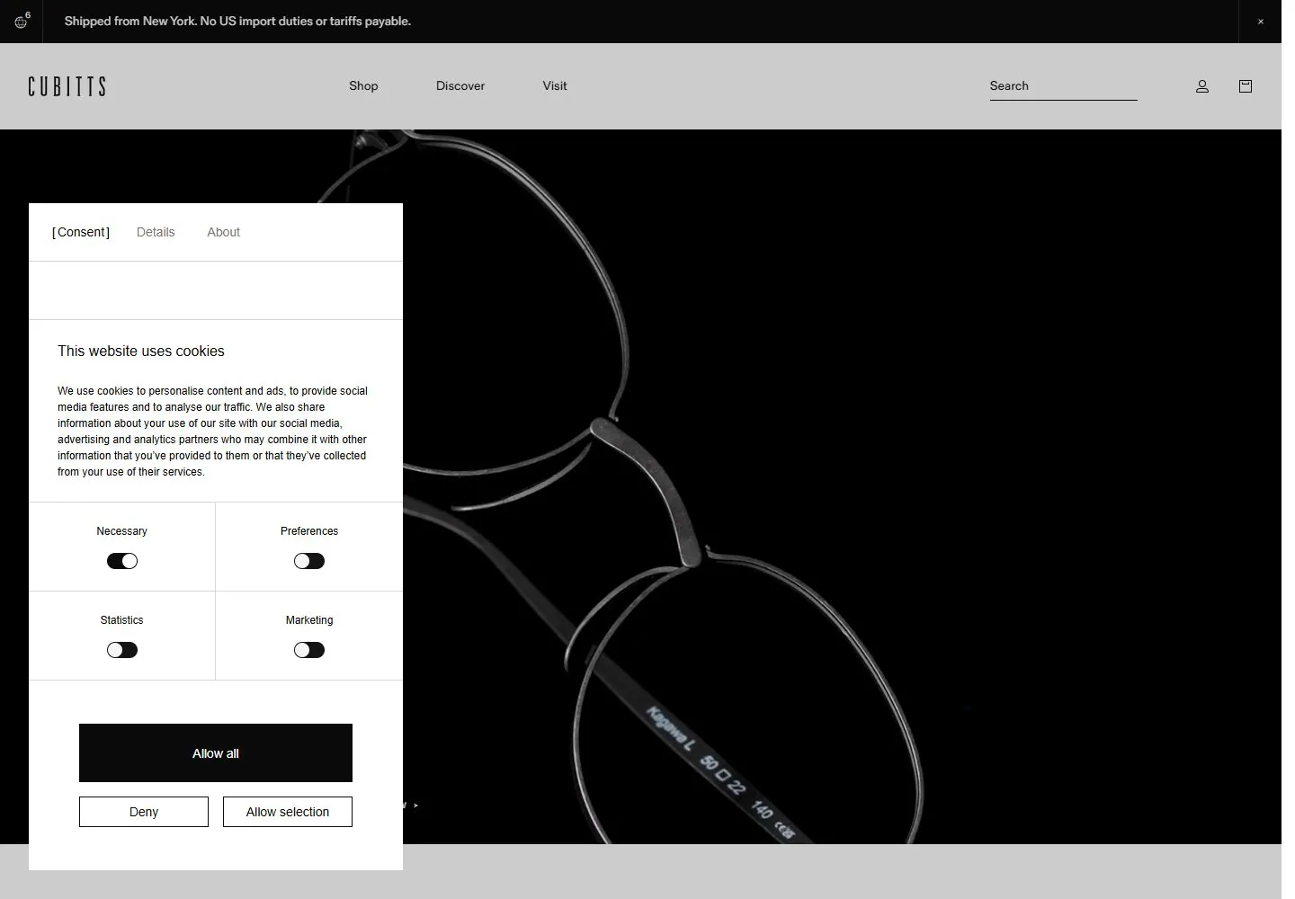
Live capture at 1440px, 2026-10-24
How it’s built
- Layout
- Light page with a narrow header above a large close-up portrait; small lower labels and a larger two-line caption sit beneath the image.
- Type
- Narrow spaced uppercase identity, small regular sans navigation and larger regular caption.
- Color and surface
- Warm neutral portrait image with off-white field and black text.
- Components
- Sparse header, dominant close-up portrait and asymmetric lower captions.
What makes it work
- Dominant close-up portrait
- sparse header
- asymmetric captions below
- off-white field
On a new subjectFor a public oral-history archive, use a large close-up portrait with sparse header and asymmetric small and larger captions below on off-white.
Measured
Fonts loadedFold Grotesque
H116px / 400
Body text16px
Page background#ffffff
Text color#0b0b0b
Page height8,751px
Computed CSS at 1440px, 2026-10-24.
Live behavior
- Today
- Desktop begins with a black announcement strip, pale navigation bar, monochrome close-up eyewear image, and a large consent/preferences panel covering much of the left side. The panel remains in t2 while announcement copy and media frame change. At y=750 the page shows three product/category columns. Tablet/mobile retain the header but the consent interface occupies most of the view. Four page errors were logged; hover locator timed out.
- Responsive
- Desktop 1440x1000 has broad nav and image hero; 768x1024 keeps logo and utility icons above image with consent panel below; 390x844 narrows to a compact announcement and consent settings dominate. Measured document heights are 8751, 12126, and 8127 CSS px respectively.
- Scroll
- At scrollY=750, the image hero gives way to a product/category row with large images, concise headings, and explanatory text.


