
Live capture at 1440px, 2026-10-24
How it’s built
- Layout
- White field; overlapping rounded portrait/object tiles form a central open ring; sparse corner labels, lower-right paragraph, three low numbered ruled markers.
- Type
- Small regular black sans identity and utilities; modest lower-right explanatory paragraph and numbered lower markers.
- Color and surface
- White unbordered field, black text, colorful and monochrome image tiles with pronounced rounded corners.
- Components
- Overlapping portrait/object tiles, sparse corner links, lower-right introduction and three numbered ruled markers along the bottom.
What makes it work
- Rounded overlapping image tiles arranged as an open central ring on white, framed by sparse edge text.
On a new subjectFor a natural-history collection, arrange rounded specimen photographs around a central gap, with quiet edge labels and a short curator note.
Measured
Fonts loadedppNeueMontreal, ppNeueMontreal Fallback
Body text16px
Page background#fefefe
Text color#1c1c1e
Page height1,000px
Computed CSS at 1440px, 2026-10-24.
Live behavior
- Today
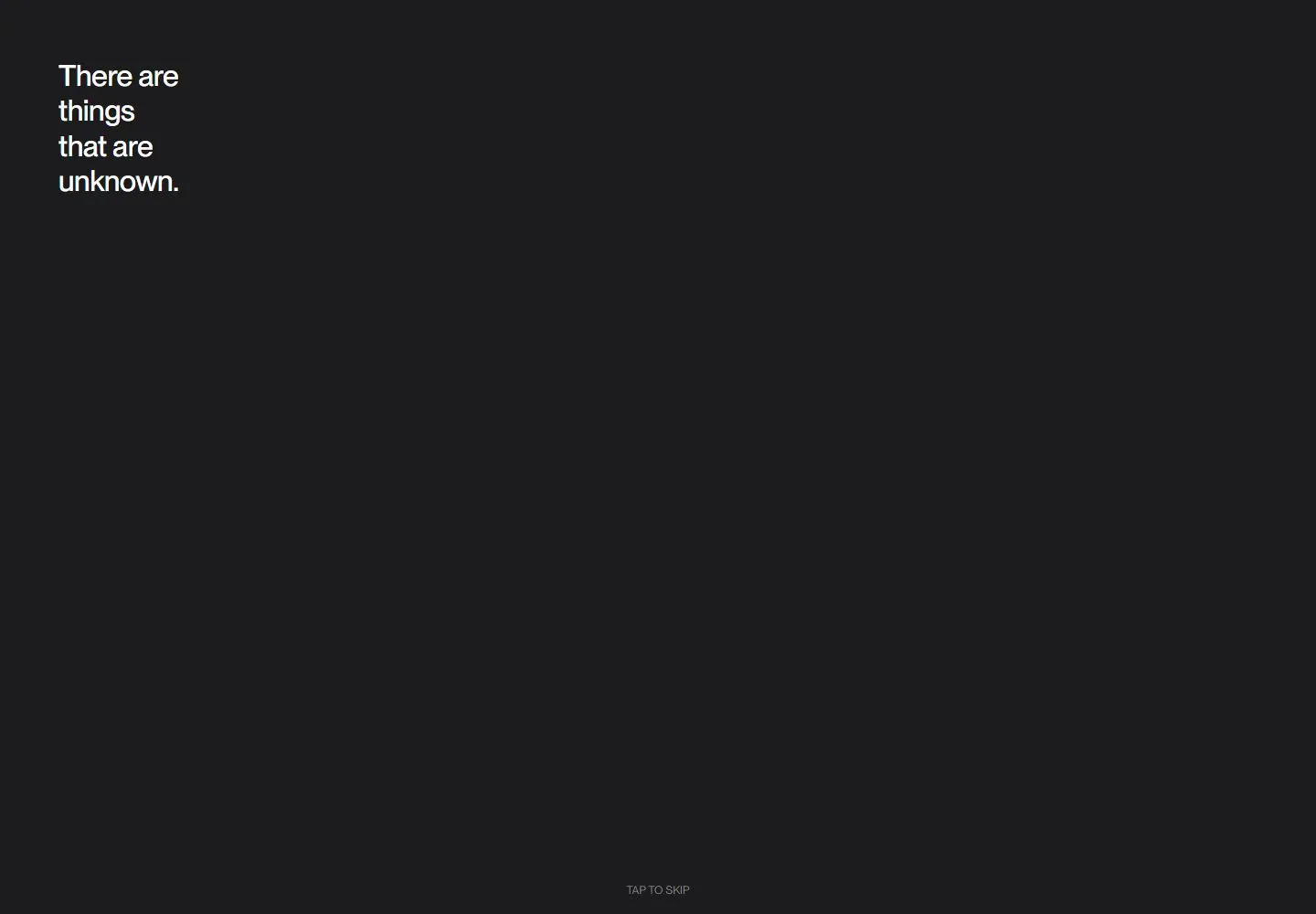
- The six bound state captures show two visually different compositions. The three desktop frames show a charcoal-black intro with white text fragments such as “There are things that are unknown,” “Things known only through experimentation,” and “Testing our limits to expose our many flaws”; a small “TAP TO SKIP” label appears near the bottom. Tablet and ordinary phone frames also show a dark intro with white text and “TAP TO SKIP.” Only the separate mobile-reduced-motion-fresh-load frame shows the white Order & Chaos portfolio collage with wordmark, Reason and Samples links, overlapping rounded project images, a description paragraph and three numbered bars. The selected gallery file depicts a separate “Forward through digital design” page with a turquoise G mark and collage and is excluded from these observations.
- Responsive
- All six viewports are at y=0 and the measured document matches the viewport: desktop 1440×1000, tablet 768×1024 and phone 390×844. The three desktop frames show different subsets of intro copy; tablet and ordinary phone show the same dark intro composition with white text and “TAP TO SKIP.” The separately loaded mobile-reduced-motion-fresh-load frame shows the white Order & Chaos portfolio collage. These are captured outputs at sampled widths; the different phone captures do not establish a responsive transformation, breakpoint or cause.
- Scroll
- The desktop-scroll-labeled capture still records y=0 in a 1440×1000 document and shows an additional intro text fragment. It is not evidence of a lower-page scroll position.


