
Live capture at 1440px, 2026-10-24
How it’s built
- Layout
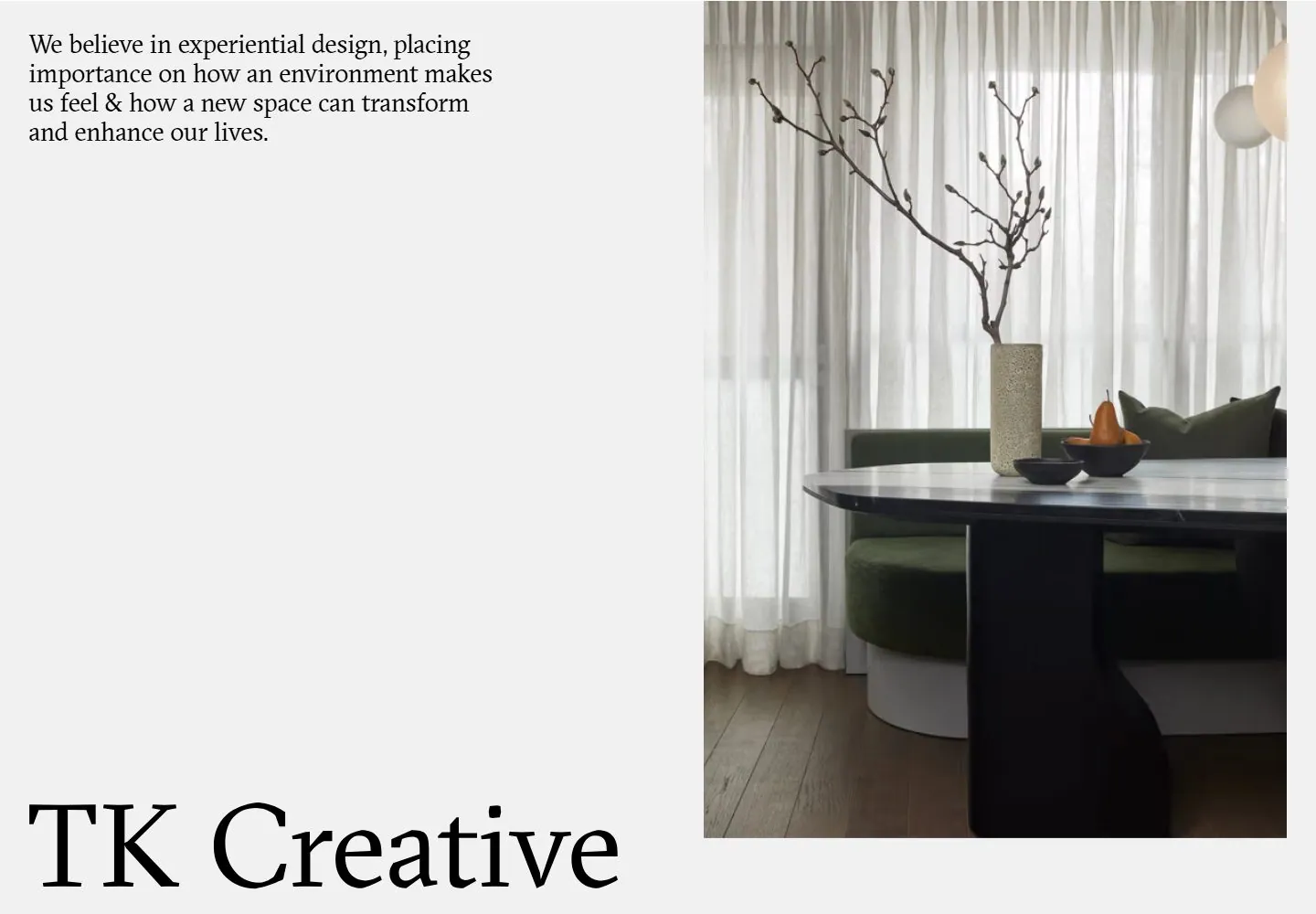
- Pale field divided into a left text area and large interior image at right; small serif paragraph at upper left and oversized serif identity near bottom.
- Type
- Black serif paragraph and much larger regular serif identity.
- Color and surface
- Pale gray, black and muted interior colors.
- Components
- Upper-left text, large right image and low identity.
What makes it work
- Small serif introduction above a large low serif identity beside a tall image.
On a new subjectFor a botanical archive, place a small serif introduction and large low title beside a plant image.
Live behavior
- Today
- Desktop frames show a pale gray canvas, black serif statement at upper left, oversized serif identity at lower left and large rectangular interior photography on the right. The selected reference shows this same asymmetric composition.
- Responsive
- At 768px and 390px the statement, large inset photo and oversized identity appear vertically stacked; the phone has narrower margins and smaller text than the tablet. Screenshots support these sampled arrangements but not exact breakpoint thresholds.
- Scroll
- Desktop scrollY changes from 248 to 810 across saved states. The statement and oversized identity remain in the same screen positions while the right-side photographs move upward and another image enters; the stills suggest a pinned text region but do not prove implementation or full scroll range.


