
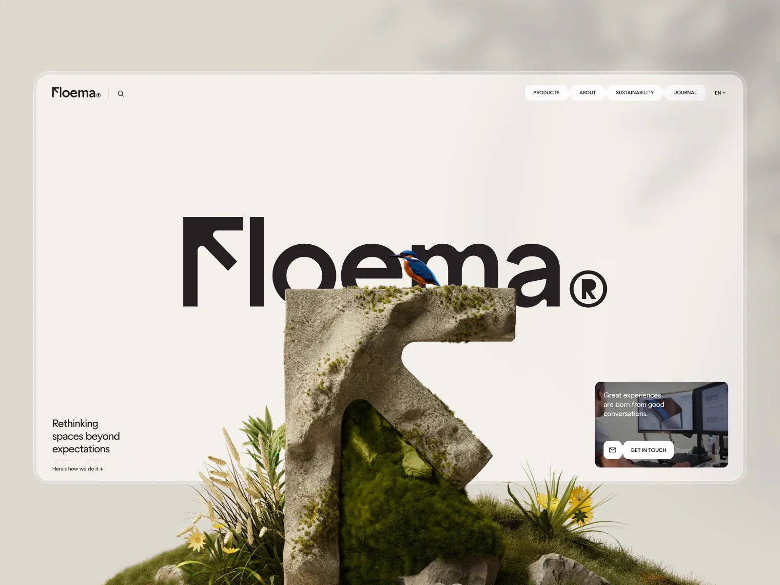
Screenshot from Awwwards, saved 2026-10-24
How it’s built
- Layout
- Within a pale bounded panel, an enormous black wordmark sits behind a moss-covered stone-like angular form with a bird perched above. Small left identity and search, top-right white navigation tabs, bottom-left brief text and a small bottom-right image/contact card surround the central composition. The vegetation extends beyond the panel into the gallery montage; its page membership there is uncertain.
- Type
- Huge geometric black sans wordmark, small clean sans navigation, modest multiline lower-left copy. Exact font and metrics unknown.
- Color and surface
- Warm off-white ground, black type, muted green moss and a vivid blue/orange bird; white rounded tabs and a photographic contact card.
- Components
- Wordmark, central mossy angular object and bird, tabs, brief copy and small contact card.
What makes it work
- Pale field and oversized black geometric wordmark
- Moss-covered angular object layered in front
- Small perched bird above the object
- Compact navigation and lower-corner copy/card
On a new subjectFor a community reading initiative, place an original moss-covered angular book-support sculpture and a small perched bird in front of a huge black geometric initiative name on pale ground, with brief corner copy and a small contact card.
Live behavior
- Today
- The live FLOEMA page uses a pale cream ground with product and interior imagery distributed across a spacious hero. A large Cookiebot consent panel covers a substantial central area in every assigned viewport. Desktop imagery and headline fragments remain visible around the panel; at phone size, the consent sheet occupies most of the view and its category controls and buttons become a vertical stack. The Awwwards gallery reference is a separate staged hero with the wordmark and bird/statue imagery; it is not proof of the current live hero because the captured live page is consent-obscured.
- Responsive
- At 1440×1000 desktop, product cards sit around the central consent panel; the 750px scroll capture shows a “Made to Last” urban/interior section behind the same panel. At 768×1024 tablet, the overlay remains centered and broad. At 390×844 phone, the consent controls stack and nearly fill the viewport. The reduced-motion fresh-load screenshot is visually similar to the ordinary phone capture; one separate load cannot establish motion preference behavior.
- Scroll
- The desktop-scroll capture is recorded at scrollY 750 and shows the “Made to Last” section behind the cookie panel. Consent remains unresolved, so lower-page content is only partially visible.


